How to describe two series of data on x-axis in a bar graph

Hi! I'm new to R and studying visualizations on R. I'd like to describe a bar graph in R that has two series of data on x-axis. The attached picture is the bar graph that I'd like to create in R.
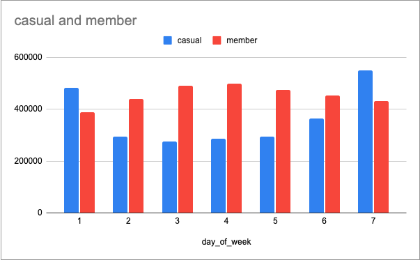
Screen Shot 2022-05-11 at 12.17.17 PM

I created this graph on the Excel, but when I tried to create it in R, I received an error , which is

#> ! Aesthetics must be either length 1 or the same as the data (14): fill

I am assuming I have to modify the aes() function in the code, or there might be a problem in a structure of the data I created but I don't know how to solve this error, so I'd like some advice. Below are the data and code.

library(tidyverse)

# The data is too big so just showing some of them as a sample
data %>% 
  select(member_casual, day_of_week) %>% 
  head(10)  
#> member_casual day_of_week
#> 1         member           4
#> 2         casual           6
#> 3         casual           3
#> 4         member           2
#> 5         member           5
#> 6         member           7
#> 7         casual           6
#> 8         member           4
#> 9         member           6
#> 10        member           4

# Summarizing the data
member_casual_data <- data %>% 
  group_by(data$member_casual) %>% 
  count(day_of_week)

# Checking the summarized data
member_casual_data
# A tibble: 14 × 3
# Groups:   data$member_casual [2]
   `data$member_casual` day_of_week      n
   <chr>                      <int>  <int>
 1 casual                         1 482812
 2 casual                         2 292978
 3 casual                         3 276351
 4 casual                         4 286383
 5 casual                         5 293593
 6 casual                         6 364257
 7 casual                         7 549973
 8 member                         1 387719
 9 member                         2 439397
10 member                         3 490060
11 member                         4 499898
12 member                         5 475282
13 member                         6 453072
14 member                         7 431302

# Creating a bar graph
library(ggplot2)
library(scales)
# The day_of_week column contains numeric data so convert these data to strings data
week <- c("Sun","Mon","Tue","Wed","Thu","Fri","Sat")

ggplot(member_casual_data, aes(x = day_of_week, y = n, fill = data$member_casual)) +
  geom_bar(stat = "identity", position = "dodge") +
  labs(x = "day of week", y = "numbers") +
  ggtitle("Comparing the number of rides between member and casual users in a year(2021/04 - 2022/03)") +
  theme(plot.title = element_text(size = 11)) +
  scale_x_continuous(breaks = seq(1,7,1), labels = week) +
  scale_y_continuous(limits = c(0,1000000), labels = label_comma())
#> Error in `check_aesthetics()`:
#> ! Aesthetics must be either length 1 or the same as the data (14): fill

Thanks in advance!

! Aesthetics must be either length 1 or the same as the data (14): fill

This message is telling you that the plot is expecting your fill aesthetic parameter to be the same length as day_of_week and n (or just length 1), but it is not that length. I usually run into this error when I'm mixing applying multiple data frames of different row lengths, and mix things up.


I think the issue is in the fill parameter in your plot aesthetics. Your current code refers to "data$member_casual", which is pulling from data, your original data source. Instead, you want to refer to the first column of your summarized data.

In your summarizing the data section, there is an issue in the group_by function. You should refer to the variable name,

member_casual_data <- data %>% 
  group_by(member_casual) %>%  
  count(day_of_week)

Now, the first column of your summary table is "member_casual", which allows you to update your plot to

ggplot(
      member_casual_data, 
      aes(x = day_of_week, y = n, fill = member_casual)
   ) +
  geom_bar(stat = "identity", position = "dodge") +
  labs(x = "day of week", y = "numbers") +
  ggtitle("Comparing the number of rides between member and casual users in a year(2021/04 - 2022/03)") +
  theme(plot.title = element_text(size = 11)) +
  scale_x_continuous(breaks = seq(1,7,1), labels = week) +
  scale_y_continuous(limits = c(0,1000000), labels = label_comma())
1 Like

Thank you for your reply. It worked! As you pointed out, I mixed up some data frames, and it seems this caused the problem.

I really appreciate your help.

This topic was automatically closed 7 days after the last reply. New replies are no longer allowed.

If you have a query related to it or one of the replies, start a new topic and refer back with a link.