How to customize a second legend in ggplot?

Hi everyone,
I made a barplot using ggplot2 and then I added it a horizontal line. My issue is that I couldn't figure out how to change the line's legend title.
Here's an example of my dataset:

mydata <- data.frame(
  stringsAsFactors = FALSE,
  country = c("Australia","Chile","Finland",
              "Germany","Turkey","Australia","Chile","Finland",
              "Germany","Turkey","Australia","Chile","Finland",
              "Germany","Turkey","Australia","Chile","Finland",
              "Germany","Turkey","Australia","Chile","Finland","Germany",
              "Turkey"),
  year = as.factor(c(2012L,2012L,2012L,2012L,
                     2012L,2013L,2013L,2013L,2013L,2013L,2014L,2014L,
                     2014L,2014L,2014L,2015L,2015L,2015L,2015L,2015L,2016L,
                     2016L,2016L,2016L,2016L)),
  gdps = c(0.181,0.168,0.206,0.173,
           0.133,0.187,0.158,0.207,0.176,0.132,0.182,0.142,
           0.211,0.177,0.146,0.188,0.152,0.22,0.175,0.144,0.193,
           0.183,0.215,0.174,0.13))

And here's the code I used to made the plot:

ggplot(mydata, aes(fill=year, y=gdps, x=country)) +
  geom_bar(position="dodge", stat="identity")+
  geom_label(data=mydata, aes(x=country, y=gdps,
                              fill=year,
                              label=paste0(round(gdps,1), "%")
  ), position=position_dodge(width=0.9)) +
  labs(title="Goverment expenditure per student as percentage of GDP",
       fill = "years", y = "", x="") +
  geom_hline(aes(yintercept = 0.10, color="line"),
             size=1.2,
             show.guide = TRUE)+
  scale_colour_manual(values = c("red"))

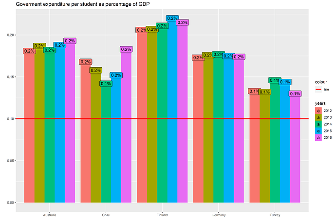
Which give me the following plot:


Basically, I'm trying to change the title "colour" in the upper legend. I tried with scale_linetype_manual, but it couldn't work.

Can anyone help me?
Thanks in advanced :v:

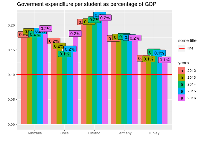
Simply set it on the labs() function:

library(ggplot2)

mydata <- data.frame(
    stringsAsFactors = FALSE,
    country = c("Australia","Chile","Finland",
                "Germany","Turkey","Australia","Chile","Finland",
                "Germany","Turkey","Australia","Chile","Finland",
                "Germany","Turkey","Australia","Chile","Finland",
                "Germany","Turkey","Australia","Chile","Finland","Germany",
                "Turkey"),
    year = as.factor(c(2012L,2012L,2012L,2012L,
                       2012L,2013L,2013L,2013L,2013L,2013L,2014L,2014L,
                       2014L,2014L,2014L,2015L,2015L,2015L,2015L,2015L,2016L,
                       2016L,2016L,2016L,2016L)),
    gdps = c(0.181,0.168,0.206,0.173,
             0.133,0.187,0.158,0.207,0.176,0.132,0.182,0.142,
             0.211,0.177,0.146,0.188,0.152,0.22,0.175,0.144,0.193,
             0.183,0.215,0.174,0.13))

ggplot(mydata, aes(fill = year, y = gdps, x = country)) +
    geom_col(position ="dodge") +
    geom_label(aes(label = paste0(round(gdps,1), "%")),
               position = position_dodge(width = 0.9)) +
    labs(title = "Goverment expenditure per student as percentage of GDP",
         y = "",
         x = "",
         colour = "some title",
         fill = "years") +
    geom_hline(aes(yintercept = 0.10, color = "line"),
               size = 1.2) +
    scale_colour_manual(values = c("line" = "red"))

Created on 2020-12-05 by the reprex package (v0.3.0.9001)

1 Like

This topic was automatically closed 7 days after the last reply. New replies are no longer allowed.

If you have a query related to it or one of the replies, start a new topic and refer back with a link.