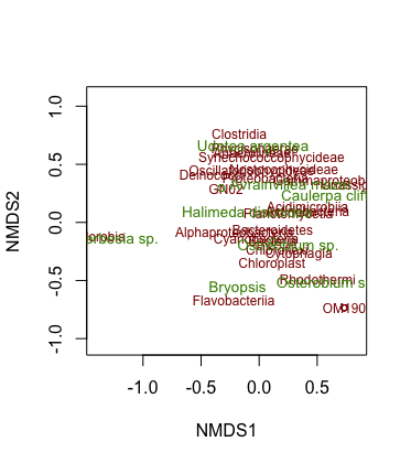
It’s really hard to give a good answer to this question without some more information. Can you try turning your question into a reproducible example? If you get stuck on that, at the very least can you please edit your question to include:
- The code you used to create the
nmds object, including any library() statements (there are lots of packages in R, and many of them have functions with similar names, so it’s better not to have to guess which ones you’re using)
- The output of running the following line:
dput(nmds)
This will look like a lot of gobbledygook, but just copy and paste it here anyway. This output lets your helpers recreate your nmds object on their own computers, so they can test out plotting solutions without needing access to your data.
When posting the above, it really helps your helpers if you can properly format  all your code and pasted console output. The quickest way: just select it and click the
 </> button at the top of the text entry box.
All that being said, here are a couple of pointers:
R has a few different graphics systems. vegan::ordiplot and vegan::orditorp are building on the base graphics system. In base graphics, if you give col a vector of colors, it will use a different color for each point, following the order of the points in the underlying data set (If you give it fewer colors than points, it will just start over at the beginning of the color vector when it runs out).
There are lots of tools available in R for making color ramps (sequential lists of colors that blend smoothly) that you can supply to the col argument. Here are a few starting points:
The second two options try to account for such issues as perceptual evenness, reproducibility in black and white, and accessibility to people with different forms of color blindness.
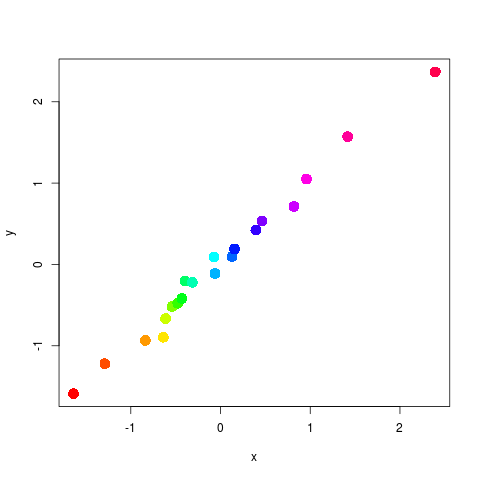
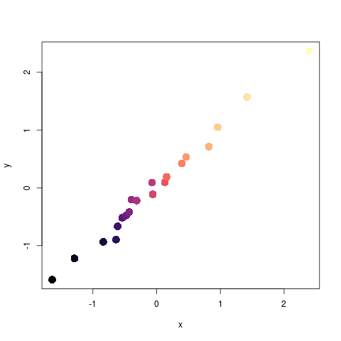
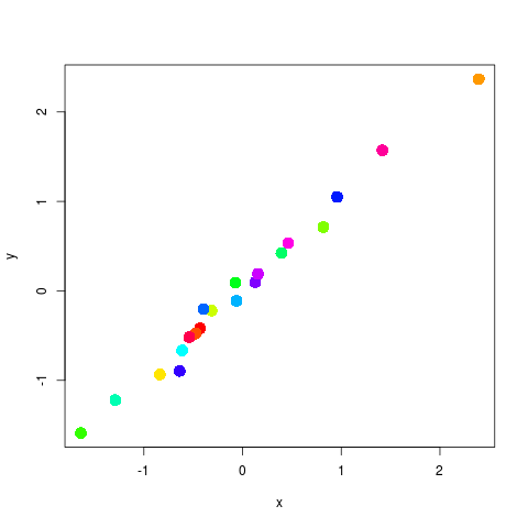
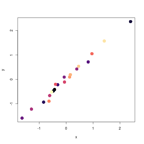
To show you how base graphics uses a color ramp, here’s a silly plot of imaginary data:
library(viridisLite)

# base graphics built-in rainbow palette
rainbow_pal <- rainbow(20)

# one of the viridis palettes
magma_pal <- viridis(20, option = "magma")

# Some made up data
x <- rnorm(20)
y <- x + (rnorm(20) * 0.1)
df <- data.frame(x, y)

# The colors are applied in the order of the data,
# so since the data were chosen randomly,
# the colors will be all mixed up
plot(df, pch = 16, cex = 2, col = rainbow_pal)
plot(df, pch = 16, cex = 2, col = magma_pal)


# Let's sort the data to get a better color ramp
plot(df[order(df$x), ], pch = 16, cex = 2, col = rainbow_pal)
plot(df[order(df$x), ], pch = 16, cex = 2, col = magma_pal)
