How to create this complex line graph in R?

Hi - I am a marine ecology postgrad looking for guidance on how to recreate a chart similar to figure three from this paper - https://www.researchgate.net/publication/353451636_First_Application_of_360-Degree_Camera_Technology_to_Marine_Predator_Bio-Logging/figures

I can't post a picture but if you can not see the research paper, I am referring to the line graph from the google images link - https://www.google.com/search?q=First+Application+of+360-Degree+Camera+Technology+to+Marine+Predator+Bio-Logging&sxsrf=ALiCzsYpFZVw5hmjVQqSP3H0HttSDt_bnQ:1659559407123&source=lnms&tbm=isch&sa=X&ved=2ahUKEwiPtcfHxKv5AhWH7rsIHf6DCd8Q_AUoAXoECAEQAw

I have data for both of these and can make a simple depth v time graph but am unsure how to add on the secondary data line referring to the habitat coverage.

Does anyone have any guidance on what would be the best software to use? Or how to make this type of graph?

Many thanks
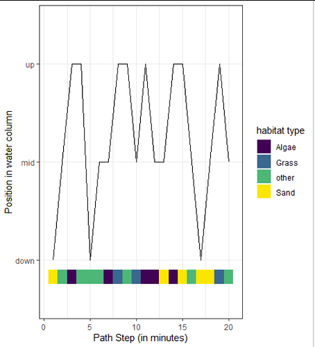
A series of geom_rect or such where the y values are fixed and the fill is the habitat coverage...?

When using categorical data it is still treated under the hood as numbers, so the 3 depths in this case the are plotted on the y-axis positions 1,2,3.
You can then simply add geom_segment() or geom_rect() to add some other information on the top, the bottom (or even in the middle or behind).

library(tidyverse)
segments = tibble(
  x_pos = 1:20,
  y_pos = rep(0.75, 20),   # you can play with the first value to adjuste the position
  class = sample(c("Sand", "Algae", "Grass", "other"), 20, replace = TRUE),
  depth = sample(c("up", "mid", "down"), 20, replace = TRUE)
  )

# show is illustrated in the paper
ggplot(segments) +
  # showing the line
  geom_path(aes(x = x_pos, 
                y = depth),
            group = 1) + 
  # showing the colours
  geom_rect(aes(xmin = x_pos-0.5, # to center this around the other values
                xmax = x_pos+0.5, # to center this around the other values
                ymin = y_pos,
                ymax = y_pos + 0.15, # defining the height
                fill = class)) +
  theme_bw() +
  scale_fill_viridis_d() + 
  labs(fill = "habitat type",
       x = "Path Step (in minutes)",
       y = "Position in water column")

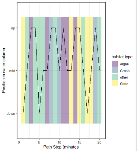
or show the colours as background:

ggplot(segments) +
  # showing the colours
  geom_rect(aes(xmin = x_pos -0.5, # to center this around the other values
                xmax = x_pos +0.5, # to center this around the other values
                ymin = y_pos + 0,
                ymax = y_pos + 2.5, # defining the height
                fill = class),
                alpha = 0.4) + 
  scale_fill_viridis_d() +
  scale_y_discrete() +  
            # oh this seems to be importand, otherwise the y axis is understand as numerical and the lines cannot be added
  # showing the line
  geom_path(aes(x = x_pos, y = depth),
            group = 1) + 
  theme_bw() +
  labs(fill = "habitat type",
       x = "Path Step (minutes",
       y = "Position in water column")

1 Like

This topic was automatically closed 21 days after the last reply. New replies are no longer allowed.

If you have a query related to it or one of the replies, start a new topic and refer back with a link.