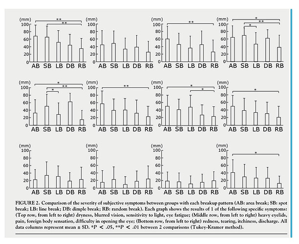
Hello, how to create a graph like this?
Thank you
You may want to use ggplot's facet_wrap() function, with a symptom variable for the subplots. See section 3.5 in R for Data Science.
https://r4ds.had.co.nz/index.html
1 Like
Hi, you could use:
1- ggplot2 library for make the bar plot and add errors bars
2- ggstatsplot library for add top bars and * simbol
3- like said @EconProf facet_wrap() function of ggplot2 or gridExtra packages
Remember put a reproducible example:
1 Like
This topic was automatically closed 42 days after the last reply. New replies are no longer allowed.
If you have a query related to it or one of the replies, start a new topic and refer back with a link.
