land use area
2005 2015 2023
lagoon 0.27 0.25 0.24
beach 3.98 5.23 8.44
how to create dual comparision bar chart using these data
land use area
2005 2015 2023
lagoon 0.27 0.25 0.24
beach 3.98 5.23 8.44
how to create dual comparision bar chart using these data
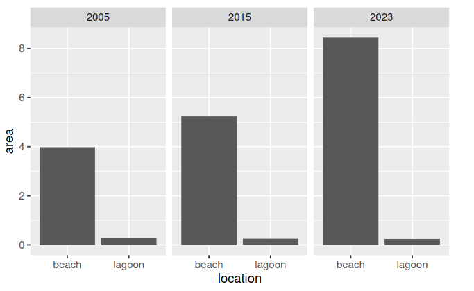
Something like this?

base::library(package = ggplot2)
base::library(package = tibble)

df <- tibble::tribble(
  ~year  , ~location   , ~area   ,
  2005   , "lagoon"     , 0.27    ,
  2005   , "beach"      , 3.98    ,
  2015   , "lagoon"     , 0.25    ,
  2015   , "beach"      , 5.23    ,
  2023   , "lagoon"     , 0.24    ,
  2023   , "beach"      , 8.44    ,
)

ggplot2::ggplot(
  data   = df,
  mapping = ggplot2::aes(
    x     = location,
    y     = area
  )
) +
  ggplot2::geom_col() +
  ggplot2::facet_grid(~year)
thank you dear it is amazing
Happy to help! If this solution worked for you please mark it as solution for future users.
Doing the same thing as @ qquagliano using a slightly different approach:
library(data.table)
library(ggplot2)


DT  <- data.table(year = c("Y2005", "Y2015", "Y2023"),
                  lagoon = c(0.27, 0.25, 0.24),
                  beach = c(3.98, 5.23,  8.44)
)

DT2 <- melt(DT,
            id.vars       = "year",
            measure.vars  = c("lagoon", "beach"),
            variable.name = "use",
            value.name    = "area")

ggplot(DT2, aes(x = year, y = area, fill = use)) + geom_col(position = "dodge") +
    facet_grid(~ year)
This topic was automatically closed 7 days after the last reply. New replies are no longer allowed.
If you have a query related to it or one of the replies, start a new topic and refer back with a link.