Hi,
Dataset: USData
Code I tried:
library(usmap)#1 . If state = "Alabama
USData <- as.data.frame(USData)
Please can someone help me here
Is this difficult for R community....I believe someone can help me here.
I think you need to start with making a more specific question and creating a reproducible example (see FAQ: What's a reproducible example (`reprex`) and how do I do one? )
2 Likes
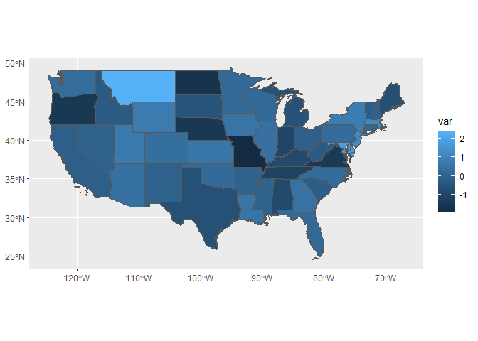
I agree with @StatSteph that we will be able to help you much better with a reprex, but just to get you started, here's some code that download geographic boundaries and plots them with ggplot2. It uses the tigris package that downloads the boundaries from the US Census Bureau. In addition, if you're doing a lot of spatial work in R, I would highly recommend you take a look at the sf package .
library(tidyverse)
library(tigris)

states <- states(cb = TRUE, class = "sf") %>%
  filter(!as.numeric(STATEFP) %in% c(2, 15, 60, 66, 69, 72, 78)) %>% # lower 48 only
  mutate(var = rnorm(nrow(.)))

states %>%
  ggplot(aes(fill = var)) +
  geom_sf()
Created on 2020-06-23 by the reprex package (v0.3.0)
2 Likes
jlacko
June 24, 2020, 9:21am
6
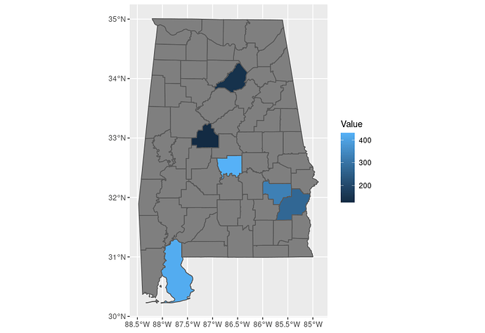
This should get you started; what the code does is:
download US Census bureau shapefile via {tigris} package, in {sf} package format
left joins your data to the shapefile, using county name as key
plots a map via ggplot2::geom_sf() call; all the usual ggplot formatting magic (legends, fill scales etc.) will apply
library(tidyverse)
library(tigris)
library(sf)

# shapefile of Alabama counties in {sf} format
alabama <- tigris::counties(state = 'AL', cb = T, class = 'sf')

# your data
data <- tribble(
 ~Date, ~County, ~State, ~Fips, ~Value,
  '2020-06-21', 'Autauga', 'Alabama', 1001, 431,
  '2020-06-21', 'Baldwin', 'Alabama', 1003, 420,
  '2020-06-21', 'Barbour', 'Alabama', 1005, 272,
  '2020-06-21', 'Bibb',    'Alabama', 1007, 126,
  '2020-06-21', 'Blount',  'Alabama', 1009, 143,
  '2020-06-21', 'Bullock', 'Alabama', 1011, 327,
)

# all Alabama counties, enriched for your data (where available)
chart_src <- alabama %>%
  left_join(data, by = c("NAME" = "County"))

# a plot to start with
ggplot(chart_src) +
  geom_sf(aes(fill = Value))
2 Likes
system
July 3, 2020, 2:17am
7
This topic was automatically closed 7 days after the last reply. New replies are no longer allowed.

