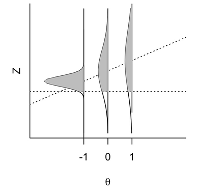
Probably a rather naive question but I am really having trouble finding an answer or recalling any solution from my reading of ggplot2 related books.
I know how to plot the usual distribution using x and y axis, but could it be rotated like that of the above picture?
Thanks!
FJCC
November 9, 2024, 3:23am
2
Here a sketch of how to make a plot similar to your image.
library(tidyverse)
DF <- data.frame(Z = rep(seq(-4,4,0.02),3),
                 Y = -c(dnorm(seq(-4,4,0.02),-1,sd = 0.5)-1,
                       dnorm(seq(-4,4,0.02),mean = 0,sd = 1.5),
                       dnorm(seq(-4,4,0.02),mean = 0.5, sd = 1)+1),
                 Theta = rep(c(1,0,-1),each = 401))
DF2 <- DF |> filter(Z > -2.0)
ggplot(DF,aes(Z,Y,group = Theta)) + geom_line() +
  geom_hline(yintercept = c(-1,0,1)) +
  geom_vline(xintercept = -2) +
  geom_ribbon(aes(ymax = Theta, ymin = Y), fill = "grey80", data = DF2) +
  coord_flip() +
  theme_bw()
Created on 2024-11-08 with reprex v2.1.1
1 Like
Thanks! This solution is really elegant and brilliant!
system
November 16, 2024, 4:41am
4
This topic was automatically closed 7 days after the last reply. New replies are no longer allowed.

