How to create a second y-axis with dates transformed to a time proportion

Hi there, I am wanting to make a second y-axis from dates that sums up multiple proportions of time. Here is a representative data sample showing variables for individual fires: class of fire size (fire_size), a weather index at the time of the fire (ONI_intensity), the area burnt in hectares (area_ha) and the date (date):

library:tidyverse

fire_size <- c("small", "medium", "medium", "small", "large", "large", "small", "large", "small", "large")
ONI_intensity <- c(-3, -3, -3, 0, 0, 0, 0, 3, 3, 3)
area_ha <- c(323, 473, 536, 227, 848, 626, 34, 739, 156, 635)
predate <- c("1970-01-15", "1970-02-15", "1970-03-15", "1970-04-15", "1970-05-15", "1970-06-15", "1970-07-15", "1970-08-15", "1970-09-15", "1970-10-15")
date <- as.Date(predate)

mydata <- data.frame(fire_size, ONI_intensity, area_ha, date)
mydata

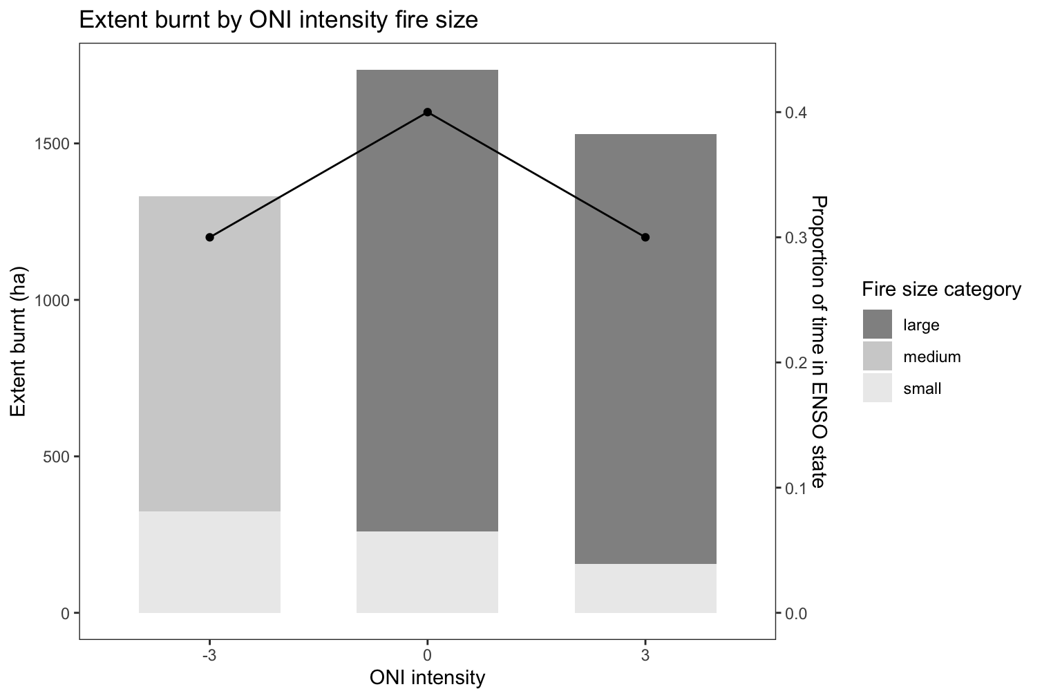
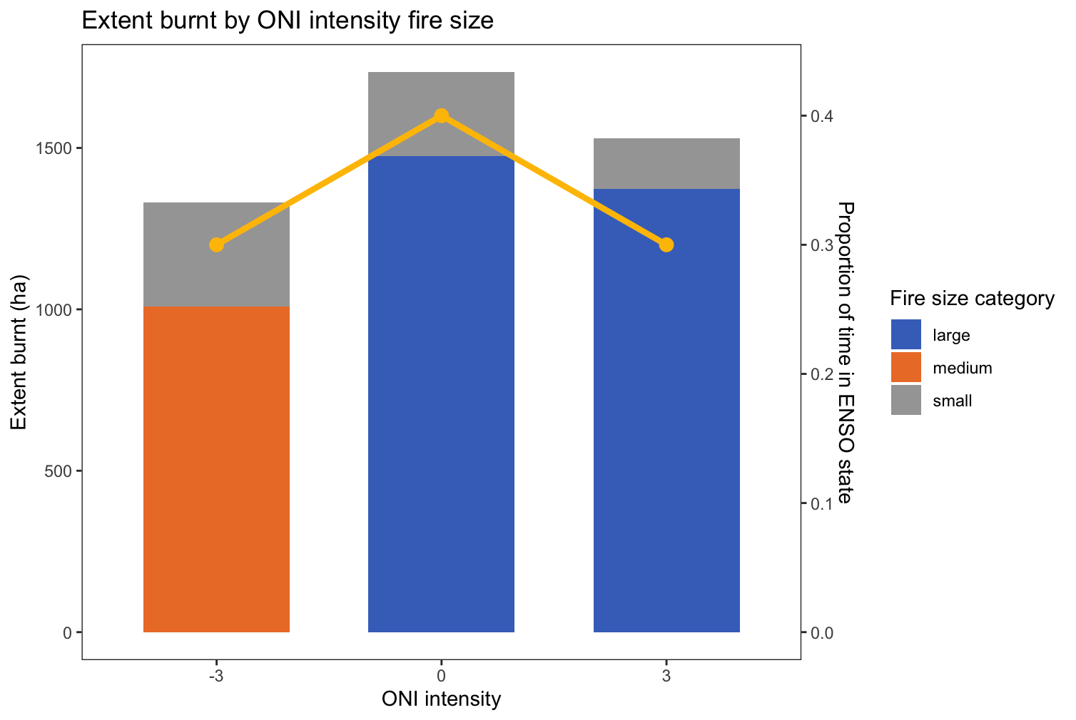
I repeated this in excel, creating a pivot table (minus the 'date' column). I added to this a column representing 'proportion', meaning the proportion spent in each ONI intensity (from date), that I calculated myself. I represented it as a stacked line with markers in a second y-axis.

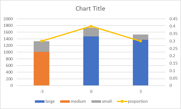
Essentially this excel chart is what I want to end up with in R, just using some function to derive 'proportion spent in each ONI intensity' from the date directly. Here is the code I tried...

mydata_2 <- mydata %>%
  group_by(ONI_intensity, fire_size) %>%
  summarise(proportion = n_distinct(date)/10, sum_area = sum(area_ha))

#I divided by date because that is how many distinct dates there were

gg1 <- mydata_2 %>%
  ggplot(aes(x = factor(ONI_intensity),
             y = sum_area,
             fill = factor(fire_size, levels = c('Large','Medium','Small')))) +
  geom_col(
    alpha = 0.5,
    width = 0.65) +
  theme_bw() +
  theme(panel.grid.major = element_blank(),
        panel.grid.minor = element_blank()) +
  labs(title = 'Extent burnt by ONI intensity fire size', x = "ONI intensity", y = "Extent burnt (ha)", fill ="Fire size category") +
  scale_fill_grey(
    start = 0,
    end = 0.85,
    na.value = "red",
    aesthetics = "fill"
  ) +
  geom_point(aes(y = proportion*4000)) +
  geom_line(aes(y = proportion*4000, group = 1)) +
  scale_y_continuous(sec.axis = sec_axis(~./4000, name = "Proportion of time in ENSO state"))

gg1

As you can see, geom_point has put in a point value for each row of mydata_2, whereas I would like to sum them to a single point value for each ONI intensity. Would anyone be able to adjust with any code to reproduce the excel graph?

library(tidyverse)

fire_size <- c("small", "medium", "medium", "small", "large", "large", "small", "large", "small", "large")
ONI_intensity <- c(-3, -3, -3, 0, 0, 0, 0, 3, 3, 3)
area_ha <- c(323, 473, 536, 227, 848, 626, 34, 739, 156, 635)
predate <- c("1970-01-15", "1970-02-15", "1970-03-15", "1970-04-15", "1970-05-15", "1970-06-15", "1970-07-15", "1970-08-15", "1970-09-15", "1970-10-15")
date <- as.Date(predate)

mydata <- data.frame(fire_size, ONI_intensity, area_ha, date)


mydata_2 <- mydata %>%
  group_by(ONI_intensity, fire_size) %>%
  summarise(proportion = n_distinct(date)/10, sum_area = sum(area_ha))

pt <- mydata_2 %>% 
  mutate(ONI_intensity = factor(ONI_intensity)) %>% 
  group_by(ONI_intensity) %>% 
  summarise(proportion = sum(proportion)*4000)

gg1 <- mydata_2 %>%
  mutate(fire_size = factor(fire_size, levels = c('large','medium','small')),
         ONI_intensity = factor(ONI_intensity)) %>% 
  ggplot(aes(x = ONI_intensity,
             y = sum_area,
             fill = fire_size)) +
  geom_col(
    alpha = 0.5,
    width = 0.65) +
  theme_bw() +
  theme(panel.grid.major = element_blank(),
        panel.grid.minor = element_blank()) +
  labs(title = 'Extent burnt by ONI intensity fire size', x = "ONI intensity", y = "Extent burnt (ha)", fill ="Fire size category") +
  scale_fill_grey(
    start = 0,
    end = 0.85,
    na.value = "red",
    aesthetics = "fill"
  ) +
  geom_point(data = pt, aes(x = ONI_intensity, y = proportion), inherit.aes = F) +
  geom_line(data = pt, aes(x = ONI_intensity, y = proportion, group = 1), inherit.aes = F) +
  scale_y_continuous(sec.axis = sec_axis(~./4000, name = "Proportion of time in ENSO state"))

gg1

If you need the same excel output

mydata_2 <- mydata %>%
  group_by(ONI_intensity, fire_size) %>%
  summarise(proportion = n_distinct(date)/10, sum_area = sum(area_ha))

pt <- mydata_2 %>% 
  mutate(ONI_intensity = factor(ONI_intensity)) %>% 
  group_by(ONI_intensity) %>% 
  summarise(proportion = sum(proportion)*4000)

gg1 <- mydata_2 %>%
  mutate(fire_size = factor(fire_size, levels = c('small', 'medium', 'large')),
         ONI_intensity = factor(ONI_intensity)) %>% 
  ggplot(aes(x = ONI_intensity,
             y = sum_area,
             fill = fire_size)) +
  geom_col(width = 0.65) +
  theme_bw() +
  theme(panel.grid.major = element_blank(),
        panel.grid.minor = element_blank()) +
  labs(title = 'Extent burnt by ONI intensity fire size', x = "ONI intensity", y = "Extent burnt (ha)", fill ="Fire size category") +
  scale_fill_manual(
    breaks = c('large','medium','small'),
    values = c("#4472C4", "#ED7D31", "#A5A5A5")) +
  geom_point(data = pt, aes(x = ONI_intensity, y = proportion), size = 3, color = "#FFC000", inherit.aes = F) +
  geom_line(data = pt, aes(x = ONI_intensity, y = proportion, group = 1), 
            linewidth = 1.5, color = "#FFC000", inherit.aes = F) +
  scale_y_continuous(sec.axis = sec_axis(~./4000, name = "Proportion of time in ENSO state"))

gg1

1 Like

This topic was automatically closed 7 days after the last reply. New replies are no longer allowed.

If you have a query related to it or one of the replies, start a new topic and refer back with a link.