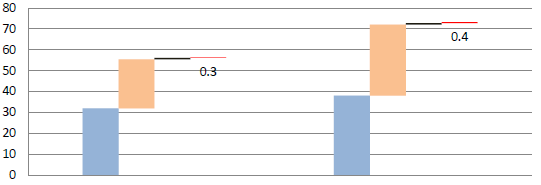
I am wondering how to use plotly to create a step chart in R

I am wondering how to use plotly to create a step chart in R

Waterfall chart perhaps?
i have tried to write a code to draw the chart that i am looking for.
Is there any smart way to re-write, in case i have 10 traces to draw?
library(tidyverse)
library(plotly)
# library(reactable)

data <- data.frame(g = rep(c("g1", "g2"), each = 4),
                   y = rep(letters[1:4], 2),
                   value = c(2, 3, 4, 10, 5, 7, 10, 20))
data <- data %>%
  arrange(g, y) %>%
  rowid_to_column(var = "id") %>%
  pivot_wider(id_cols = c("id", "g"), names_from = y,
              values_from = value, values_fill = 0) %>%
  select(-id) %>%
  mutate(blank = rowSums(.[2:5])) %>%
  group_split(g) %>%
  lapply(function(f) {
    f %>%
      mutate(blank = c(0, head(cumsum(blank), -1))) %>%
      add_row(g = rep(unique(.$g), 2), .before = 1)
  }) %>%
  bind_rows() %>%
  replace(is.na(.), 0) %>%
  rowid_to_column(var = "id") %>% filter(!id %in% 1)


# Bar
p <- plot_ly(data, x = ~id, y = ~blank , type = 'bar', name = 'blank',
             marker = list(color = "white"), opacity = 0, showlegend = FALSE,
             hoverinfo  = "none") %>%
  add_trace(y = ~a, name = 'Trade Financing', marker = list(color = "#95B3D7"),
            opacity = 1, showlegend = TRUE, hoverinfo = 'y') %>%
  add_trace(y = ~b, name = 'Project Financing', marker = list(color = "#FABD8B"),
            opacity = 1, showlegend = TRUE,hoverinfo = 'y') %>%
  add_trace(y = ~c, name = 'Special Assistance', marker = list(color = "#1E1C11"),
            opacity = 1, showlegend = TRUE, hoverinfo = 'y') %>%
  add_trace(y = ~d, name = 'Technical Assistance', marker = list(color = "#FF0000"),
            opacity = 1, showlegend = TRUE, hoverinfo = 'y') %>%
  layout(title = list(text = "<b>Fig1: Net Approvals by Type of Operation</b>",
                      yanchor = "top",
                      yref = "paper"),
         margin = list(b = 30, l = 70, t = 60, r = 30, pad = 10),
         font = list(family = "Roboto", size = 12),
         showlegend = TRUE,
         legend = list(orientation = 'h', xanchor = "center",  x = 0.5,
                       traceorder = "normal"),
         xaxis = list(showline = FALSE,
                      # range = -10:10,
                      ticks = "outside", tickangle = 0, ticklen = 0, tickwidth = 0,
                      tickvals = c(4.5, 10.5),
                      ticktext = sprintf("<b>%s</b>", c("Year 1", "Year 2")),
                      title = ""),
         yaxis = list(title = "<b>US$ billion</b>"),
         barmode = 'stack', bargap = 0)
p
This topic was automatically closed 21 days after the last reply. New replies are no longer allowed.
If you have a query related to it or one of the replies, start a new topic and refer back with a link.