How to create a line graph with multiple lines?

Hello, I hope you are well.

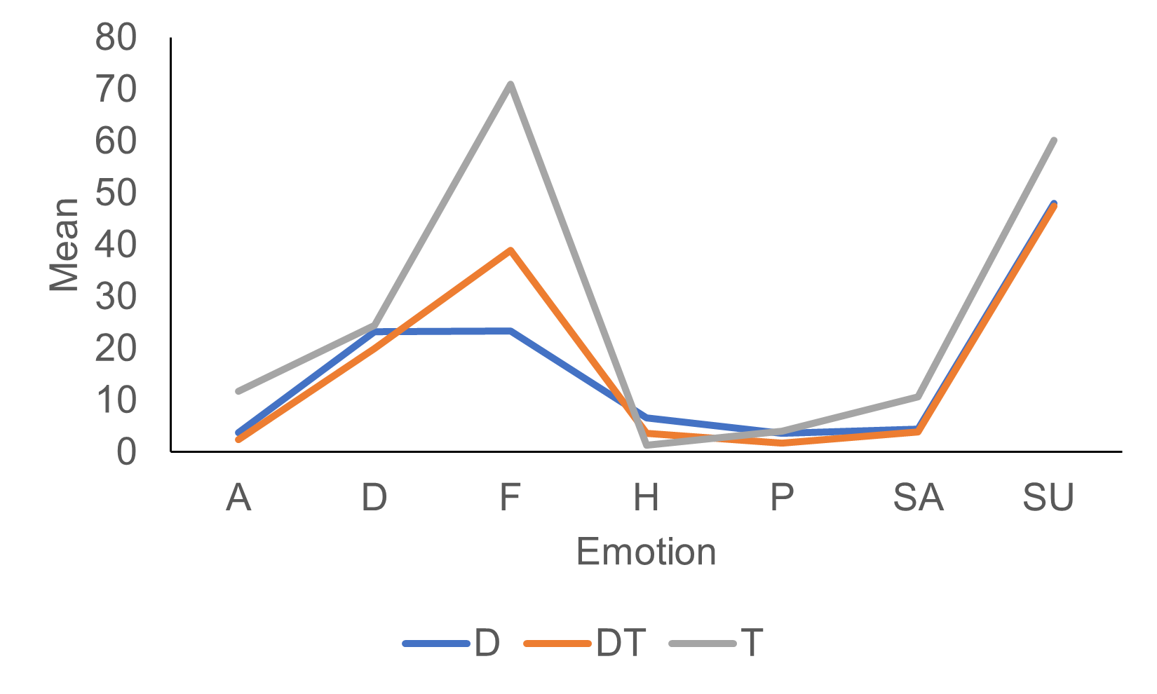
I am new to r and pretty out of my depth. I have run a 3 x 7 experiment looking at how people perceive different emotions (anger, disgust, fear, happy, pain, sad and surprise) across different presentation conditions (dynamic, dynamic-text and text). My supervisor wants me to make a line graph showing the emotion ratings across the three different conditions. So the 7 different emotions will be along the x axis, and there will be 3 lines for the different conditions showing the different mean scores for each emotion. I was trying to follow use the example someone kindly shared here Steve’s Data Tips and Tricks - Plotting Multiple Lines on a Graph in R: A Step-by-Step Guide.

The code I am working on, based on the above example.

Emotion <- (c("Anger", "Disgust", "Fear", "Happy", "Pain", "Sad", "Surprise"))
  D <- c(41.33333333, 52.36796537, 33.27536232, 19.59090909, 34.33333333, 49.12735849, 27.6746988)
 names (D) <- Emotion
 T <- c(70.31606218,	48.5019305, 24.28333333, 18.22727273, 40.20481928,47.0349345 , 46.2020202)
names (T) <- Emotion
 DT <- c(42.59106529, 44.00877193, 18.86666667,13.88235294, 24.2875, 44.96103896, 34.47619048)
 names (DT) <- Emotion 
View(data)
x <- Emotion
y1 <- c(D)
y2 <- c(DT)
y3 <- c(T)
matplot(x, cbind(y1, y2, y3), type = "l", lty = 1, 
        col = c("red", "blue", "green"), xlab = "X", 
        ylab = "Y", main = "Multiple Lines Plot")
legend("topright", legend = c("Line 1", "Line 2", "Line 3"), 
       col = c("red", "blue", "green"), 
       lty = 1)

I am not sure what I am doing wrong and how to fix it. I get this error message when trying to plot the graph.

 Error in plot.window(...) : need finite 'xlim' values
In addition: Warning messages:
1: In xy.coords(x, y, xlabel, ylabel, log = log, recycle = TRUE) :
  NAs introduced by coercion
2: In min(x) : no non-missing arguments to min; returning Inf
3: In max(x) : no non-missing arguments to max; returning -Inf
4: In xy.coords(x, y, xlabel, ylabel, log) : NAs introduced by coercion

If anyone has any suggestions I am all ears and would really appreciate it. Have a lovely day! Thank you.

I think your immediate problem is that you are doing

x   <-  Emotions

It looks like the "x" in the matplot function requires a numeric vector and "x" is a character vector. "x" is setting the length of the x-axis.

I'm having a problem visualizing just how your data is organized . Do you want a line plot for each value in the Emotions vector ?

In any case, doing what you want is probably easier using the {ggplot2} package.

Does this look like how you you would want your data to to look? Just copy and paste the data below into R

dat1  <-  structure(list(Anger = c(41.33333333, 42.59106529, 70.31606218
), Disgust = c(52.36796537, 44.00877193, 48.5019305), Fear = c(33.27536232, 
18.86666667, 24.28333333), Happy = c(19.59090909, 13.88235294, 
18.22727273), Pain = c(34.33333333, 24.2875, 40.20481928), Sad = c(49.12735849, 
44.96103896, 47.0349345), Surprise = c(27.6746988, 34.47619048, 
46.2020202)), class = "data.frame", row.names = c("D", "DT", 
"T"))

Good afternoon,

I hope you are well.

Thanks for your reply. I really appreciate it, Sorry you had difficulty visualising things. I want a graph showing the values for each the emotions , with a separate line for each of the 3 different conditions. I have tried to upload an example from a quick graph put together in Excel. Hopefully you will be able to see it.

Thank you for the example of the data. Yes, that is exactly how I want the data to look.

Best wishes,
Emily

Okay, I was visualizing something different but that example makes things clear.

I'm going to be tied up for a while but I'll try to see what I can do later today if someone else does not give you a solution.

Here's what I would do:

library(tidyverse)

df <- tibble(
  Emotion  = c("Anger", "Disgust", "Fear", "Happy", "Pain", "Sad", "Surprise"),
  D = c(41.33333333, 52.36796537, 33.27536232, 19.59090909, 34.33333333, 49.12735849, 27.6746988),
  T = c(70.31606218,	48.5019305, 24.28333333, 18.22727273, 40.20481928,47.0349345 , 46.2020202),
  DT = c(42.59106529, 44.00877193, 18.86666667,13.88235294, 24.2875, 44.96103896, 34.47619048)
) %>% 
  pivot_longer(cols = -Emotion, names_to = "Variable", values_to = "Value")

ggplot(df)+
  geom_line(aes(x = Emotion, y = Value, color = Variable, group = Variable))

I am doing things slightly differently than mduvekot as I prefer to use the {data.table} package rather than the {dplyr} package (part of {tidyverse} ) but basically we are doing the same thing.

You may need to install the {tidyverse} package for mduvekot 's solution or both {tidyverse} & {data.table} for mine.

suppressMessages(library(data.table)); suppressMessages(library(tidyverse))

dat1 <- structure(list(Anger = c(41.33333333, 42.59106529, 70.31606218
), Disgust = c(52.36796537, 44.00877193, 48.5019305), Fear = c(33.27536232, 
18.86666667, 24.28333333), Happy = c(19.59090909, 13.88235294, 
18.22727273), Pain = c(34.33333333, 24.2875, 40.20481928), Sad = c(49.12735849, 
44.96103896, 47.0349345), Surprise = c(27.6746988, 34.47619048, 
46.2020202)), class = "data.frame", row.names = c("D", "DT", 
"T"))

DT <- as.data.table(dat1)
DT[, Condition := rownames(dat1)]

DT1 <- melt(DT, id.vars = "Condition")

ggplot(DT1, aes(variable, value, colour = Condition, group = Condition )) + geom_line() +
        xlab("Emotion") + ylab("Mean")

To resolve the error, convert Emotion into a factor using x <- factor(Emotion) before matplot() in your R code. This ensures that the x-axis values are treated as categorical variables, preventing the "need finite 'xlim' values" error. Additionally, adjust your legend() labels to correspond accurately with your conditions ("Dynamic", "Dynamic-Text", "Text"). This should correct the plot and display the emotion ratings across different presentation conditions as intended.