ggplot generates legends only when you create an aesthetic mapping inside aes . This is usually done by mapping a data column to an aesthetic, like colour , shape , or fill. ggplot is also set up to work most easily with data in "long" format. In your case, that would mean stacking the dv and sim columns and adding an additional column that marks whether a value came from dv or sim. Below, we'll do that with the gather function.
library(tidyverse)
theme_set(theme_classic())

# Fake data
set.seed(2)
dat = data.frame(othercolumn = sample(LETTERS, 100, replace=TRUE),
                 dv = rnorm(100, 10, 3),
                 sim = rnorm(100, 11, 2))

# convert data to long format
dat.l = gather(dat, key, value, dv, sim)
Note that we now have the numeric data in a single column called value and a categorical column called key that tells us where the data came from.
dat.l[c(1:5,101:105), ]
    othercolumn key     value
1             E  dv  7.485139
2             S  dv 16.198904
3             O  dv  8.313259
4             E  dv 13.827147
5             Y  dv  6.857282
101           E sim 12.951781
102           S sim 10.661154
103           O sim 12.444384
104           E sim  9.311163
105           Y sim 13.554587
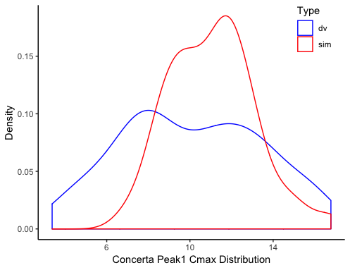
To plot the data, we set the x aesthetic to value (we could have done x=value, but x is first by default, so we can just type value) and the colour aesthetic to key inside aes, which generates a legend. We set custom colors using scale_colour_manual and we use theme to set a custom legend position.
ggplot(dat.l, aes(value, colour=key)) +
  geom_density() +
  labs(colour="Type",
       x="Concerta Peak1 Cmax Distribution",
       y="Density") +
  scale_colour_manual(values=c("blue", "red")) +
  theme(legend.position=c(0.9, 0.9))
Instead of creating dat.l as a separate object, we could have converted the data to long format on the fly:
dat %>%
  gather(key, value, dv, sim) %>%
  ggplot(aes(value, colour=key)) +
    geom_density() +
    labs(colour="Type",
         x="Concerta Peak1 Cmax Distribution",
         y="Density") +
    scale_colour_manual(values=c("blue", "red")) +
    theme(legend.position=c(0.9, 0.9))
With your original data, to get two density plots, we need two calls to geom_density. We can also create a legend with artificial "dummy" aesthetics, which are done below with colour="dv" and colour="sim"(we could have used any strings instead of "dv" and "sim"). This "works", but requires more work and doesn't maintain a natural mapping between the data and the plot.
ggplot(dat) +
  geom_density(aes(dv, colour="dv")) +
  geom_density(aes(sim, colour="sim")) +
  labs(colour="Type",
       x="Concerta Peak1 Cmax Distribution",
       y="Density") +
  scale_colour_manual(values=c("blue", "red")) +
  theme(legend.position=c(0.9, 0.9))
For all of these versions of the code, the plot looks like this: