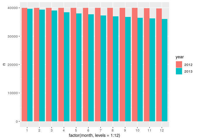
If you pay more attention you would notice that in practice it is the same thing, the only difference is the position of the bars, which can be fixed pretty easily.
# Library calls
library(tidyverse)

# Sample data on a copy/paste friendly format
df <- data.frame(
    n = c(39966L,39637L,40000L,39344L,39997L,
          39009L,40000L,38460L,40000L,38049L,40000L,37676L,40000L,
          37269L,40000L,37021L,39999L,36758L,40000L,36515L,39897L,
          36268L,39766L,36093L),
    month = as.factor(c("1","1","2","2","3",
                        "3","4","4","5","5","6","6","7","7","8",
                        "8","9","9","10","10","11","11","12","12")),
    year = as.factor(c("2012","2013","2012",
                       "2013","2012","2013","2012","2013","2012",
                       "2013","2012","2013","2012","2013","2012","2013",
                       "2012","2013","2012","2013","2012","2013","2012",
                       "2013"))
)

# Relevant code for the issue
df %>%
    ggplot(aes(x = factor(month, levels = 1:12), y = n, fill = year)) +
    geom_col(position = "dodge")