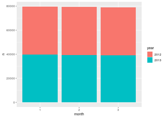
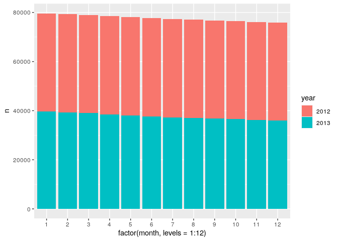
I need to create a plot of the total number of observations in each month of the study period. The df is
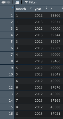
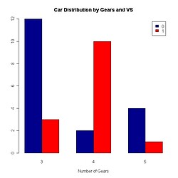
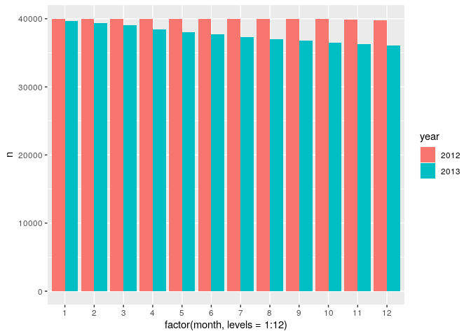
To create a better graph, I think grouped bar plot will be better. Ideally, Quick-R: Bar Plots
Thus, 2012-01 and 2013-01 can be combined a group bar.
I refer to the above website, and use the code
barplot(df.1a$n, main = "Total Number of Observations", xlab = "Each Month of the Study Period",beside=TRUE, col=c("darkblue","red"))
I think the problem is due to my df.
Also, if you have any suggestion about this graph, please tell me. Thank you so much!
