How to create a ggplot2 pie and donut chart on same plot?

Hi all!
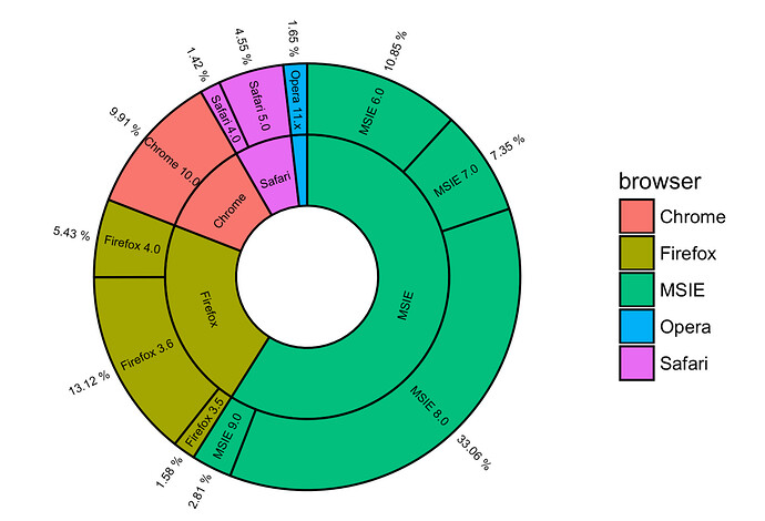
I am would like to create something like this:

I would appreciate any advice to do so

This is my database

metadata <- data.frame(data.frame(stringsAsFactors=FALSE,
                              Domain = c("Eukaryotes PR2", "Bacteria Silva 16S",
                                         "Eukaryotes Silva 18S",
                                         "Archaea NCBI"),
                               Total = c(2138457, 2594766, 1237100, 8e+05),
                               Group = c("Algae PR2", "Cyanobacteria Silva 16S", "Algae Silva 18S",
                                         "Nogroup"),
                               Share = c("1320398", "1524609", "796201", "Nogroup")
                        )
)

Created on 2019-10-22 by the reprex package (v0.3.0)

and it looks like this

metadata <- data.frame(tibble::tribble(
                                         ~Domain,  ~Total,                    ~Group,    ~Share,
                                "Eukaryotes PR2", 2138457,               "Algae PR2", "1320398",
                            "Bacteria Silva 16S", 2594766, "Cyanobacteria Silva 16S", "1524609",
                          "Eukaryotes Silva 18S", 1237100,         "Algae Silva 18S",  "796201",
                                  "Archaea NCBI",   8e+05,                 "Nogroup", "Nogroup"
                          )
)

Created on 2019-10-22 by the reprex package (v0.3.0)

I would like to explain briefly what my results are about. The Domain Eukaryotes PR2, Bacteria Silva 16S and Eukaryote Silva 18S has a group of microorganisms that I would like to be represented (Algae PR2, Cyanobacteria 16s and Algae 18S respectively). The amount of each group (share) is already considered in the total. Archae has no group.

Thanks in advance

Osiris.
Hi @OSDIAZ. I didn't get what plot that you want, can you elaborate more about the plot that you wanted. If you want donut plot, you can use geom_rect plus coord_polar.

1 Like

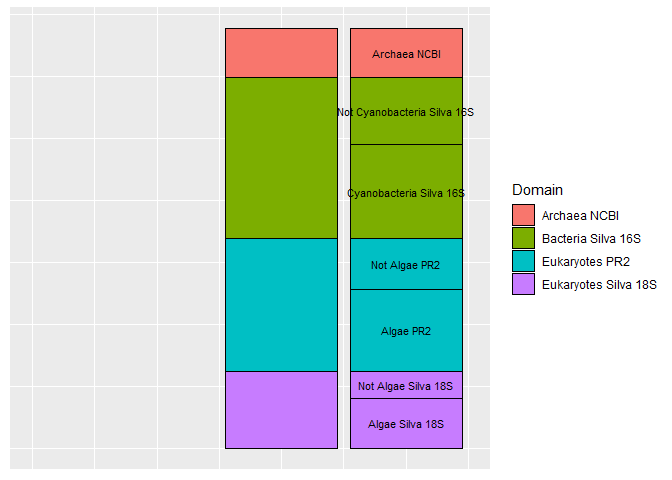
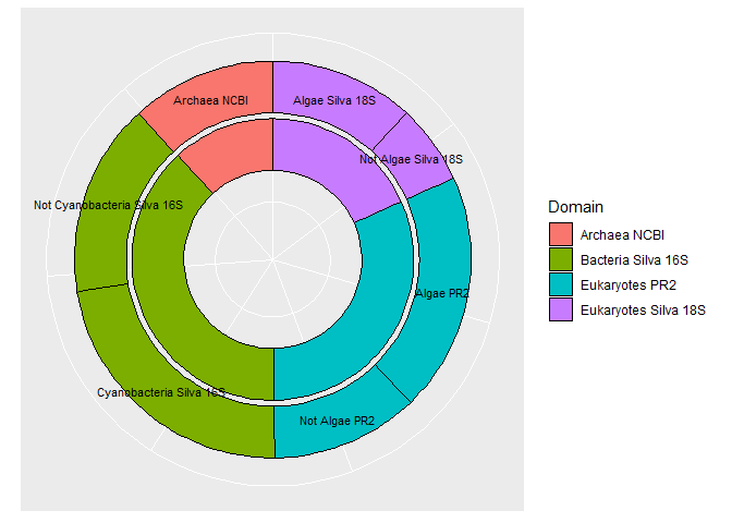
Here is a start on a possible solution. I do not know how to get the text labels written radially. Also, shorter labels are probably needed.

library(dplyr)
#> Warning: package 'dplyr' was built under R version 3.5.3
#> 
#> Attaching package: 'dplyr'
#> The following objects are masked from 'package:stats':
#> 
#>     filter, lag
#> The following objects are masked from 'package:base':
#> 
#>     intersect, setdiff, setequal, union
library(tibble)
#> Warning: package 'tibble' was built under R version 3.5.3
library(tidyr)
#> Warning: package 'tidyr' was built under R version 3.5.3
library(ggplot2)
#> Warning: package 'ggplot2' was built under R version 3.5.3
metadata <- data.frame(tibble::tribble(
  ~Domain,  ~Total,                    ~Group,    ~Share,
  "Eukaryotes PR2", 2138457,               "Algae PR2", "1320398",
  "Bacteria Silva 16S", 2594766, "Cyanobacteria Silva 16S", "1524609",
  "Eukaryotes Silva 18S", 1237100,         "Algae Silva 18S",  "796201",
  "Archaea NCBI",   8e+05,                 "Nogroup", "Nogroup"
)
)

#Make Share numeric
metadata <- mutate(metadata, Share = ifelse(Share == "Nogroup", "0", Share)) %>% 
  mutate(Share = as.numeric(Share))

#Calculate the size and invent Group labels for the unnamed fraction of each Domain
metadata2 <- data.frame(Domain = metadata$Domain,
                        Total = metadata$Total,
                        Group = paste("Not", metadata$Group),
                        Share = metadata$Total - metadata$Share,
                        stringsAsFactors = FALSE)

#Make a data set where each Group is explicit
metadata2 <- rbind(metadata2, metadata) %>% 
  filter(Share != 0) %>% 
  mutate(Group = ifelse(Group == "Not Nogroup", Domain, Group)) %>%
  arrange(Domain, Group) 

metadata2 <- metadata2 %>%
  mutate(Tot = sum(Share)) %>% 
  group_by(Domain) %>% 
  mutate(CUM = cumsum(Share), DomSize = max(CUM))

#Calculate the bottom edge of the Domains when stacked
DomBot <- unique(select(metadata2, Domain, Tot, DomSize)) %>% ungroup() %>% 
  mutate(Bottom = Tot - cumsum(DomSize))

metadata2 <- inner_join(metadata2, select(DomBot, Domain, Bottom))
#> Joining, by = "Domain"
metadata2 <- mutate(metadata2, Pos = Bottom + CUM - Share/2)


plt <- ggplot() + geom_col(aes(x = 2, y = Total, fill = Domain), 
                    data = metadata, color = "black") + 
  geom_col(aes(x = 3, y = Share, fill = Domain), 
           data = metadata2, color = "black") +
  geom_text(aes(label = Group, x= 3, y = Pos), data = metadata2, size = 3)+
  xlim(0, 3.5) + labs(x = NULL, y = NULL) + 
  theme(axis.ticks=element_blank(),
axis.text=element_blank(),
axis.title=element_blank())

plt


plt + coord_polar(theta = "y") 

Created on 2019-10-22 by the reprex package (v0.3.0.9000)

3 Likes

Thank you so much!

This is exactly what I was trying to do.

Hi @FJCC and @OSDIAZ. For your information. The sunburst_data function of package ggsunburst can help to calculate the angle and hjust for labels in radially.

1 Like

Thank you a lot @raytong, surburst_data function helped me to make my analysis look better.

This topic was automatically closed 7 days after the last reply. New replies are no longer allowed.