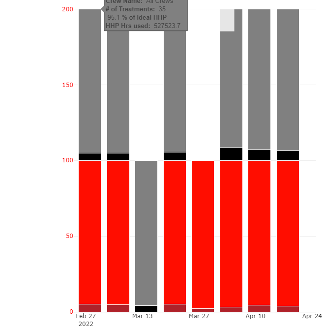
I'm trying to create a 100% Stacked Bar Chart with 2 groups using 4 columns in my dataset to be displayed on a timeseries. I'm currently having challenges putting the 2 groups side by side and ordering (small % above the larger % below) the stack for each date using Plotly in R. As shown on the attached. Currently it is stack-up all columns for every time period together causing a 200%. Any Idea on how to resolve this would be greatly appreciated.
Can you share your code and sample data on how this chart is made? My guess is that you don't have this data into a tidyverse 'pivot_longer' or reshape2 'melt' format. Once that is done you can do follow this example using ggplot2-integrated plotly ('ggplotly(plotname)') plots: charts - How to produce stacked bars within grouped barchart in R - Stack Overflow
This topic was automatically closed 21 days after the last reply. New replies are no longer allowed.
If you have a query related to it or one of the replies, start a new topic and refer back with a link.
