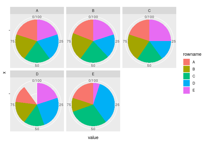
I have the following dataframe (in a reduced version, it can achieve up to 1000 variables) and I'd like to build multiple pie charts for each of the columns of my dataframe. RStudio community helped me with this code in order to build them with a loop using plotly (but suggestions with ggplot2 would be good, too) but I don't know how to plot them together, in a single plot, using a loop to combine them. The dataset is the following:
a=c(20.0,20.0,20.0,20.0,20.0)
b=c(19.0,21.0,22.0,18.0,20.0)
c=c(20.0,20.5,19.5,15.0,25.0)
d=c(13.0,17.0,15.5,24.5,20.0)
e=c(20.0,10.5,29.5,35.0,5.0)
data=cbind(a,b,c,d,e)
colnames(data)<-c("A","B","C","D","E")
rownames(data)<-c("A","B","C","D","E")
data=as.table(data)
data
while the code for writing the different pie charts is, as follows:
for(i in 1:dim(data)[1]){
  assign(paste0("pie_",i), plot_ly(as.data.frame(data[,i], nm = "y"),
                                 labels = colnames(data), values = ~y, type = 'pie'))
}
I'd like to combine all the created pie charts together, using a loop in order to make the combination automatic according to the number of different columns (variables) in the dataframe.
Thank you in advance for the help!
