How to color each factor by a different color?

library(socviz)
glimpse(gss_sm)
p <- ggplot(data = gss_sm,
            mapping = aes (x = happy), color = happy)
p + geom_bar(mapping=aes(y=..prop.., group=1)) +
    facet_grid(~ region)  + theme(axis.text.x = element_text(angle = 270, hjust = 1))

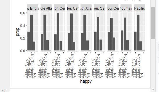
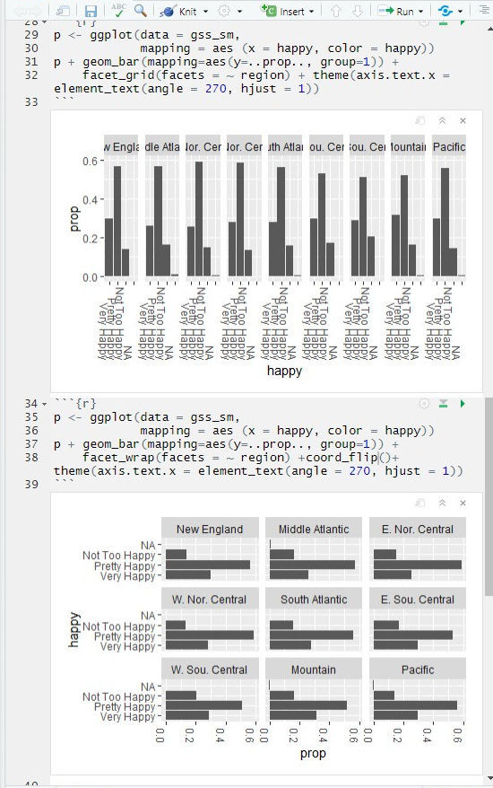
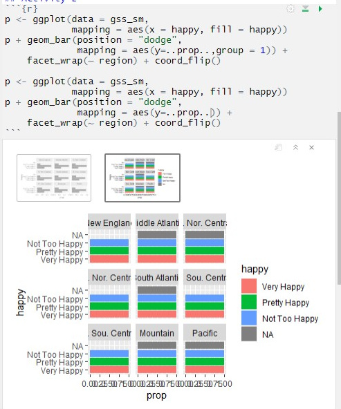
Could anyone help me how to color each factor (Very Happy, Pretty Happy, Not Too Happy, N/A) by a different color and create a legend to the top left?
Also, I have a problem that the region's name does not fit the box.
Thank you!
image

Welcome to the community

Try to provide the color argument inside aes call. Compare the two graphs generated by p and q below:

library(ggplot2)

p <- ggplot(data = mpg,
            mapping = aes(x = displ,
                          y = hwy),
            colour = trans)
p +
    geom_point() +
    facet_wrap(facets = ~ class,
               nrow = 2) +
    labs(title = "p with colour outside aes")


q <- ggplot(data = mpg,
            mapping = aes(x = displ,
                          y = hwy,
                          colour = trans))
q +
    geom_point() +
    facet_wrap(facets = ~ class,
               nrow = 2) +
    labs(title = "q with colour inside aes")

Hope this helps.


By the way, can you try without group = 1. Why are you using it?

I can't really test, because I don't have this data, and don't want to download the package just for this.

Can you please share a small part of the data set in a copy-paste friendly format?

In case you don't know how to do it, there are many options, which include:

  1. If you have stored the data set in some R object, dput function is very handy.

  2. In case the data set is in a spreadsheet, check out the datapasta package. Take a look at this link.

Hi, thank you for your speedy response!
I really appreciate it.
However, I'vechanged the prentacy () but the what I would like to change the color by each factor as to compare the difference level of happiness by different regions.

Hi, thank you
I get rid of "group = 1", then I will have a problem that the bar's height is stretched horizontally. Also, the label of x-axis are also over-lapsed.
I'm just new to R. Hope to receive advice from everyone. Thanks.

oh, I got it! Thank you so much for your help!

This topic was automatically closed 7 days after the last reply. New replies are no longer allowed.