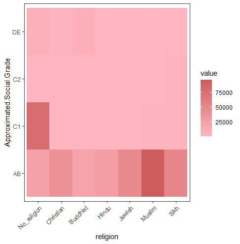
Hi, this is my plot. Because of large data, the range is not clear.
How can I solve it? thank you. 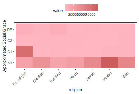
this is my code. thank you.
library(reshape2)
library(ggplot2)
library(scales)
data<-c(22115,39435,19107,25921,47909,96496,51339,78338,453,800,326,523,1882,2446,597,1529,
         709,824,131,293,2391,6334,2025,7072,646,1205,465,985)
data <- as.data.frame(matrix(data, ncol=7, byrow=T))
colnames(data) <- c("No_religion", "Christian", "Buddhist",
                    "Hindu","Jewish","Muslim","Sikh")
rownames(data) <- c("AB", "C1","C2","DE")
head(data)[,1:4]

data$Approximated.Social.Grade <- rownames(data)
data_m <- melt(data, id.vars=c("Approximated.Social.Grade"))
head(data_m)

p <- ggplot(data_m, aes(x=variable,y=Approximated.Social.Grade)) +
  xlab("religion") + theme_bw() +
  theme(panel.grid.major = element_blank()) +
  theme(legend.key=element_blank())  +
  theme(axis.text.x=element_text(angle=45,hjust=1, vjust=1)) +
  theme(legend.position="top") +
  geom_tile(aes(fill=value)) +
  scale_fill_gradient(low = "#FFB6C1", high = "#CD5C5C")

p