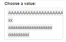
How to change selectizeInput to make order more apparent to the user within the box

Hello,

See my reprex below. I am looking for an easy way to change the selectizeInput to make order more evident to the user. Currently the order in which you put in is perserved but I want to make it clearer either by having each next selection below the previous or another way in which to do order (long single box doesn't work given it will affect resolution/display for my actual use case).

Any ideas?

library(shiny)

shinyApp(
  ui = fluidPage(
    selectizeInput("value", "Choose a value:",
                   multiple = TRUE,
                list(`xx xx` = list("AAAAAAAAAAAAAAAAAAAAAAAAAAAAAAAA", "xx", "xxxxxxxxxxxx"),
                     `yy yy` = list("bbbbbbbbbbbbbb", "aaaaaaaaaaaaaaaaaaa", "zzzzzzzzzzzzzz"),
                     `zz` = list("ddddddddd", "tttttttttttttttt", "lllllllllllllllll"))
    ),
    textOutput("result")
  ),
  server = function(input, output) {
    output$result <- renderText({
      paste("You chose", input$value)
    })
  }
)
Shiny applications not supported in static R Markdown documents

Created on 2021-07-21 by the reprex package (v2.0.0)

Any advice or help? :slight_smile:

It's not clear to me what you are trying to achive.
Can you please create an image with the expected output?

Essentially all options selected need to appear below each other but the selected options should also be completely visible in the box. So something like the below but the "AAAAAAAAAAAA...." needs to be visible.

image

I want to stop multi line input like the below where 3 are on the same line.

image

Solution turned out to be:

https://cran.r-project.org/web/packages/sortable/vignettes/built_in.html

This topic was automatically closed 7 days after the last reply. New replies are no longer allowed.

If you have a query related to it or one of the replies, start a new topic and refer back with a link.