I want to create bind them all together so that when I click hover on any chart it displays the value for all three altogether and how to correct the percentage value for each line chart.
rendered reprex looks like this...
library(plotly)
#> Loading required package: ggplot2
#>
#> Attaching package: 'plotly'
#> The following object is masked from 'package:ggplot2':
#>
#>     last_plot
#> The following object is masked from 'package:stats':
#>
#>     filter
#> The following object is masked from 'package:graphics':
#>
#>     layout
library(shiny)
ui<-fluidPage(plotlyOutput("p3"))


server<-function(input,output){
  output$p3<-renderPlotly({

    # df <- read.csv("c:/users/nic user/desktop/lk.csv")
    df<-tibble::tribble(
      ~month, ~abortion, ~delivery, ~pregnant,
      "Jan-17",        13,        30,        43,
      "Feb-17",        40,        14,        54,
      "Mar-17",        19,        15,        34,
      "Apr-17",        45,        20,        65,
      "May-17",        16,        60,        76,
      "Jun-17",        10,        35,        45,
      "Jul-17",        10,        55,        65,
      "Aug-17",        17,        70,        87,
      "Sep-17",        10,        88,        98,
      "Oct-17",        18,        60,        78,
      "Nov-17",        25,        40,        65,
      "Dec-17",        30,        37,        67,
      "Jan-18",        30,        26,        56,
      "Feb-18",        25,        20,        45,
      "Mar-18",        20,        14,        34,
      "Apr-18",        30,        24,        54,
      "May-18",        20,        45,        65,
      "Jun-18",        10,        57,        67,
      "Jul-18",        10,        88,        98,
      "Aug-18",        60,        18,        78,
      "Sep-18",        30,        35,        65,
      "Oct-18",        30,        37,        67,
      "Nov-18",        10,        46,        56,
      "Dec-18",        20,        45,        65,
      "Jan-19",        10,        35,        45,
      "Feb-19",        10,        24,        34,
      "Mar-19",        30,        35,        65,
      "Apr-19",        40,        25,        65,
      "May-19",        40,        48,        88
    )

    d1<-aggregate(. ~month, data=df,sum)
    d1
    xaxis <- list(title = "months",
                  showline = TRUE,
                  showgrid = FALSE,
                  showticklabels = TRUE,
                  linecolor = 'rgb(204, 204, 204)',
                  linewidth = 2,
                  autotick = FALSE,
                  ticks = 'outside',
                  tickcolor = 'rgb(204, 204, 204)',
                  tickwidth = 2,
                  ticklen = 5,
                  tickfont = list(family = 'Arial',
                                  size = 16,
                                  color = 'rgb(82, 82, 82)'))

    yaxis <- list(title = "abortion vs pregnant vs delivery",
                  showgrid = FALSE,
                  zeroline = FALSE,
                  showline = FALSE,
                  showticklabels = FALSE)

    margin <- list(autoexpand = TRUE,
                   l = 100,
                   r = 100,
                   t = 110)

    # Build the annotations

    abortion1 <- list(
      xref = 'paper',
      yref = 'y',
      x = 0.05,
      y = d1$abortion[1],
      xanchor = 'right',
      yanchor = 'middle',
      text = ~paste('abortion ', d1$abortion[1], '%'),
      font = list(family = 'Arial',
                  size = 16,
                  color = 'rgba(67,67,67,1)'),
      showarrow = FALSE)

    pregnant1 <- list(
      xref = 'paper',
      yref = 'y',
      x = 0.05,
      y = d1$pregnant[1],
      xanchor = 'right',
      yanchor = 'middle',
      text = ~paste('pregnant ', d1$pregnant[1], '%'),
      font = list(family = 'Arial',
                  size = 16,
                  color = 'rgba(49,130,189, 1)'),
      showarrow = FALSE)

    delivery1 <- list(
      xref = 'paper',
      yref = 'y',
      x = 0.05,
      y = d1$delivery[1],
      xanchor = 'right',
      yanchor = 'middle',
      text = ~paste('delivery ', d1$delivery[1], '%'),
      font = list(family = 'Arial',
                  size = 16,
                  color = 'rgba(67,67,67,1)'),
      showarrow = FALSE)

    abortion2 <- list(
      xref = 'paper',
      x = 0.95,
      y = d1$abortion[12],
      xanchor = 'left',
      yanchor = 'middle',
      text = paste('abortion ', d1$abortion[29], '%'),
      font = list(family = 'Arial',
                  size = 16,
                  color = 'rgba(67,67,67,1)'),
      showarrow = FALSE)

    pregnant2 <- list(
      xref = 'paper',
      x = 0.95,
      y = d1$pregnant[12],
      xanchor = 'left',
      yanchor = 'middle',
      text = paste('pregnant ', d1$pregnant[29], '%'),
      font = list(family = 'Arial',
                  size = 16,
                  color = 'rgba(67,67,67,1)'),
      showarrow = FALSE)

    delivery2 <- list(
      xref = 'paper',
      x = 0.95,
      y = d1$delivery[29],
      xanchor = 'left',
      yanchor = 'middle',
      text = paste('delivery ', d1$delivery[29], '%'),
      font = list(family = 'Arial',
                  size = 16,
                  color = 'rgba(67,67,67,1)'),
      showarrow = FALSE)

    fig <- plot_ly(d1, x = d1$month)
    fig <- fig %>% add_trace(y = d1$abortion, type = 'scatter', mode = 'lines', line = list(color = 'rgba(67,67,67,1)', width = 3),name="abortion")
    fig <- fig %>% add_trace(y = d1$pregnant, type = 'scatter', mode = 'lines', line = list(color = 'rgba(49,130,189, 1)', width = 3),name="pregnant")
    fig <- fig %>% add_trace(y = d1$delivery, type = 'scatter', mode = 'lines', line = list(color = 'rgba(49,130,189, 1)', width = 3),name="delivery")
    fig <- fig %>% add_trace(x = ~c(d1$month[1], d1$month[29]), y = ~c(d1$abortion[1], d1$abortion[29]), type = 'scatter',name="abortion", mode = 'markers', marker = list(color = 'rgba(67,67,67,1)', size = 16))
    fig <- fig %>% add_trace(x = ~c(d1$month[1], d1$month[29]), y = ~c(d1$pregnant[1], d1$pregnant[29]), type = 'scatter',name="pregnant", mode = 'markers', marker = list(color = 'rgba(49,130,189, 1)', size = 16))
    fig <- fig %>% add_trace(x = ~c(d1$month[1], d1$month[29]), y = ~c(d1$delivery[1], d1$delivery[29]), type = 'scatter',name="delivery", mode = 'markers', marker = list(color = 'rgba(49,130,189, 1)', size = 16))
    fig <- fig %>% layout(title = "pregnant vs abortion vs delivery", xaxis = xaxis, yaxis = yaxis, margin = margin,
                          autosize = TRUE,
                          showlegend = FALSE,
                          annotations = abortion1)
    fig <- fig %>% layout(annotations =pregnant1 )
    fig <- fig %>% layout(annotations =delivery1 )
    fig <- fig %>% layout(annotations =abortion2 )
    fig <- fig %>% layout(annotations =pregnant2 )
    fig <- fig %>% layout(annotations =delivery2 )

    fig
  })
}
shinyApp(ui,server)
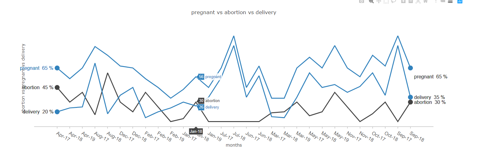
and the graph looks like this...

Any help and suggestion would be great. if there is any other suggestion to improvise it further would be appreciated.