How to avoid stacking columns in a bar chart (shiny)

Hello,

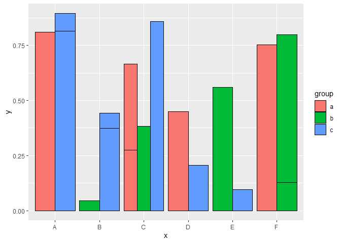
I created a bar chart for a shiny app with:
geom_col(position = "dodge2")+.
The purpose of "dodge2" component is to avoid stacking/putting behind each bars.
And instead having them next to each other. But, this approach does not work for me.
I was wondering if someone might have some hints of a way to avoid stacking bars?

Thanks!

Can you post a minimal reproducible example?

library(ggplot2)

set.seed(123)

df <- data.frame(x = sample(LETTERS[1:6], 20, replace = TRUE), 
                 group = sample(letters[1:3], 20, replace = TRUE), 
                 y = runif(20))

ggplot() +
  geom_col(data = df, mapping = aes(x = x, y = y, group = group, fill = group), colour = "black")


ggplot() +
  geom_col(data = df, mapping = aes(x = x, y = y, group = group, fill = group), colour = "black", position = "dodge")


ggplot() +
  geom_col(data = df, mapping = aes(x = x, y = y, group = group, fill = group), colour = "black", position = "dodge2")

Created on 2020-07-13 by the reprex package (v0.3.0)

1 Like

I also suggest to apply the same width to each column/bar via preserve = "single":

library(ggplot2)

set.seed(123)

df <- data.frame(x = sample(LETTERS[1:6], 20, replace = TRUE), 
                 group = sample(letters[1:3], 20, replace = TRUE), 
                 y = runif(20))

ggplot() +
  geom_col(data = df, mapping = aes(x = x, y = y, group = group, fill = group), 
           colour = "black", position = position_dodge2(preserve = "single"))

Created on 2020-07-13 by the reprex package (v0.3.0)

1 Like

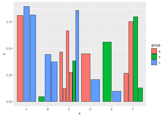
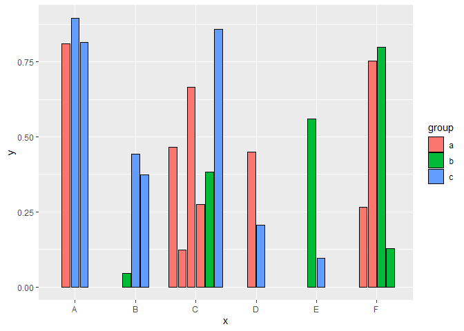
Thank you for the help, @Z3tt! these are great examples.
I see that putting position = "dodge2" works when you group data.
Data I am working with has 2 columns and I create 2 geom_col to ggplot().
My example:

library(data.table)
library(ggplot2)

DF <- data.table(Fiscal_Year = seq(2001, 2019, by =1))
DF <- DF[,var1 := data.table(rnorm(19, 30, 5))]
DF <- DF[,var2 := data.table(rnorm(19, 60, 10))]
DF <- data.frame(DF)

ggplot() +
geom_col(data=DF, mapping = aes(x=Fiscal_Year, y=var2,group = 1, fill = "orangered1"),
color = "black", position = "dodge2")+
geom_col(data=DF, aes(x=Fiscal_Year, y=var1,group = 2, fill = "royalblue3"),
color = "black", position = "dodge2")+
theme_bw()`DF <- data.table(Fiscal_Year = seq(2001, 2019, by =1))
DF <- DF[,var1 := data.table(rnorm(19, 30, 5))]
DF <- DF[,var2 := data.table(rnorm(19, 60, 10))]
DF <- data.frame(DF)

ggplot() +
geom_col(data=DF, mapping = aes(x=Fiscal_Year, y=var2,group = 1, fill = "orangered1"),
color = "black", position = "dodge2")+
geom_col(data=DF, aes(x=Fiscal_Year, y=var1,group = 2, fill = "royalblue3"),
color = "black", position = "dodge2")+
theme_bw()`

image

You need to use pivot_longer to get your data in long format

data = DF %>% pivot_longer(starts_with("var")),
mapping = aes(x=Fiscal_Year, y=value, group = name, fill = name)
2 Likes

@woodward, transforming to the long format solved it.
Thank you!

1 Like

This topic was automatically closed 7 days after the last reply. New replies are no longer allowed.