Hi again. I still havent found any solution regarding this problem online.
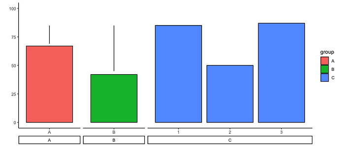
I need a significant bar and the text of their p-value between two bars that come from two facet grids.
Shown below are my sample code, data, and graph.
set.seed(1000)
data = tibble(
  x=c("A", "B", "1", "2", "3"),
  type=c('A', "B", rep("C",3)),
  group=c('A', "B", rep("C",3)),
  y=sample(seq(0,100),5,replace=T))

q5 = ( ggplot(data, aes(x=x, y=y, fill=group)) +
         theme_classic()  + labs(x = '', y = '') +
         geom_bar(stat="identity", color="black") +
         facet_grid('. ~ group', scales="free", switch = "x", space='free') +
         theme(strip.placement = "outside") +
         scale_y_continuous(limits = c(0,100))
)
q5

neg.pos.line = tibble(
  type = c(rep("A",2), rep("B",2)),
  group = c(rep("A",2), rep("B",2)),
  x = c(1,1,1,1),
  y = c(69,85,85,45)
)

h5 = q5 +
  geom_line(data = neg.pos.line,
            aes(x= x, y = y), inherit.aes = F)
h5
This gives me the following graph.
I have so far been able to place a vertical line in the same facet as in groups A and B, but I can't seem to draw a geom_line in between A and B. I also do not know how to place a geom_text (i.e. p < 0.01 or n.s.) in between groups A and B.
Has anyone able to do something like this before? Please share your solution. Thank you very much!
