Hi,
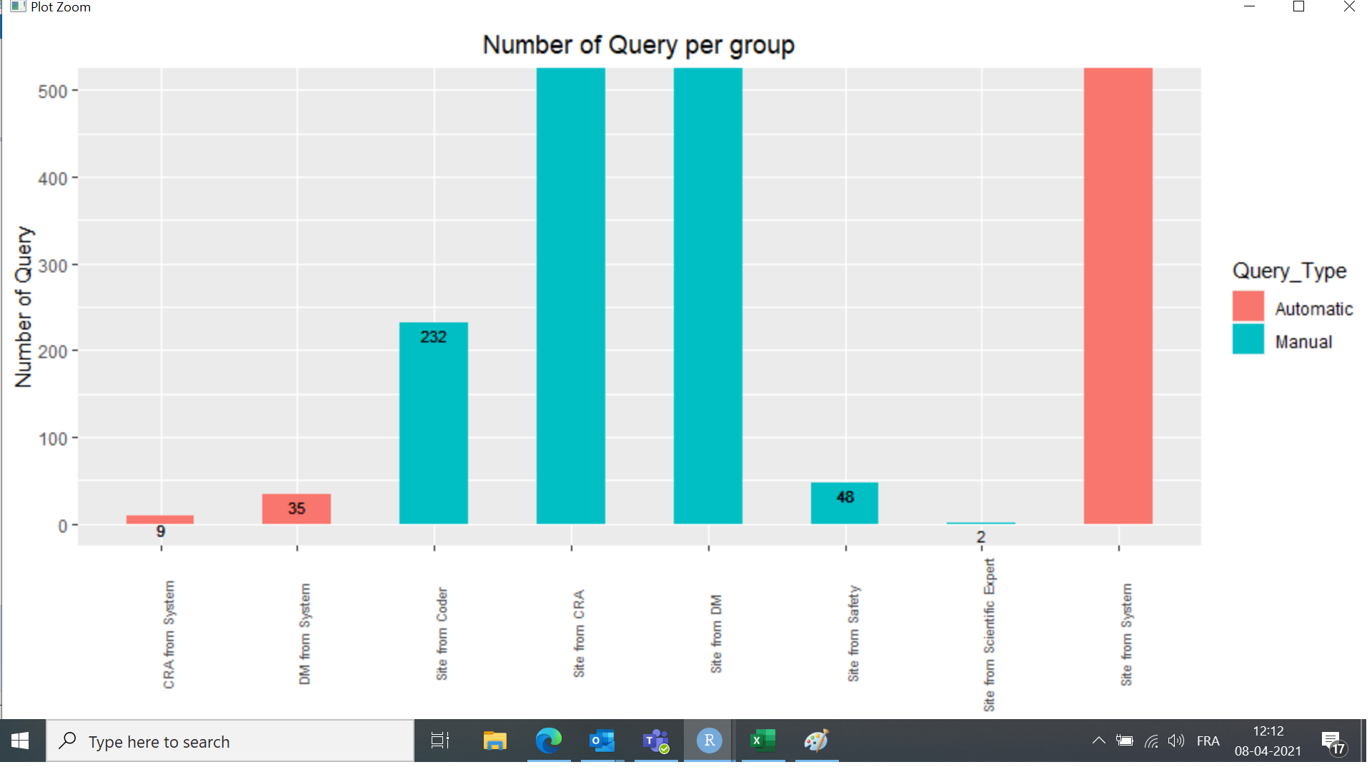
I was trying to generate a bar graph through ggplot but I am unable to adjust the scales.
My data difference between two groups are very big so the bar for the smaller count group is very small, almost invisible. so how should I adjust the scales of Y axis so that it is visit. if there is any scope to add zoom bar on scale to drag the bar in ggplot.
How to add labels on the top of the bar in bar graph.
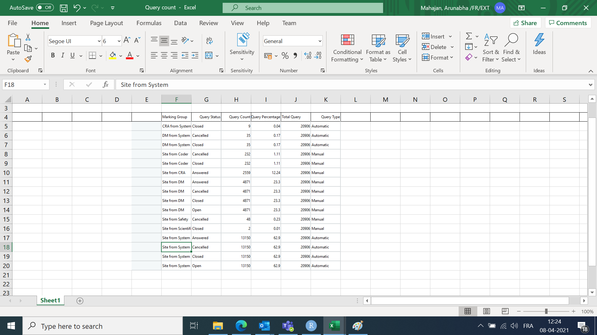
Code and the data has been attached.
Regards,
Arunabha
Query_detail_Rave2 %>% ggplot(aes(fill = Query_Type, x= Marking Group, y= Query_Count), height = 50, width = 200) +
geom_bar(position= position_dodge(), stat="identity", width = 0.5) + coord_cartesian(ylim = c(0, 500)) +
theme(axis.text.x = element_text(angle = 90, size = 7)) +
geom_text(aes(label = Query_Count), vjust = 1.5, size=3) +
theme(plot.title = element_text(hjust=0.5)) + ylab('Number of Query') +
ggtitle("Number of Query per group")
Hi,
I don't have your data, so I cannot reproduce the graph. Next time, I suggest to make a Reprex, which is great for receiving good responses.
Some suggestions:
- yscale limits are set in your script. Change upper limit and full bars will become visible
- change
vjust = 1.5 to a negative number to print it above the bar
Hope this brings something you are looking for.
JW
Thanks a lot. I am able to bring the desired one according to your suggestion
Hi,
I would like continue with this topic.
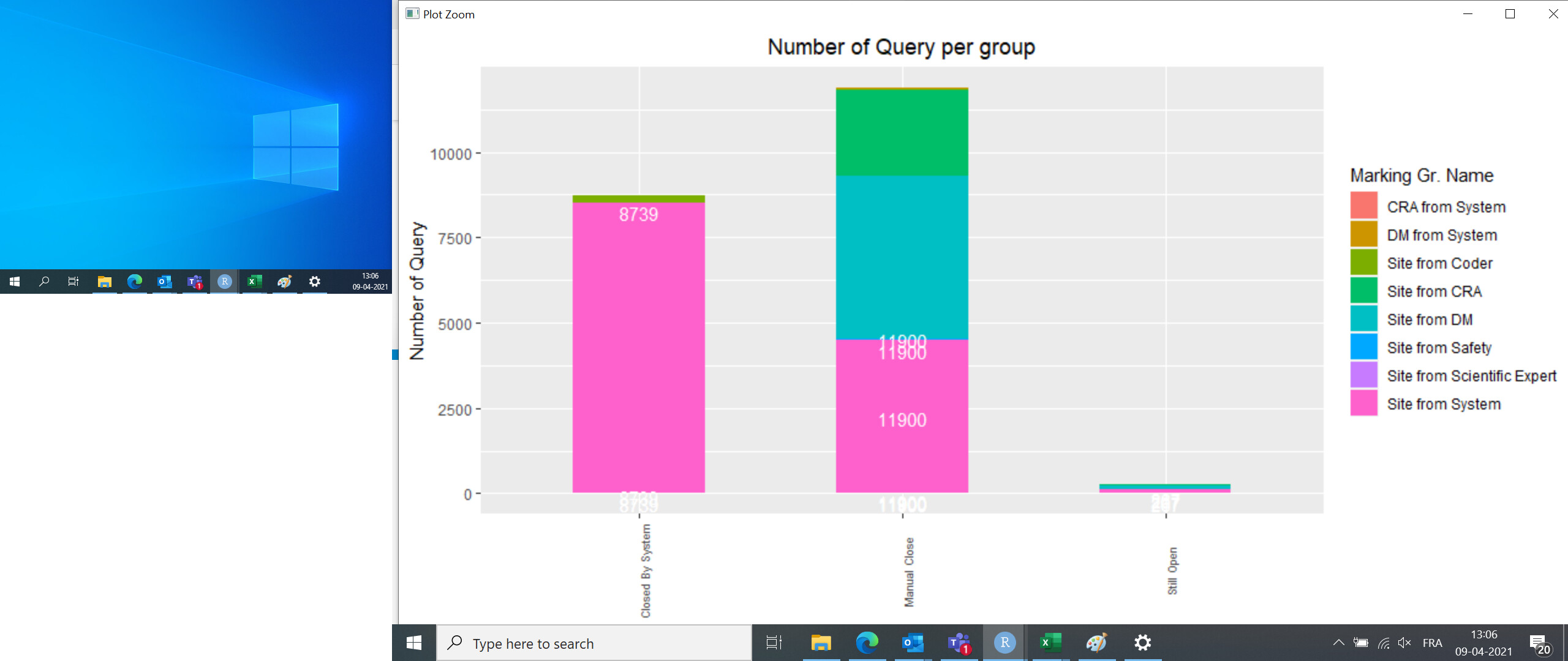
How to make the label appear only once for every segmented stacked bar. When I am trying to do so the label is appearing for every segment but I need only once at the top of the bar. Please see my data. I am passing the label variable "Query_Closed" for geom_text.
| Query_Closed_By |
Marking Group |
Query_Closed |
Query_Closed_Per_Group |
| Manual Close |
Site from System |
11900 |
4485 |
| Manual Close |
Site from DM |
11900 |
4785 |
| Manual Close |
Site from CRA |
11900 |
2517 |
| Manual Close |
DM from System |
11900 |
33 |
| Still Open |
Site from DM |
267 |
86 |
| Closed By System |
Site from System |
8739 |
8527 |
| Closed By System |
Site from Coder |
8739 |
202 |
| Still Open |
Site from CRA |
267 |
42 |
| Still Open |
Site from System |
267 |
138 |
| Still Open |
Site from Safety |
267 |
1 |
| Manual Close |
Site from Coder |
11900 |
30 |
| Closed By System |
DM from System |
8739 |
2 |
| Manual Close |
Site from Scientific Expert |
11900 |
2 |
| Manual Close |
Site from Safety |
11900 |
46 |
| Closed By System |
CRA from System |
8739 |
7 |
| Manual Close |
CRA from System |
11900 |
2 |
| Closed By System |
Site from Safety |
8739 |
1 |
Currently my graph is looking like below.
Thanks for your help.
Regards,
Arunabha
You need to make a dataframe with summed values. I borrowed my code as well, so to pay credits to my source, see the answer here at Stackoverflow
Good luck!
JW