Hi,
here is my code:
irrigacje <- structure(list(irrigationes = structure(c(1L, 1L, 1L, 1L, 1L,
1L, 1L, 1L, 1L, 1L, 2L, 2L, 2L, 2L, 2L, 2L, 2L, 2L, 2L, 2L, 3L,
3L, 3L, 3L, 3L, 3L, 3L, 3L, 3L, 3L), levels = c("Control", "Irrigated 10\nmm",
"Irrigated 20 mm"), class = "factor", contrasts = structure(c(0,
1, 0, 0, 0, 1), dim = 3:2, dimnames = list(c("Control", "Irrigated 10\nmm",
"Irrigated 20 mm"), c("Irrigated 10\nmm", "Irrigated 20 mm")))),
biomass = 1:30), row.names = c(NA, -30L), class = "data.frame")
library(gplots) # for plotmeans()
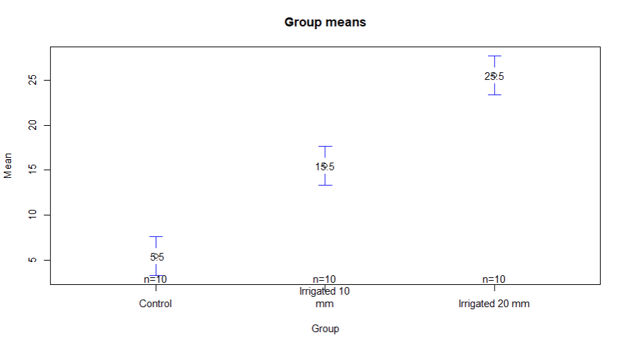
plotmeans(biomass ~ irrigationes, data = irrigacje, connect = FALSE, digits = 2,
mean.labels = TRUE, main = "Group means", xlab="Group", ylab = "Mean")
plotmeans(biomass ~ irrigationes, data = irrigacje, connect = TRUE, digits = 2,
mean.labels = TRUE, col="red", pch=7, cex = 2, pos = 2, offset = 1.5, ps = 3, cex.lab=2,
main = "Group means", xlab="Group", ylab = "Mean", text(biomass, irrigationes, pos = 2))
And this first plot look rather OK, apart from that means' labels overlapping circles representing those means. This is not nice.
and some strange things happen later:
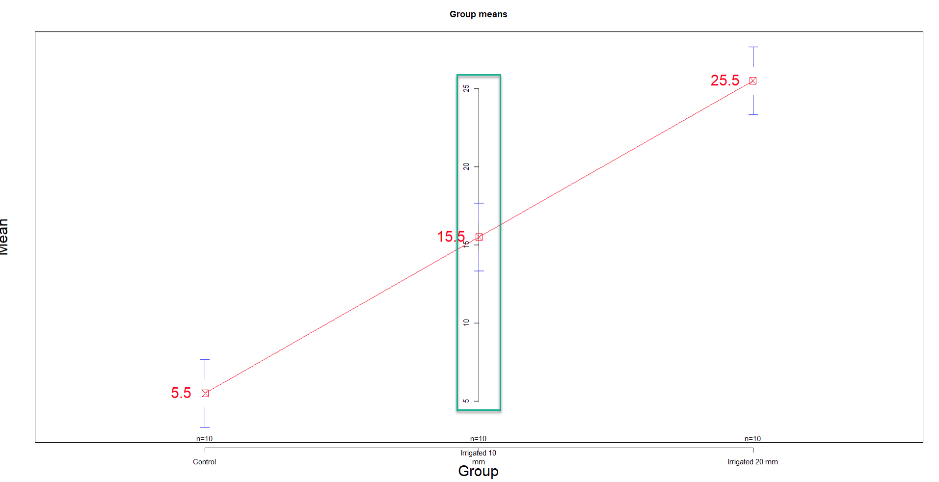
I do not know , what I have done to place this vertical line with some scale on it, in the middle of the plot ?
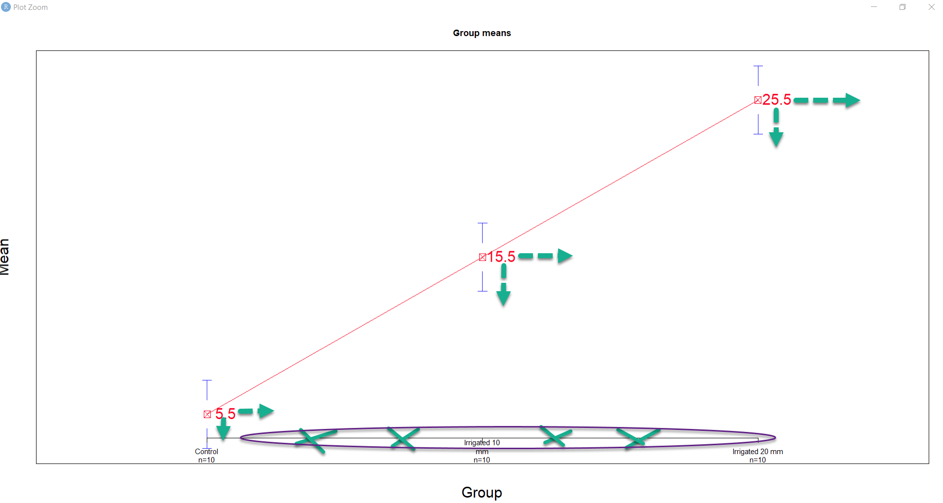
or somehow I managed to place the same line above X axis. I just want to get rid of it and ask how to adjust
text labels for group means horizontally and vertically. In ggplot we have geom_text and geom_labels but here, I played with pos argument and offset but rather intuitively by trial and error.
Maybe someone could shed some light how to do it properly, thank you.
I would like to know how to change size of pch shapes and what ps argument is for ? I must admit I forgot a bit base R plots lately, but it turns out that it is still needed sometimes.