Hi everybody,
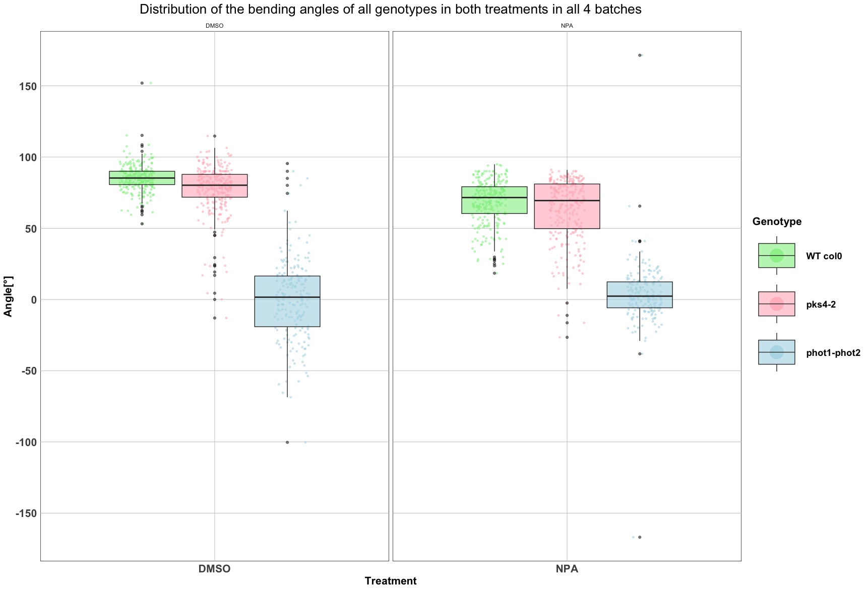
I'm trying to add brackets to show the p-values I obtained with a Tukey HSD test to show comparisons between each genotype in both levels of my treatment factor (e.g., comparing pks4-2 in DMSO and pks4-2 in NPA). I have looked online at the ggpubr package, but i can't find a way to show the results i got in my Tukey test. Below is the code i'm using to create the plot, and the plot itself.
# data preparation
levels(pool$Genotype) <- c("pks4-2", "phot1-phot2", "WT col0")
desired_order <- c("WT col0", "pks4-2", "phot1-phot2")
pool$Genotype <- factor(pool$Genotype, levels = desired_order)
# plot
library(ggplot2)
library(scales)


gg <- ggplot(pool, aes(x = factor(Treatment), y = Angle, fill = Genotype)) +
  geom_point(data = subset(pool, Treatment == "DMSO"), aes(color = Genotype), position = position_jitterdodge(jitter.width = 0.3, dodge.width = 0.8), size = 1, alpha = 0.5) +
  geom_point(data = subset(pool, Treatment == "NPA"), aes(color = Genotype), position = position_jitterdodge(jitter.width = 0.3, dodge.width = 0.8), size = 1, alpha = 0.5) +
  geom_boxplot(alpha = 0.6) +
  labs(title = "Distribution of the bending angles of all genotypes in both treatments in all 4 batches", x = "Treatment", y = "Angle[°]") +
  scale_fill_manual(values = c("pks4-2" = "lightpink", "phot1-phot2" = "lightblue", "WT col0" = "lightgreen"), name = "Genotype") +
  scale_color_manual(values = c("pks4-2" = "lightpink", "phot1-phot2" = "lightblue", "WT col0" = "lightgreen")) +
  facet_grid(~Treatment, scales = "free", space="free") +
  scale_y_continuous(breaks = pretty_breaks(n = 10)) +
  theme_minimal() +
  theme(
    legend.title = element_text(face = "bold", size = 16),
    legend.text = element_text(size = 14),
    legend.key.size = unit(5, "lines"),
    axis.title = element_text(face = "bold", size = 16),
    plot.title = element_text(hjust = 0.5, size = 20),
    panel.background = element_rect(fill = "transparent"),
    panel.grid.major = element_line(color = "gray", size = 0.3),
    panel.grid.minor = element_blank(),
    axis.text.x = element_text(face = "bold", size = 16),
    axis.text.y = element_text(face = "bold", size = 16),
    legend.key = element_rect(colour = "transparent", fill = "transparent")  # Remove legend key border and background
  )

# Modify specific labels in the legend + pvalues
gg <- gg + guides(fill = guide_legend(override.aes = list(size = 9)))
gg <- gg + theme(legend.text = element_text(face = "bold", size = 14),
                 legend.title = element_text(face = "bold", size = 16))


gg  # Display the plot
If any of you could help me, you'd be doing me a great favor !
Thank you for reading me !