Hi y'all!
I have two data sets that I want to compare on the same linear regression graph, I made the graph but I can't get the lines for each data set to appear
Code:
htdi <- read.csv("Runoff_htdi.csv")
cor.test(htdi$Height, htdi$Diameter)
htdireg <- lm(htdi$Height~htdi$Diameter, data = htdi)
summary(htdireg)
ctrl_htdi <- read.csv("Control_htdi.csv")
ctrlhtdireg <- lm(ctrl_htdi$Height~ctrl_htdi$Diameter, data = ctrl_htdi)
summary(ctrlhtdireg)
ggplot() +
geom_point(data = ctrl_htdi, aes(x = Diameter, y = Height), color = "blue") +
geom_point(data = htdi, aes(x = Diameter, y = Height), color = "green") +
abline(lm(ctrl_htdi$Height~ctrl_htdi$Diameter, data = ctrl_htdi), col = "blue")+
abline(lm(htdi$Height~htdi$Diameter, data = htdi), col = "green")+
labs(title = "Linear Regression for Height v. Diameter", x = "Diameter", y = "Height") +
theme_minimal()
The graph just shows the data points for each dataset (ctrl_htdi and htdi) but not their linear regression lines, which I really would like to see. Any help would be appreciated!
Update: I had a friend who is good with excel help me create the graphs I needed, but I'm still going to try to figure out how to do it in R
Try something like changing
lm(ctrl_htdi$Height~ctrl_htdi$Diameter, data = ctrl_htdi)
to
lm(coef = ctrl_htdi$Height~ctrl_htdi$Diameter$coefficients, data = ctrl_htdi)
The problems are that lm() returns a whole structure, not just the coefficients, and that you have to tell abline that you are supplying both coefficients.
This is untested code because I don't have access to your original data, but something like this to combine the datasets into one and then use the geom_smooth() layer to plot the linear regression model calculated using lm():
htdi <- read.csv("Runoff_htdi.csv")
ctrl_htdi <- read.csv("Control_htdi.csv")

library(dplyr)
all_hdti <- bind_rows(Runoff = htdi, Control = ctrl_htdi, .id = "HDTI_type")

library("ggplot2")
ggplot(data = all_hdti, aes(x = Diameter, y = Height, color = "HDTI_type")) +
  geom_point() +
  geom_smooth(method = "lm") +
  labs(title = "Linear Regression for Height v. Diameter")
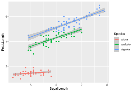
I can demonstrate the same plotting code with the iris dataset for each species separately:
ggplot(iris, aes(x = Sepal.Length, y = Petal.Length, color = Species)) +
  geom_point() +
  geom_smooth(method = "lm")
I tried this out and it returned with the same graph I got originally, thank you for the input though!
I tried this out and it returned with a graph with just one linear regression line, I tried playing around with it but didn't get any change unfortunately. Thank you for the idea!
I think I typed too quickly. Try
abline(coef=lm(ctrl_htdi$Height~ctrl_htdi$Diameter$coefficients, data = ctrl_htdi))
If that doesn't work you might post your data using dput() and copy-and-paste to see if someone can come up with a better solution.
This topic was automatically closed 90 days after the last reply. New replies are no longer allowed.
If you have a query related to it or one of the replies, start a new topic and refer back with a link.