How to add text and line in ggplot r?
(1) I want to add text that some parts are in bold.
(2) I want to add this line parallel to which part of the graph the text refers to.

How to add text and line in ggplot r?
(1) I want to add text that some parts are in bold.
(2) I want to add this line parallel to which part of the graph the text refers to.

Take a look at geom_text() and geom_hline().
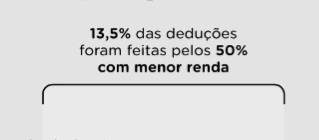
geom_text doesn't allow to selectively bold only parts of the text, but the ggtext package has a function that does: geom_textbox(), You can use markdown and some CSS for styling. For example:
ggplot() +
  geom_textbox(
    aes(
      x = 1, y = 10,
      label = "<span style = 'color:#ff7f00'>**13,5%**</span> das deduções foram feitas pelos **50% com menor renda**",
      hjust = .5, # center the box itself
      halign = 0.5, center the text in the box
      ),
    width = unit(124, "pt"),
    box.color = NA, # no outline
    fill = "transparent", # no background

  )
I couldn't place the text box in other areas of the chart, such as above the data plot area and not inside that area. It would be easier to increase the y-axis a little bit so that you have room to do that or check if there's anything that you put out. What I'm trying to do is recreate a graph in R.
This will (mostly) reproduce the chart you posted:
library(ggplot2)
library(ggtext)
library(scales)
# remotes::install_github("hrbrmstr/ggchicklet")
library(ggchicklet)

df <- data.frame(
  x = c(1, 10, 20, 30, 40, 50, 60, 70, 80, 90, 100),
  y = c(0, 0.0001, 0.0002, 0.00625, 0.00125, 0.0025, 0.005, 0.01, 0.01, 0.02, 0.08)
)

ggplot()+
  coord_cartesian(clip = "off")+
  geom_rrect(
    aes(xmin = 1, xmax = 50, ymin = 0, ymax = 0.10),
    fill = "#eaeaea", color = "#000000", radius = grid::unit(6, "pt"),
  )+
  geom_rrect(
    aes(xmin = 90, xmax = 100, ymin = 0, ymax = 0.10),
    fill = "#eaeaea", color = "#000000", radius = grid::unit(6, "pt"),
  )+

  geom_rect(aes(xmin = 0, xmax = 51, ymin = -0.01, ymax = .095), fill = "#eaeaea", )+
  geom_rect(aes(xmin = 89, xmax = 101, ymin = -0.01, ymax = .095), fill = "#eaeaea", )+
  geom_line(data = df, mapping = aes(x = x, y = y))+
  geom_textbox(
    aes(
      x = 25, y = .11,
      label = "<span style = 'color:#ff7f00'>**13,5%**</span> das deduções foram feitas pelos **50% com menor renda**",
      hjust = .5, # center the box itself
      halign = 0.5, # center the text in the box
    ),
    width = unit(124, "pt"),
    box.color = NA, # no outline
    fill = "transparent", # no background

  )+
  geom_textbox(
    aes(
      x = 100, y = .11,
      label = "<span style = 'color:#ff7f00'>**41,5%**</span> das deduções foram feitas pelos **10% mais ricos**",
      hjust = 1, # right-align box itself
      halign = 1, # right-align the text in the box
    ),
    width = unit(124, "pt"),
    box.color = NA, # no outline
    fill = "transparent", # no background

  )+

  scale_x_continuous(
    limits = c(-5, 101),
    breaks = c(1, 10, 20, 30, 40, 40, 50, 60, 70, 80, 90, 100),
                     minor_breaks = 1:100
                     )+
  scale_y_continuous(
    labels = label_percent(),
    limits = c(-.01, .12),
    breaks = c(0, 0.02, 0.04, 0.06, 0.08),
    )+
  guides(
    x = guide_axis(minor.ticks = TRUE)
  )+
  labs(
    title = "% do total de deduções que vai para cada grupo de declarantes",
    subtitle = "Por centil, no Imposto de Renda de 2022",
    caption = "Fonte: Dados de declaração do IRPF",
    y = "de deduções",
  )+
  theme_void()+
  theme(
    aspect.ratio = 1,
    plot.title = element_textbox_simple(
      size = 20, face = "bold",
      margin = margin(0, 0, 4, 0),
    ),
    plot.subtitle = element_textbox_simple(
      size = 12, face = "bold", color = "#7f7f7f",
    ),

    plot.caption = element_text(
      hjust = 0, vjust = 0, size = 8, color = "#3f3f3f",
    ),
    plot.margin = margin(24, 24, 24, 24), "pt",
    plot.background = element_rect(fill = "#e3e3e3"),

    axis.title.y = element_text(
      angle = 0, hjust = 0,
      vjust = .6925, # align with highest label on y-axis
      margin = margin(0, -80, 0, 20)),

    axis.line.x.bottom = element_line(color = "black", size = 0.5),

    axis.ticks.length.x.bottom = unit(6, "pt"),
    axis.minor.ticks.length.x.bottom = unit(4, "pt"),

    axis.ticks.x.bottom = element_line(color = "black", size = 0.5),
    axis.minor.ticks.x.bottom = element_line(color = "black", size = 0.25),

    axis.text.x = element_text(size = 10),
    axis.title.x = element_text(size = 10),

    axis.text.y.left = element_text(size = 10,
                                    margin = margin(0, -16, 0, 0), # align text with grid
                                    vjust = -0.4, # place text slight;y above the y grid lines
                                    ),

    panel.grid.major.y = element_line(color = "#7f7f7f", linetype = "dotted"),
    panel.background = element_rect(fill = NA, color = NA),
    panel.ontop = TRUE
  )
This topic was automatically closed 7 days after the last reply. New replies are no longer allowed.
If you have a query related to it or one of the replies, start a new topic and refer back with a link.