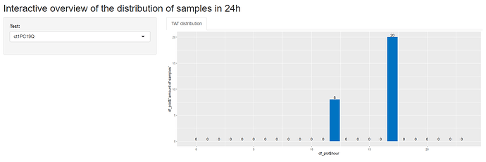
Hi, I tried using the reprex, tis is my total Shiny code, but the problem is more on the end of the document. I applied your code on mu values, but I get an error. I you need more info, please let me know.
#
# This is a Shiny web application. You can run the application by clicking
# the 'Run App' button above.
#
# Find out more about building applications with Shiny here:
#
#    http://shiny.rstudio.com/
#

library(shiny)
library(lubridate)
#>
#> Attaching package: 'lubridate'
#> The following objects are masked from 'package:base':
#>
#>     date, intersect, setdiff, union
library(tidyverse)
library(ggplot2)
library(reprex)

#First the exported file from the Infinity server needs to be in the correct folder and read in:
setwd("G:/My Drive/Traineeship Advanced Bachelor of Bioinformatics 2022/Internship 2022-2023/internship documents/")
server_data <- read.delim(file="PostCheckAnalysisRoche.txt", header = TRUE, na.strings=c(""," ","NA"))


#Create a subset of the data to remove/exclude the unnecessary columns:
subset_data_server <- server_data[,c(-5:-7,-9,-17,-25:-31)]
#Remove the rows with blank/NA values:
df1 <- na.omit(subset_data_server)
#The difference between the ResultTime and the FirstScanTime is the turn around time:
df1$TS_start <- paste(df1$FirstScanDate, df1$FirstScanTime)
df1$TS_end <- paste(df1$ResultDate, df1$ResultTime)


ui = fluidPage(
  titlePanel("Interactive overview of the distribution of samples in 24h"),
  sidebarLayout(
    sidebarPanel(
      selectInput("test", "Test:", choices = NULL)
    ),
    mainPanel(
      tabsetPanel(
        tabPanel("TAT distribution",
      plotOutput("barplot"))
   )))
  )

server = shinyServer(function(input, output,session){
  updateSelectizeInput(session, 'test', choices = df1$TestName, server = TRUE)

  output$barplot <- renderPlot({
    if (input$test!=""){

    df1_filtered <- df1[df1$TestName == input$test,]

    #Calculate the amount of Result-samples each hour:
    df2 <- as.data.frame(hour(hms(df1_filtered$ResultTime)))
    df_aggr_Result <- aggregate(df2, by=list(df2$`hour(hms(df1_filtered$ResultTime))`), FUN = length)
    #Renaming
    names(df_aggr_Result)[names(df_aggr_Result) == "Group.1"] <- "hour"
    names(df_aggr_Result)[names(df_aggr_Result) == "hour(hms(df1_filtered$ResultTime))"] <- "amount of samples"
    all_h <- tibble(hour = 0:23)
    # find percentages and make label
    df_plot <-
      mutate(df_plot, p = df_plot$`amount of samples` / sum(df_plot$`amount of samples`), # percentage
             p = scales::label_percent()(p), # format nicely
             lab = paste(df_plot$`amount of samples`, p, sep = "\n")) # combine into label

    df_plot = merge(x=all_h,y=df_aggr_Result,by="hour",all=TRUE)
    df_plot[is.na(df_plot)] <- 0
    ggplot(df_plot, aes(x = df_plot$hour, y = df_plot$`amount of samples`)) +
      geom_bar(fill = "#0073C2FF", stat = "identity") +
      geom_text(aes(label = if_else(df_plot$`amount of samples` > 0, df_plot$lab, "")), # only create label if n > 0
                vjust = 0, # "bottom align" to put on top of bar
                nudge_y =.1) + # nudge to create distance
      theme(axis.text.x = element_text(face = "bold", color = "#993333", size = 15),
            axis.text.y = element_text(face = "bold", color = "#993333", size = 15),
            axis.line = element_line(color = "#993333", size = 1)) +
      scale_x_continuous(breaks=seq(0,23,1))
    }
    })
  })

shinyApp(ui, server)
Shiny applications not supported in static R Markdown documents
Created on 2022-10-21 with reprex v2.0.2


