How To add Ellipses to this PCoA Plot?

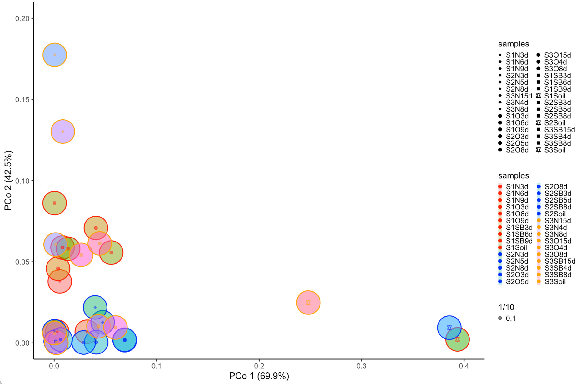
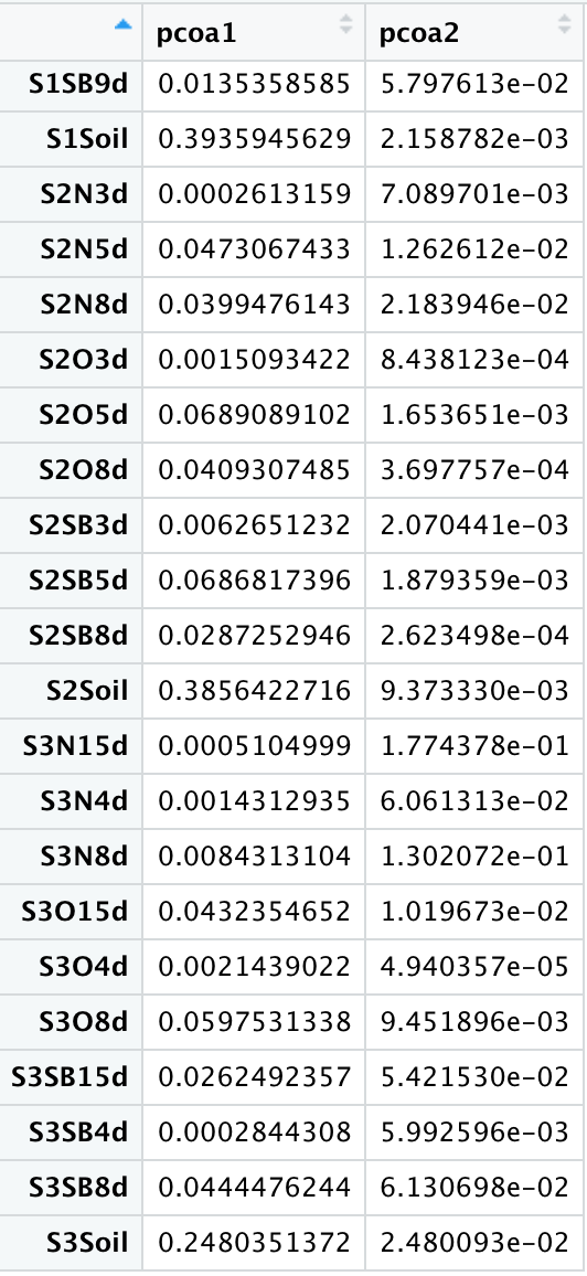
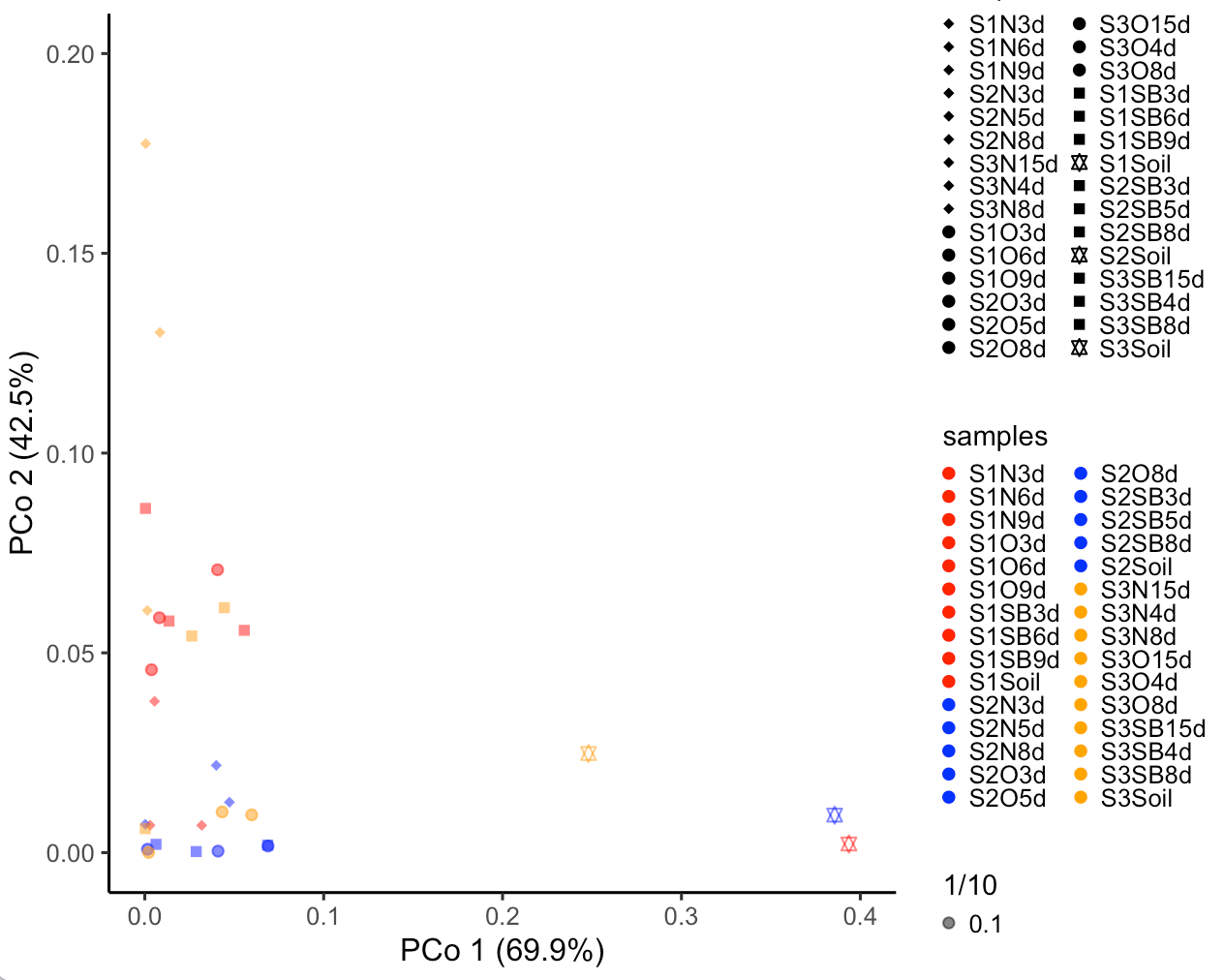
I created a scatter plot using the following script.

pcoa_plot <- positions %>%
as_tibble(rownames = "samples") %>%
ggplot(aes(x=pcoa1, y=pcoa2, shape= samples)) +
geom_point() +
aes(colour=samples) + #adds legend to the plot
labs(x="PCo 1 (69.9%)", y="PCo 2 (42.5%)") +
scale_color_manual(
values = c("S1N3d"= "red","S1N6d"= "red", "S1N9d"= "red", "S1O3d"= "red",
"S1O6d"= "red", "S1O9d"= "red", "S1SB3d"= "red", "S1SB6d"= "red",
"S1SB9d"= "red", "S1Soil" = "red",
"S2N3d"= "blue","S2N5d"= "blue", "S2N8d"= "blue", "S2O3d"= "blue",
"S2O5d"= "blue", "S2O8d"= "blue", "S2SB3d"= "blue", "S2SB5d"= "blue",
"S2SB8d"= "blue", "S2Soil" = "blue",
"S3N15d"= "orange","S3N4d"= "orange", "S3N8d"= "orange", "S3O15d"= "orange",
"S3O4d"= "orange", "S3O8d"= "orange", "S3SB15d"= "orange", "S3SB4d"= "orange",
"S3SB8d"= "orange", "S3Soil" = "orange")) +
scale_shape_manual(values = c("S1N3d"= "diamond", "S1N6d"= "diamond", "S1N9d"= "diamond",
"S2N3d"= "diamond","S2N5d"= "diamond", "S2N8d"= "diamond",
"S3N15d"= "diamond","S3N4d"= "diamond", "S3N8d"= "diamond",
"S1O3d"= "circle", "S1O6d"= "circle", "S1O9d"= "circle",
"S2O3d"= "circle", "S2O5d"= "circle", "S2O8d"= "circle",
"S3O15d"= "circle", "S3O4d"= "circle", "S3O8d"= "circle",
"S1SB3d"= "square", "S1SB6d"= "square", "S1SB9d"= "square", "S1Soil" = "star",
"S2SB3d"= "square", "S2SB5d"= "square", "S2SB8d"= "square", "S2Soil" = "star",
"S3SB15d"= "square", "S3SB4d"= "square", "S3SB8d"= "square", "S3Soil" = "star")) +
aes(alpha= 1/10) +
scale_x_continuous(limits = c(0.0, 0.4)) +
scale_y_continuous(limits = c(0.0, 0.2)) +
theme_void() +
theme_classic() +
theme(legend.key.size = unit(0.1, 'cm'), #change legend key size
legend.key.height = unit(0.001, 'cm'), #change legend key height
legend.key.width = unit(0.001, 'cm'),
legend.title = element_text(size=10))

I get the plot as follows

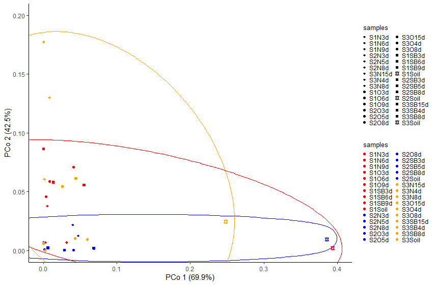
I want to create this scatter plot with ellipses in such a way that all red will be grouped in one ellipse, all blue in a separate ellipse and all yellow in separate ellipse.

Please help me in this regard. I hope i was able to explain my question well.
Regards
Hira

Take a look at ggforce::geom_mark_ellipse()

1 Like

Can you please tell me which parameter should i set in geom_mark_ellipse to have three ellipses only(one for each three colors in my scatter plot). Because when i do it it creates circles around each individual point in my scatter plot. Please explain me a bit as i am new to R language.

I used geom_mark_ellipse like this. What should i add in it to get the ellipses as i explained above.

pcoa_plot <- positions %>%
as_tibble(rownames = "samples") %>%
ggplot(aes(x=pcoa1, y=pcoa2, shape= samples)) +
geom_mark_ellipse(aes(fill = samples)) +
geom_point() +
aes(colour=samples) + #adds legend to the plot
labs(x="PCo 1 (69.9%)", y="PCo 2 (42.5%)") +
scale_color_manual(
values = c("S1N3d"= "red","S1N6d"= "red", "S1N9d"= "red", "S1O3d"= "red",
"S1O6d"= "red", "S1O9d"= "red", "S1SB3d"= "red", "S1SB6d"= "red",
"S1SB9d"= "red", "S1Soil" = "red",
"S2N3d"= "blue","S2N5d"= "blue", "S2N8d"= "blue", "S2O3d"= "blue",
"S2O5d"= "blue", "S2O8d"= "blue", "S2SB3d"= "blue", "S2SB5d"= "blue",
"S2SB8d"= "blue", "S2Soil" = "blue",
"S3N15d"= "orange","S3N4d"= "orange", "S3N8d"= "orange", "S3O15d"= "orange",
"S3O4d"= "orange", "S3O8d"= "orange", "S3SB15d"= "orange", "S3SB4d"= "orange",
"S3SB8d"= "orange", "S3Soil" = "orange")) +
scale_shape_manual(values = c("S1N3d"= "diamond", "S1N6d"= "diamond", "S1N9d"= "diamond",
"S2N3d"= "diamond","S2N5d"= "diamond", "S2N8d"= "diamond",
"S3N15d"= "diamond","S3N4d"= "diamond", "S3N8d"= "diamond",
"S1O3d"= "circle", "S1O6d"= "circle", "S1O9d"= "circle",
"S2O3d"= "circle", "S2O5d"= "circle", "S2O8d"= "circle",
"S3O15d"= "circle", "S3O4d"= "circle", "S3O8d"= "circle",
"S1SB3d"= "square", "S1SB6d"= "square", "S1SB9d"= "square", "S1Soil" = "star",
"S2SB3d"= "square", "S2SB5d"= "square", "S2SB8d"= "square", "S2Soil" = "star",
"S3SB15d"= "square", "S3SB4d"= "square", "S3SB8d"= "square", "S3Soil" = "star")) +
aes(alpha= 1/10) +
scale_x_continuous(limits = c(0.0, 0.4)) +
scale_y_continuous(limits = c(0.0, 0.2)) +
theme_void() +
theme_classic() +
theme(legend.key.size = unit(0.1, 'cm'), #change legend key size
legend.key.height = unit(0.001, 'cm'), #change legend key height
legend.key.width = unit(0.001, 'cm'),
legend.title = element_text(size=10))

Regards
Hira

to experiment with your code, we would need a sample of your data.

You might use tools such as the library datapasta, or the base function dput() to share a portion of data in code form, i.e. that can be copied from forum and pasted to R session.

Reprex Guide

1 Like

Thank you for replying sir.

I used dput() as you guided as follows:

dput(positions)
structure(c(0.00544815711950608, 0.031809183872217, 0.00295833511471403,
0.00374776439028969, 0.0406834693528516, 0.00815303078791478,
0.000393196597238439, 0.0556077406563358, 0.0135358584655523,
0.393594562892309, 0.000261315911127579, 0.0473067433010633,
0.0399476142772836, 0.00150934217479202, 0.0689089102195301,
0.0409307485498064, 0.00626512315885165, 0.0686817396158806,
0.0287252946138909, 0.385642271602795, 0.000510499942869509,
0.00143129350821356, 0.00843131036731882, 0.0432354652231734,
0.00214390223027345, 0.0597531338407985, 0.0262492357181321,
0.000284430756786979, 0.0444476243642517, 0.248035137151755,
0.0378701469305432, 0.00682942321690139, 0.00683760428946566,
0.0457680543575575, 0.0707986166210382, 0.0587925204457527, 0.0861534801529267,
0.0556371061876673, 0.0579761256652328, 0.00215878224919294,
0.00708970066439689, 0.0126261153031024, 0.0218394602622643,
0.000843812262323225, 0.00165365084025309, 0.000369775724521361,
0.00207044146601326, 0.00187935871642063, 0.000262349796480839,
0.00937333035205324, 0.17743775322607, 0.0606131301690102, 0.130207241853574,
0.0101967287727652, 4.94035708645193e-05, 0.00945189617232762,
0.0542152950748867, 0.00599259625208367, 0.0613069798692429,
0.0248009340857729), dim = c(30L, 2L), dimnames = list(c("S1N3d",
"S1N6d", "S1N9d", "S1O3d", "S1O6d", "S1O9d", "S1SB3d", "S1SB6d",
"S1SB9d", "S1Soil", "S2N3d", "S2N5d", "S2N8d", "S2O3d", "S2O5d",
"S2O8d", "S2SB3d", "S2SB5d", "S2SB8d", "S2Soil", "S3N15d", "S3N4d",
"S3N8d", "S3O15d", "S3O4d", "S3O8d", "S3SB15d", "S3SB4d", "S3SB8d",
"S3Soil"), c("pcoa1", "pcoa2")))

My data in table form looks like this in R:

I have this table in excel as well but i am unable to attach it here.

Regards
HIRA


colmap <- c("S1N3d"= "red","S1N6d"= "red", "S1N9d"= "red", "S1O3d"= "red",
             "S1O6d"= "red", "S1O9d"= "red", "S1SB3d"= "red", "S1SB6d"= "red",
             "S1SB9d"= "red", "S1Soil" = "red",
             "S2N3d"= "blue","S2N5d"= "blue", "S2N8d"= "blue", "S2O3d"= "blue",
             "S2O5d"= "blue", "S2O8d"= "blue", "S2SB3d"= "blue", "S2SB5d"= "blue",
             "S2SB8d"= "blue", "S2Soil" = "blue",
             "S3N15d"= "orange","S3N4d"= "orange", "S3N8d"= "orange", "S3O15d"= "orange",
             "S3O4d"= "orange", "S3O8d"= "orange", "S3SB15d"= "orange", "S3SB4d"= "orange",
             "S3SB8d"= "orange", "S3Soil" = "orange")


pcoa_plot <- positions %>%
  as_tibble(rownames = "samples") %>% 
  left_join(enframe(colmap,value="color"),by=c("samples"="name")) %>%
  ggplot(aes(x=pcoa1, y=pcoa2, shape= samples,colour=samples)) +
  geom_point() +
  labs(x="PCo 1 (69.9%)", y="PCo 2 (42.5%)") +
  scale_color_manual(
    values = colmap) +
  scale_shape_manual(values = c("S1N3d"= "diamond", "S1N6d"= "diamond", "S1N9d"= "diamond",
                                "S2N3d"= "diamond","S2N5d"= "diamond", "S2N8d"= "diamond",
                                "S3N15d"= "diamond","S3N4d"= "diamond", "S3N8d"= "diamond",
                                "S1O3d"= "circle", "S1O6d"= "circle", "S1O9d"= "circle",
                                "S2O3d"= "circle", "S2O5d"= "circle", "S2O8d"= "circle",
                                "S3O15d"= "circle", "S3O4d"= "circle", "S3O8d"= "circle",
                                "S1SB3d"= "square", "S1SB6d"= "square", "S1SB9d"= "square", "S1Soil" = "star",
                                "S2SB3d"= "square", "S2SB5d"= "square", "S2SB8d"= "square", "S2Soil" = "star",
                                "S3SB15d"= "square", "S3SB4d"= "square", "S3SB8d"= "square", "S3Soil" = "star")) +
  scale_x_continuous(limits = c(0.0, 0.4)) +
  scale_y_continuous(limits = c(0.0, 0.2)) +
    geom_mark_ellipse(aes(fill=color,group=color),show.legend = FALSE) +
  theme_classic() +
  theme(legend.key.size = unit(0.1, 'cm'), #change legend key size
        legend.key.height = unit(0.001, 'cm'), #change legend key height
        legend.key.width = unit(0.001, 'cm'),
        legend.title = element_text(size=10)) 

2 Likes

Thank you very much for helping me sir.

The ellipses are not completely within the plot area as a complete ellipse. Is it because of the points that are scattered unevenly or can they be adjusted within the plot. What i mean to ask is, can the size of these created ellipses be adjusted so they are within the graph area?