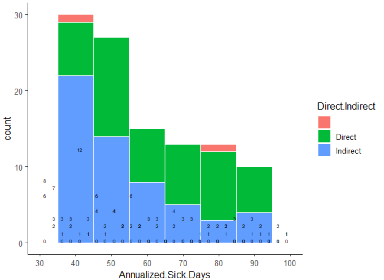
Hi, I try to create a histogram to show the distribution of sick days reported by our organization.
below is my code.
Unfortunately, the labels are not in place, it looks there are more data labels than it should be.
Hi!
To help us help you, could you please prepare a repr oducible ex ample (reprex) illustrating your issue? Please have a look at this guide, to see how to create one:
A minimal reproducible example consists of the following items:
A minimal dataset, necessary to reproduce the issue
The minimal runnable code necessary to reproduce the issue, which can be run
on the given dataset, and including the necessary information on the used packages.
Let's quickly go over each one of these with examples:
FJCC
November 8, 2020, 2:42pm
3
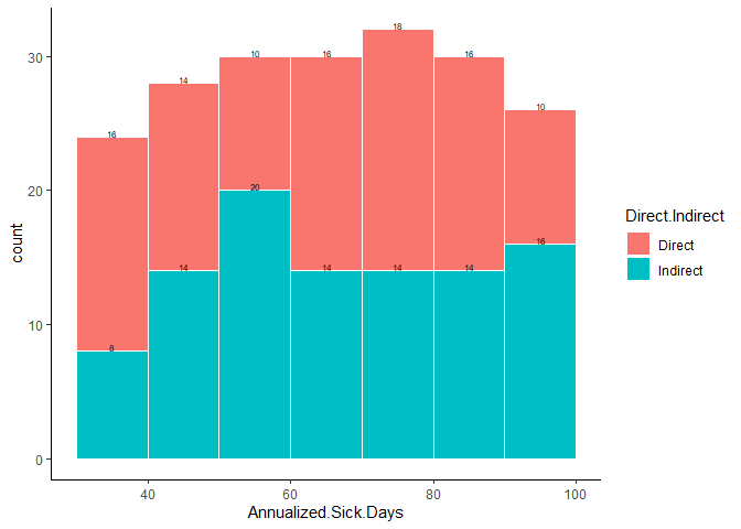
If the following does not solve your problem, please follow nirgrahanuk's advice and provide a reprex.breaks argument in both geom_histogram and geom_text.
library(ggplot2)
DF <- data.frame(Direct.Indirect=rep(c("Direct","Indirect"),100),
                 Annualized.Sick.Days=runif(100,30,100))
ggplot(DF,mapping=aes(x=Annualized.Sick.Days,label=..count..,fill=Direct.Indirect))+
  geom_histogram(binwidth=10,color="white",breaks = seq(30, 100, 10))+
  theme_classic() +
  geom_text(stat="bin", size=2,vjust=0,breaks = seq(30, 100, 10),position="stack")
Created on 2020-11-08 by the reprex package (v0.3.0)
system
November 29, 2020, 2:42pm
4
This topic was automatically closed 21 days after the last reply. New replies are no longer allowed.