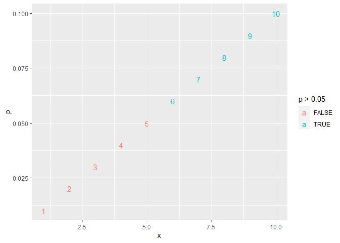
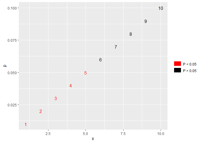
Hi,
I would like to add legend to odds ratios ggplot like that:
geom_text(data = df2, hjust = 0, vjust = -1.1, nudge_x = -0.2, size = 5,
 aes(x = boxOdds, label = format(p_values, nsmall = 3), color = p_values > 0.05), show.legend = TRUE)
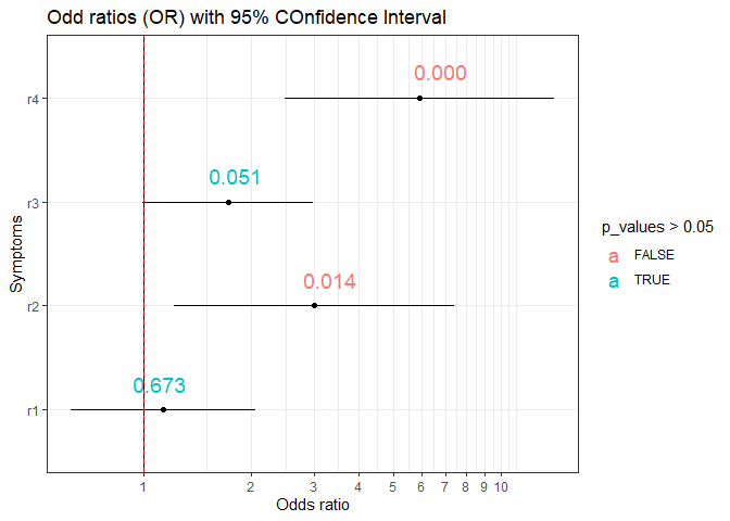
and there is a legend made by geom_text() looking like this:
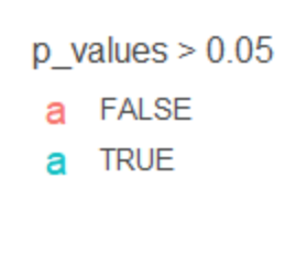
My desired output would be something like this:
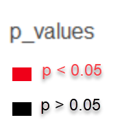
My question is how can I customize such a legend in order to remove "a" and add: p-values < 0.05 in red colour, and the rest values for example in green or yellow or black colour ? How can I add a title to such a legend ?
I have got a df2 dataframe with column p_values that contains all p-values I need.
On the X-axis there are odds ratios values that belongs to variable boxOdds in my df2 dataframe.
Thank you for any ideas.
library(tidyverse)

boxLabels2 <-  c("r1", "r2", "r3", "r4")


df2 <- data.frame(yAxis = boxLabels2, boxOdds = c(1.136, 3.000, 1.724, 5.909),
boxCILow = c(0.628, 1.216, 0.997, 2.485), boxCIHigh = c(2.056,  7.404,  2.981, 14.054),
 p_values = c(0.673, 0.014, 0.051, 0.000))


p2 <- ggplot(df2, aes(y=yAxis)) +
  geom_point(aes(x=boxOdds)) +
  geom_segment(aes(x=boxCILow,xend=boxCIHigh,yend=yAxis))


p2 <- p2 + geom_vline(xintercept=1) + theme_bw()

p3 <- p2+scale_x_continuous(breaks = seq(0,10, 1)) +
  ylab("Symptoms") +
  xlab("Odds ratio") +
  ggtitle("Odd ratios (OR) with 95% COnfidence Interval")+
  ylab("Symptoms")+
  geom_vline(aes(xintercept = 1), size = .25, linetype = "dashed", color = "red")+
 coord_trans(x = "log10") +
 geom_text(data = df2, hjust = 0, vjust = -1.1, nudge_x = -0.2, size = 5,
aes(x = boxOdds, label = format(p_values, nsmall = 3), color = p_values > 0.05), show.legend = TRUE)

p3
Created on 2022-01-31 by the reprex package (v2.0.1)
