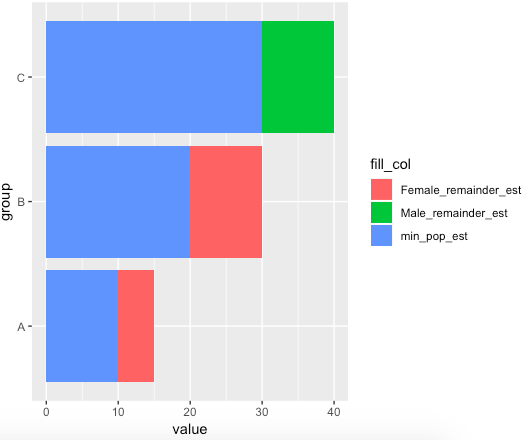
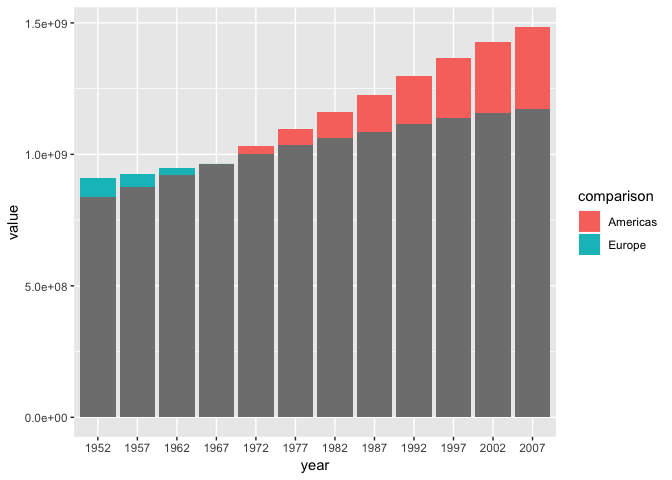
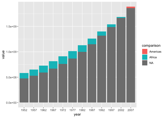
I recently encountered a bar chart that compared counts of an ordinal variable (age range) across two categorical variables (binary gender). The fill behavior/color was interesting: the length of each bar corresponded to the counts of the larger level, but the fill showed the the counts of the smaller level + the remainder of the larger level. I was able to recreate the chart with a fair amount of reshaping, but I'd like to abstract this into a simpler process. Is it easiest to create a new Geom? a new Stat? A separate shaping function?
An example of the code and final plot is below:
library(tidyverse)
library(zeallot)
library(glue)

df <- tibble(
  x1 = c("A", "A", "B", "B", "C", "C"),
  x2 = c("M", "F", "M", "F", "M", "F"),
  x3 = c(10, 15, 20, 30, 40, 30)
) %>%
  group_by(x2, x1) %>%
  summarize(estimate = sum(x3)) %>%
  ungroup() %>%
  spread(x2, estimate) %>%
  mutate(larger = if_else(`F` > `M`, "Larger F", "Larger M")) %>%
  gather(x2, estimate, `F`:`M`, -x1, -larger)

c(fdf, mdf) %<-% split(df, f = df$x2)

names(mdf) <- glue("m_{names(mdf)}")
names(fdf) <- glue("f_{names(fdf)}")

df2 <- bind_cols(mdf, fdf) %>%
  rowwise() %>%
  mutate(larger = if_else(m_estimate > f_estimate, "Male", "Female"),
         total_est = m_estimate + f_estimate,
         min_pop_est = min(m_estimate, f_estimate)) %>%
  mutate(remainder_est = max(m_estimate, f_estimate) - min_pop_est)

df3 <- df2 %>%
  select(group = f_x1, larger, min_pop_est, remainder_est) %>%
  gather(fill_col, value, min_pop_est:remainder_est, -group, -larger) %>%
  unite("fill_col", c("larger", "fill_col"), sep = "_") %>%
  mutate(fill_col = recode(
    fill_col,
    "Female_min_pop_est" = "min_pop_est",
    "Male_min_pop_est" = "min_pop_est"))

ggplot(df3, aes(x = group, y = value, fill = fill_col)) +
  geom_col() +
  coord_flip()


 Nice! Thanks for your help with this!