Hi,
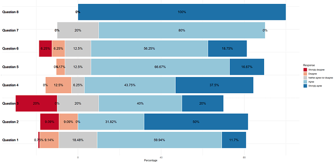
Well I've taken the tutorial above, and plugged in your data instead.
I changed some of the variable names and added a new filter in the section that creates the first diverging chart, but otherwise kept everything the same (so the title, labels etc need updating). I think you should be able to figure it out from here.
Load Packages
Let's load the two packages we'll use
library(tidyverse)
library(scales)
Generate Data
We'll create some fake data.
school_quality_summary <- data.frame(
  school = c(
    "Question 1", "Question 1", "Question 1", "Question 1", "Question 1",
    "Question 2", "Question 2", "Question 2", "Question 2", "Question 2",
    "Question 3", "Question 3", "Question 3", "Question 3", "Question 3",
    "Question 4", "Question 4", "Question 4", "Question 4", "Question 4",
    "Question 5", "Question 5", "Question 5", "Question 5", "Question 5",
    "Question 6", "Question 6", "Question 6", "Question 6", "Question 6",
    "Question 7", "Question 7", "Question 7", "Question 7", "Question 7",
    "Question 8", "Question 8", "Question 8", "Question 8", "Question 8"
  ),
  opinion = c(
    "Strongly disagree", "Disagree", "Neither agree nor disagree", "Agree", "Strongly agree",
    "Strongly disagree", "Disagree", "Neither agree nor disagree", "Agree", "Strongly agree",
    "Strongly disagree", "Disagree", "Neither agree nor disagree", "Agree", "Strongly agree",
    "Strongly disagree", "Disagree", "Neither agree nor disagree", "Agree", "Strongly agree",
    "Strongly disagree", "Disagree", "Neither agree nor disagree", "Agree", "Strongly agree",
    "Strongly disagree", "Disagree", "Neither agree nor disagree", "Agree", "Strongly agree",
    "Strongly disagree", "Disagree", "Neither agree nor disagree", "Agree", "Strongly agree",
    "Strongly disagree", "Disagree", "Neither agree nor disagree", "Agree", "Strongly agree"
  ),
  n_answers = c(
    24, 294, 594, 1927, 376,
    2, 2, 0, 7, 11,
    2, 0, 2, 4, 2,
    0, 2, 1, 7, 6,
    0, 1, 3, 16, 4,
    1, 1, 2, 9, 3,
    0, 0, 1, 4, 0,
    0, 0, 0, 0, 2
  ),
  percent_answers = c(
    0.7, 9.1, 18.5, 59.9, 11.7,
    18.2, 18.2, 0, 63.6, 0,
    20, 0, 20, 40, 20,
    0, 12.5, 6.3, 43.8, 37.5,
    0, 4.2, 12.5, 66.7, 16.7,
    6.3, 6.3, 12.5, 56.3, 18.8,
    0, 0, 20, 80, 0,
    0, 0, 0, 0, 100
  )
) %>% mutate(percent_answers = percent_answers / 100, percent_answers_label = percent(percent_answers, accuracy = 1))
Default Bar Chart
Let's make a summary of our data.
school_quality_summary %>%
  ggplot(aes(x = school,
             y = percent_answers,
             fill = opinion)) +
  geom_col() +
  geom_text(aes(label = percent_answers_label),
            position = position_stack(vjust = 0.5),
            color = "white",
            fontface = "bold") +
  coord_flip() +
  scale_x_discrete() +
  scale_fill_viridis_d() +
  labs(title = "How good is the education at your school?",
       x = NULL,
       fill = NULL) +
  theme_minimal() +
  theme(axis.text.x = element_blank(),
        axis.title.x = element_blank(),
        panel.grid = element_blank(),
        legend.position = "top")
Basic Diverging Bar Chart
Let's create data that we need to make a basic diverging bar chart.
school_quality_summary_diverging <- school_quality_summary %>%
  mutate(percent_answers = if_else(opinion %in% c("Strongly agree", "Agree"), percent_answers, -percent_answers)) %>%
  mutate(percent_answers_label = percent(percent_answers, accuracy = 1)) %>%
  filter(percent_answers != 0)

school_quality_summary_diverging
We can now make a basic diverging bar chart.
school_quality_summary_diverging %>%
  ggplot(aes(x = school,
             y = percent_answers,
             fill = opinion)) +
  geom_col() +
  geom_text(aes(label = percent_answers_label),
            position = position_stack(vjust = 0.5),
            color = "white",
            fontface = "bold") +
  coord_flip() +
  scale_x_discrete() +
  scale_fill_viridis_d() +
  labs(title = "How good is the education at your school?",
       x = NULL,
       fill = NULL) +
  theme_minimal() +
  theme(axis.text.x = element_blank(),
        axis.title.x = element_blank(),
        panel.grid = element_blank(),
        legend.position = "top")
Positive/Negative Labels
In our previous chart, the labels for very bad and bad were negative. Let's change this!
This will make our labels are positive numbers.
school_quality_summary_diverging_good_labels <- school_quality_summary_diverging %>%
  mutate(percent_answers_label = abs(percent_answers)) %>%
  mutate(percent_answers_label = percent(percent_answers_label, accuracy = 1))

school_quality_summary_diverging_good_labels
school_quality_summary_diverging_good_labels %>%
  ggplot(aes(x = school,
             y = percent_answers,
             fill = opinion)) +
  geom_col() +
  geom_text(aes(label = percent_answers_label),
            position = position_stack(vjust = 0.5),
            color = "white",
            fontface = "bold") +
  coord_flip() +
  scale_x_discrete() +
  scale_fill_viridis_d() +
  labs(title = "How good is the education at your school?",
       x = NULL,
       fill = NULL) +
  theme_minimal() +
  theme(axis.text.x = element_blank(),
        axis.title.x = element_blank(),
        panel.grid = element_blank(),
        legend.position = "top")
Reorder Bars
Our bars are out of order. Let's fix this!
school_quality_summary_diverging_right_order <- school_quality_summary_diverging_good_labels %>%
  mutate(opinion = fct_relevel(opinion,
                               "Bad", "Very bad", "Good", "Very Good"),
         opinion = fct_rev(opinion))

school_quality_summary_diverging_right_order
school_quality_summary_diverging_right_order %>%
  ggplot(aes(x = school,
             y = percent_answers,
             fill = opinion)) +
  geom_col() +
  geom_text(
    aes(label = percent_answers_label),
    position = position_stack(vjust = 0.5),
    color = "white",
    fontface = "bold"
  ) +
  coord_flip() +
  scale_x_discrete() +
  scale_fill_viridis_d() +
  labs(title = "How good is the education at your school?",
       x = NULL,
       fill = NULL) +
  theme_minimal() +
  theme(axis.text.x = element_blank(),
        axis.title.x = element_blank(),
        panel.grid = element_blank(),
        legend.position = "top")
Make Legend Order Match
The bars are now in the right order, but the legend doesn't match. Let's fix this!
school_quality_summary_diverging_right_order %>%
  ggplot(aes(x = school,
             y = percent_answers,
             fill = opinion)) +
  geom_col() +
  geom_text(aes(label = percent_answers_label),
            position = position_stack(vjust = 0.5),
            color = "white",
            fontface = "bold") +
  coord_flip() +
  scale_x_discrete() +
  scale_fill_viridis_d(breaks = c("Very bad", "Bad", "Good", "Very Good")) +
  labs(title = "How good is the education at your school?",
       x = NULL,
       fill = NULL) +
  theme_minimal() +
  theme(axis.text.x = element_blank(),
        axis.title.x = element_blank(),
        panel.grid = element_blank(),
        legend.position = "top")
Improve Colors
Let's use a more appropriate color scale for this data.
school_quality_summary_diverging_right_order %>%
  ggplot(aes(x = school,
             y = percent_answers,
             fill = opinion)) +
  geom_col() +
  geom_text(aes(label = percent_answers_label),
            position = position_stack(vjust = 0.5),
            color = "white",
            fontface = "bold") +
  coord_flip() +
  scale_x_discrete() +
  scale_fill_manual(breaks = c("Very bad", "Bad", "Good", "Very Good"),
                    values = c(
                      "Very bad" = "darkorange3",
                      "Bad" = "orange",
                      "Good" = "deepskyblue",
                      "Very Good" = "deepskyblue4"
                    )) +
  labs(title = "How good is the education at your school?",
       x = NULL,
       fill = NULL) +
  theme_minimal() +
  theme(axis.text.x = element_blank(),
        axis.title.x = element_blank(),
        panel.grid = element_blank(),
        legend.position = "top")
