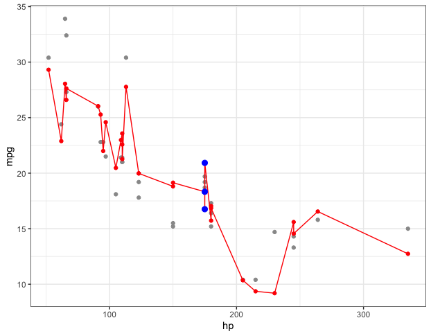
What you're seeing is due to the fact that each data point not only has a different value for Years of Exprience, each also (in general) has different values for the other independent variables in the regression. That's what's causing the squiggly line, even though the regression "hyperplane" is flat (assuming you have only linear terms in the regression).
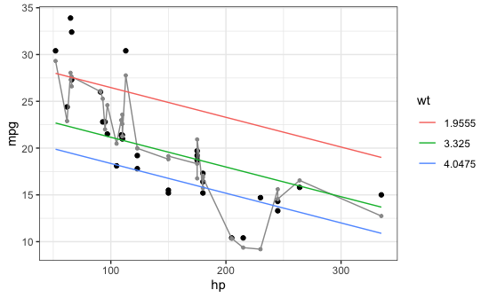
Here's an example with the built-in mtcars data frame. The regression below has two independent variables (hp and wt) so the fitted regression equation is a (flat) plane. When I plot the fitted values and connect them (the gray squiggly line) it's all over the place because, in general, points with similar values of hp can have different values of wt. (If you look at the regression coefficients (run coef(m1)) you'll see that the coefficient for wt is -3.88, meaning a car that is 1.0 greater in wt (for a given value of hp) is predicted to be 3.88 lower in mpg.
To see the predicted relationship of hp and mpg separately from wt, we need to plot mpg vs. hp for a fixed value of wt. The plot below shows mpg vs. hp for three specific values of wt (the 10th, 50th, and 90th percentiles in the data). You can see that each of those lines is straight.
library(tidyverse)

# Model
m1 = lm(mpg ~ hp + wt, data=mtcars)

# Model predictions for the data
mtcars$mpg.fitted = predict(m1)

# Model predictions for specific values of each independent variable
newdata = data.frame(hp=rep(seq(min(mtcars$hp), max(mtcars$hp), length=20), 3),
                     wt=rep(quantile(mtcars$wt, prob=c(0.1,0.5,0.9)), each=20))

newdata$mpg.fitted = predict(m1, newdata)

ggplot(mtcars, aes(x=hp)) +
  geom_point(aes(y=mpg)) +
  geom_line(aes(y=mpg.fitted), colour="grey60") +
  geom_point(aes(y=mpg.fitted), colour="grey60", size=1) +
  geom_line(data=newdata, aes(y=mpg.fitted, colour=factor(wt))) +
  labs(colour="wt") +
  theme_bw()
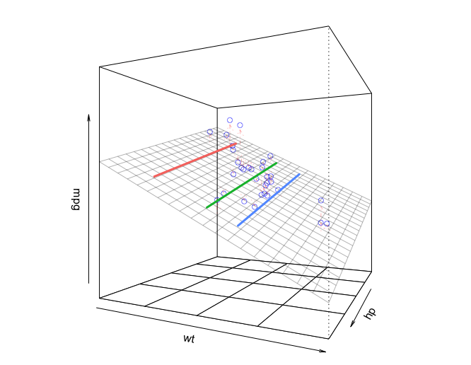
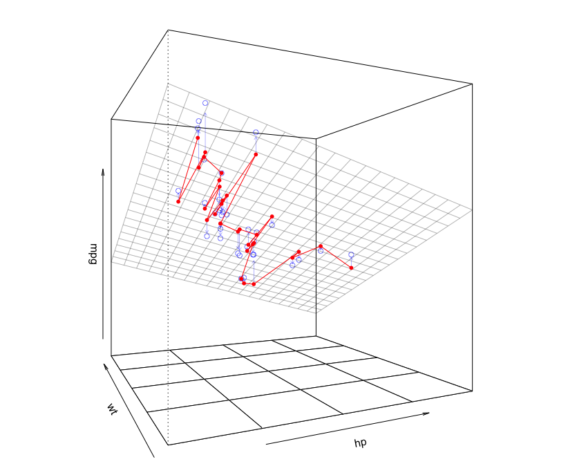
Since this regression model has only two independent variables and the regression function is therefore a plane, we can visualize it with a 3D plot. In the plot below, the plane is the fitted regression equation. The little circles are the data points. The three lines we drew in the 2D plot above are the lines of constant wt on the plane in the plot below:
library(rockchalk)

lf = plotCurves(m1, plotx="hp", modx="wt", modxVals=unique(newdata$wt),
                col=hcl(seq(15,375,length=4)[1:3],100,65), lty=1)
plotPlane(m1, plotx1="hp", plotx2="wt", drawArrows = TRUE, phi=0, theta=115,
          linesFrom=lf)
If we fit a model that is second-order in both independent variables, you can now see that the regression fit is a surface that is curved in both independent-variable directions.
# Model with second-order polynomials for each independent variable
m2 = lm(mpg ~ poly(hp,2,raw=TRUE) + poly(wt,2,raw=TRUE), data=mtcars)

lf = plotCurves(m2, plotx="hp", modx="wt", modxVals=unique(newdata$wt),
                col=hcl(seq(15,375,length=4)[1:3],100,65), lty=1)
plotPlane(m2, plotx1="hp", plotx2="wt", drawArrows = TRUE, phi=0, theta=115,
          linesFrom=lf)
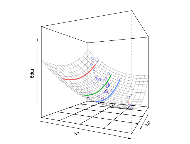
 I may not be able to visualize 4th and beyond, but at least seeing this in 3 dimensions gives a good sense of it.
 I really appreciate your above and beyond help and amazing charts.