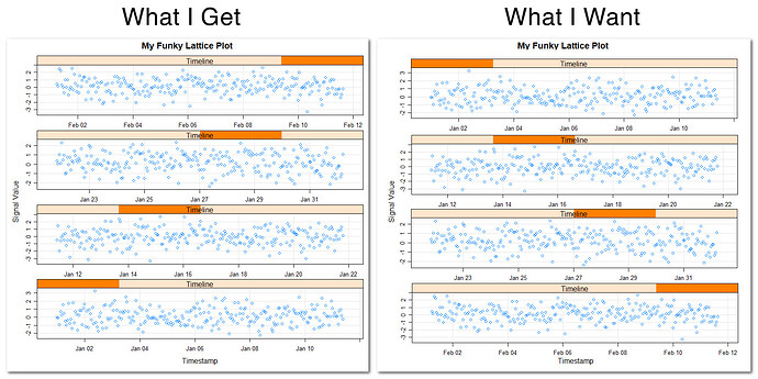
I have signal timeseries data that I'd like to split into multiple lattice panels, arranged in a single column, to make variation easier to see. Unfortunately, the code I'm using draws panels in reverse chronological order (newer data are in the top panel instead of older).
How can I reverse the panel draw order?
I tried converting the Timestamp field to a factor and reversing the levels, as suggested in similar posts, but that hasn't improved my situation, which I suspect is related to using posix times; panel draw order remains unaffected and x-axis ticks/labels are reformatted.
#Example

library(lattice)

data <- data.frame(
  Timestamp = seq(
    from = as.POSIXct("2016-01-01 00:00:00 PST"),
    length.out = 1000,
    by = "hours"
  ),
  Signal = rnorm(1000)
)

Timeline <- equal.count(data$Timestamp, number = 4, overlap = 0)

xyplot(
  Signal ~ Timestamp | Timeline,
  data,
  grid = TRUE,
  auto.key = TRUE,
  scales = list(relation = "free"),
  layout = c(1, 4),
  xlab = "Timestamp",
  ylab = "Signal Value",
  main = "My Funky Lattice Plot"
)
