How do write my server logic for a histogram to use aggregate freqency when using a checkbox widget

Hello,

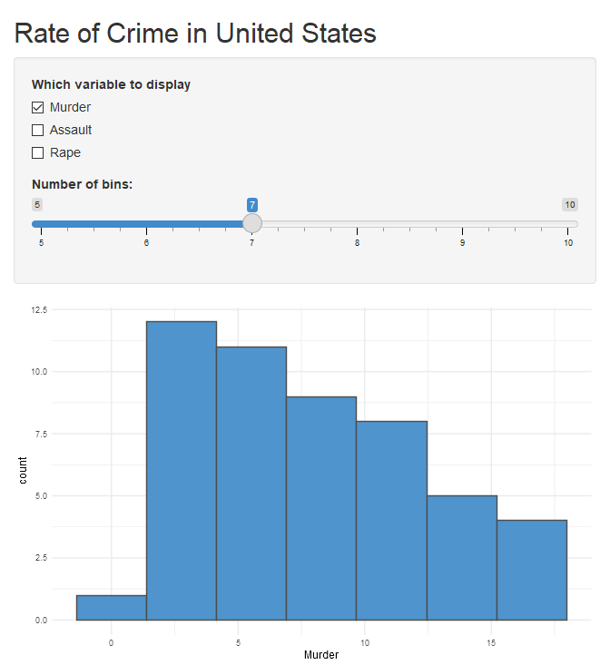
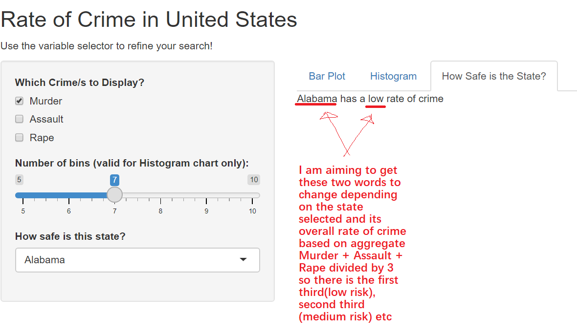
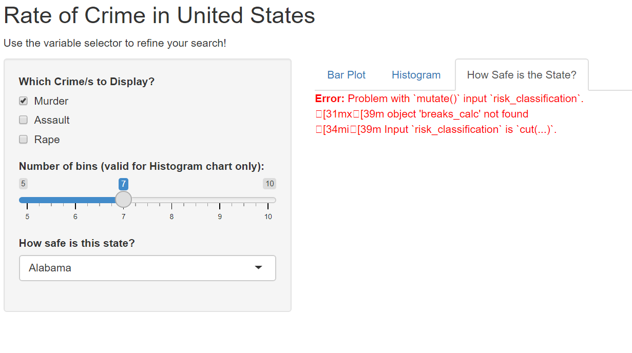
I am stuck on how to write my server logic for my checkboxgroup widget. I currently have the server logic for a histogram to display the frequency of a particular crime (murder, assault or rape). However, I am unable to make the model show cumulative frequency based on variables selected so that if they select Murder AND rape or assault AND rape it produces an aggregate frequency of the variables selected. Any help would be appreciated!

library(shiny)
library(ggplot2)

# Define UI for application that draws a histogram
ui <- fluidPage(
    
    # Application title
    titlePanel("Rate of Crime in United States"),
    
        # Sidebar with a slider input for number of bins
    sidebarLayout(
        sidebarPanel(
            checkboxGroupInput("display_var",
                         "Which variable to display",
                         choices = c("Murder" = "Murder",
                                     "Assault" = "Assault",
                                     "Rape" = "Rape"),
                         selected = "Murder"
            ),
            sliderInput("bins",
                        "Number of bins:",
                        min = 5,
                        max = 10,
                        value = 7)
        ),
        
        # Show a plot of the generated distribution
        mainPanel(
            plotOutput("distPlot")
        )
    )
)

# Define server logic required to draw a histogram
server <- function(input, output) {
    
    output$distPlot <- renderPlot({
        # set x-axis label depending on the value of display_var
        if (input$display_var == "Murder") {
            xlabel <- "Frequency of Murder)"
        } else if (input$display_var == "Assault") {
            xlabel <- "Frequency of Assault"
        } else if (input$display_var == "Rape") {
            xlabel <- "Frequency of Rape"
        }
        
        # create plot
        ggplot(USArrests, aes(.data[[input$display_var]])) +
            geom_histogram(bins = input$bins,
                           fill = "steelblue3",
                           colour = "grey30") +
            xlab(xlabel) +
            theme_minimal()
    })
}

# Run the application
shinyApp(ui = ui, server = server)

Hi there,

Happy to help to help you with slightly more clarity.

So couple of points I'd like you to clarify:

  1. We only want a single histogram shown on the ggplot which is the combination of the checkboxes? Correct?
  2. What should the xlabel be in the case of multi select? In your current situation it will only add a single label to input$display_var.

Hello,

Thanks for your response.

I would like a single histogram which represents the cumulative frequency of the combination selected in the checkbox widget.

I would like the xlabel to be reactive in the sense that if all three variables were selected it would say “Frequency of Murder, Rape and Assault” if murder and rape was selected; “Frequency if Murder and Rape”.

Thanks in advance!

Hi!

So I decided to have a quick go at your problem. The trick is to know how to use the inputs correctly. As you will see in the select I do something odd. It is called unquoting and with user inputs in shiny you will often have to make use of it (see here: 19 Quasiquotation | Advanced R ). Basically instead of evaluating the thing as is, it evaluates the code inside (so the actual names) in a way that R can translate it.

You will see that for the later label I used str_c essentially just taking that vector of names and getting them into a single unit.

I removed your filtering of labels as they are too restrictive. You'd also probably want to look at multi conditions or something with using %in% or some other operator. The approach I have below is not that bad as you will see. Let me know if this helps? :slight_smile:

library(shiny)
library(tidyverse)

# Define UI for application that draws a histogram
ui <- fluidPage(
  
  # Application title
  titlePanel("Rate of Crime in United States"),
  
  # Sidebar with a slider input for number of bins
  sidebarLayout(
    sidebarPanel(
      checkboxGroupInput("display_var",
                         "Which variable to display",
                         choices = c("Murder" = "Murder",
                                     "Assault" = "Assault",
                                     "Rape" = "Rape"),
                         selected = "Murder"
      ),
      sliderInput("bins",
                  "Number of bins:",
                  min = 5,
                  max = 10,
                  value = 7)
    ),
    
    # Show a plot of the generated distribution
    mainPanel(
      plotOutput("distPlot")
    )
  )
)

# Define server logic required to draw a histogram
server <- function(input, output) {
  
  output$distPlot <- renderPlot({
    
    #create new data based on the selection
    USArrests2 <- 
    USArrests %>%
    #magic happens here with Unquoting the input variable with the bang-bang    
      select(!!input$display_var) %>% 
    #we create the new cumaltive column based on row sums where they are numeric  
      mutate(cumulative_frequency = rowSums(across(where(is.numeric))))
  
    # create plot - we show the cum_freq
    ggplot(USArrests2, aes(cumulative_frequency)) +
      geom_histogram(bins = input$bins,
                     fill = "steelblue3",
                     colour = "grey30") +
    #we create a new label based on what has been selected  
      xlab(paste0("Frequency of ", str_c(input$display_var, collapse = " & "))) +
      theme_minimal()
  })
}

# Run the application
shinyApp(ui = ui, server = server)
#> 
#> Listening on http://127.0.0.1:8316

Created on 2021-10-21 by the reprex package (v2.0.0)

1 Like

Hey GreyMerchant, I appreciate your response in regards to my question and I have implemented your solution into my project as you can see below:

library(shiny)
library(tidyverse)
library(ggplot2)

# Define UI for application that draws a histogram
ui <- fluidPage(
    
    # Application title
    titlePanel("Rate of Crime in United States"),
    p("Use the variable selector to refine your search!"),
    
    # Sidebar with a slider input for number of bins
    sidebarLayout(
        sidebarPanel(
            checkboxGroupInput("display_var",
                               "Which Crime/s to Display?",
                               choices = c("Murder" = "Murder",
                                           "Assault" = "Assault",
                                           "Rape" = "Rape"),
                               selected = "Murder"
            ),
            
            sliderInput("bins",
                        "Number of bins (valid for Histogram chart only):",
                        min = 5,
                        max = 10,
                        value = 7
            ),
            
            selectInput(
                "search", "How safe is this state?", choices = (attributes(USArrests)$row.names), selected = NULL)
            
            
        ),


        # Show a plot of the generated distribution
        mainPanel(
            tabsetPanel(
                tabPanel("Bar Plot", plotOutput("barplot")),
                tabPanel("Histogram", plotOutput("distPlot")),
                tabPanel("How Safe is the State?", textOutput("howsafe"))
                
            )
        )
    ))
       

# Define server logic required to draw a histogram
server <- function(input, output) {
    output$barplot <- renderPlot({
        
        marchoice <- req(input$display_var)
        sd <- setdiff(names(USArrests),marchoice)
        temp_df <- USArrests
        temp_df[,sd] <- 0
        
        counts <- temp_df$Murder + temp_df$Assault + temp_df$Rape
        names(counts) <- rownames(temp_df)
        barplot(counts, 
                main="Aggregate Sum of Crime in the United States",
                xlab="State",
                ylab="Frequency",las=2,col=rgb(0.2,0.4,0.6,0.6))
    })
    
CategorisedMAR <- cut(USArrests$Murder + USArrests$Assault + USArrests$Rape, breaks=c(0,150,300,450), labels = c("Low", "Medium", "High"))
    
    output$howsafe <- renderText({ 
        if (input$search == "Low") {
            "________ has a low rate of crime"
        } else if (input$search == "Medium") {
            "________ has a mid-level rate of crime"
        } else if (input$search == "High") {
            "________ has a high rate of crime"
        }
        
        
    })
    
    output$distPlot <- renderPlot({
        
        #create new data based on the selection
        USArrests2 <- 
            USArrests %>%
            #magic happens here with Unquoting the input variable with the bang-bang    
            select(!!input$display_var) %>% 
            #we create the new cumaltive column based on row sums where they are numeric  
            mutate(cumulative_frequency = rowSums(across(where(is.numeric))))
        
        # create plot - we show the cum_freq
        ggplot(USArrests2, aes(cumulative_frequency)) + ggtitle("Histogram of Variable Frequency") +
            theme(plot.title = element_text(hjust = 0.5)) + 
            geom_histogram(bins = input$bins,
                           fill = rgb(0.2,0.4,0.6,0.6),
                           colour = "grey30") + 


            #we create a new label based on what has been selected  
            xlab(str_c(input$display_var, collapse = " & ")) +
            theme_minimal()
        
        
    })
    
    output$searchstate <- renderDataTable(USArrests, options = list(pageLength = 5))
}


# Run the application
shinyApp(ui = ui, server = server)

I have spent all day working on my project and am requiring a bit more assistance if you don't mind helping me out. I am trying to also incorporate a simple risk statement that just follows " (state name) has a low/medium/high rate of crime." My method I am hoping to use involves transforming the sum of the three variables (murder, assault and rape) into a categorical variable which is either low/medium/high as done using:

CategorisedMAR <- cut(USArrests$Murder + USArrests$Assault + USArrests$Rape, breaks=c(0,150,300,450), labels = c("Low", "Medium", "High"))

Disregard this section here because I'm not too sure how to go about it but I wrote something there as a placeholder whilst still being able to the run the code without error

   output$howsafe <- renderText({ 
        if (input$search == "Low") {
            "________ has a low rate of crime"
        } else if (input$search == "Medium") {
            "________ has a mid-level rate of crime"
        } else if (input$search == "High") {
            "________ has a high rate of crime"
        }

The breaks are simply the maximum number of crime divided by 3 and split into thirds. I then intend of using if statements that are dependent on the input from the user interface and if the state they selected has low risk, the output will simply print the text saying "state has a low rate of crime" else if the state selected has medium risk, the text will say "state has a medium rate of crime". Is there any advice or assistance in writing the code that can point me in the right direction? I have attached a photo of what I am trying to achieve. Thanks in advance :slight_smile:

You will see that I have done a couple of things. Make use of browser() to see specifically what is happening where.

You will see that I have created this risk_classification column which classifies the risk. The first one is selective where it uses breaks_calc based on which crime columns are selected and adjusting the ranges. This is one way you can do it.

You will see in USArrests3 I created a set of steps for you to classify the specific state and then pass that info to a render text.

All these changes above should help you with getting to what you exactly want.

library(shiny)
library(tidyverse)

# Define UI for application that draws a histogram
ui <- fluidPage(
  
  # Application title
  titlePanel("Rate of Crime in United States"),
  p("Use the variable selector to refine your search!"),
  
  # Sidebar with a slider input for number of bins
  sidebarLayout(
    sidebarPanel(
      checkboxGroupInput("display_var",
                         "Which Crime/s to Display?",
                         choices = c("Murder" = "Murder",
                                     "Assault" = "Assault",
                                     "Rape" = "Rape"),
                         selected = "Murder"
      ),
      
      sliderInput("bins",
                  "Number of bins (valid for Histogram chart only):",
                  min = 5,
                  max = 10,
                  value = 7
      ),
      
      selectInput(
        "search", "How safe is this state?", choices = (attributes(USArrests)$row.names), selected = NULL)
      
    ),
    
    # Show a plot of the generated distribution
    mainPanel(
      tabsetPanel(
        tabPanel("Bar Plot", plotOutput("barplot")),
        tabPanel("Histogram", plotOutput("distPlot")),
        tabPanel("How Safe is the State?", textOutput("howsafe"))
        
      )
    )
  ))


# Define server logic required to draw a histogram
server <- function(input, output) {
  output$barplot <- renderPlot({
    
    marchoice <- req(input$display_var)
    sd <- setdiff(names(USArrests),marchoice)
    temp_df <- USArrests
    temp_df[,sd] <- 0
    
    counts <- temp_df$Murder + temp_df$Assault + temp_df$Rape
    names(counts) <- rownames(temp_df)
    barplot(counts, 
            main="Aggregate Sum of Crime in the United States",
            xlab="State",
            ylab="Frequency",las=2,col=rgb(0.2,0.4,0.6,0.6))
  })


  output$distPlot <- renderPlot({
    
    
    #calculate the specific breaks based on which crime categories are selected
    if(length(input$display_var == 3)){
      breaks_calc <- c(0,150,300,450)
    } else if(length(input$display_var == 2)){
      breaks_calc <- c(0,150,300,450)*2/3
    } else {
      breaks_calc <- c(0,150,300,450)*1/3
    }
    
    
    #create new data based on the selection
    USArrests2 <- 
      USArrests %>%
      #magic happens here with Unquoting the input variable with the bang-bang    
      select(!!input$display_var) %>% 
      #we create the new cumaltive column based on row sums where they are numeric  
      mutate(cumulative_frequency = rowSums(across(where(is.numeric)))) %>% 
      #creating the risk classification column for the data based on the cumulative freq and the specified breaks 
      mutate(risk_classification = cut(cumulative_frequency, breaks_calc, labels = c("Low", "Medium", "High")))
    
    # create plot - we show the cum_freq
    ggplot(USArrests2, aes(cumulative_frequency)) + ggtitle("Histogram of Variable Frequency") +
      theme(plot.title = element_text(hjust = 0.5)) + 
      geom_histogram(bins = input$bins,
                     fill = rgb(0.2,0.4,0.6,0.6),
                     colour = "grey30") + 


      #we create a new label based on what has been selected  
      xlab(str_c(input$display_var, collapse = " & ")) +
      theme_minimal()
    
  })
  
  output$searchstate <- renderDataTable(USArrests, options = list(pageLength = 5))
  
  
  output$howsafe <- renderText({

    USArrests2 <- 
      USArrests %>%
      #magic happens here with Unquoting the input variable with the bang-bang    
      select(!!input$display_var) %>% 
      #we create the new cumaltive column based on row sums where they are numeric  
      mutate(cumulative_frequency = rowSums(across(where(is.numeric)))) %>% 
      #creating the risk classification column for the data based on the cumulative freq and the specified breaks 
      mutate(risk_classification = cut(cumulative_frequency, breaks_calc, labels = c("Low", "Medium", "High")))
   
    USArrests3 <- 
      USArrests %>% 
      mutate(states_as_row_names = rownames(USArrests)) %>% 
      filter(states_as_row_names == !!input$search) %>% 
      select(Murder, Assault, Rape) %>% 
      mutate(cumulative_frequency = rowSums(across(where(is.numeric)))) %>% 
      mutate(risk_classification = cut(cumulative_frequency, c(0,150,300,450), labels = c("low", "medium", "high")))


    #show the rate of crime for the select country 
    print(paste0(input$search, " has a " , USArrests3$risk_classification, " rate of crime"))
  })
  
  
}


# Run the application
shinyApp(ui = ui, server = server)

Created on 2021-10-21 by the reprex package (v2.0.1)

Hey GreyMerchant,

I've just tried using the code and I get an error message when I run the App for that section. I'm not sure how to fix the error but I've attached a photo of the error as it appears on the website. Do you know what this could be from?

In the meantime, I've tried a different approach but I'm still getting an error message

CategorisedMAR <- cut(USArrests$Murder + USArrests$Assault + USArrests$Rape, breaks=c(0,150,300,450), labels = c("Low", "Medium", "High"))
names(CategorisedMAR) <- attributes(USArrests)$row.names
st <- input$search


    output$howsafe <- renderText({ 

        if (CategorisedMAR[[input$search]] == "Low") {
            paste0(st, "has a low rate of crime")
        } else if (CategorisedMAR[[input$search]] == "Medium") {
            paste0( st,"has a mid-level rate of crime")
        } else if (CategorisedMAR[[input$search]] == "High") {
            paste0( st, "has a high rate of crime")
        }

Could this be an easier way of doing it provided I am able to get the code right?

Hi there. Sorry about that - I should have deleted some of those lines. It is working now

library(shiny)
library(tidyverse)

# Define UI for application that draws a histogram
ui <- fluidPage(
  
  # Application title
  titlePanel("Rate of Crime in United States"),
  p("Use the variable selector to refine your search!"),
  
  # Sidebar with a slider input for number of bins
  sidebarLayout(
    sidebarPanel(
      checkboxGroupInput("display_var",
                         "Which Crime/s to Display?",
                         choices = c("Murder" = "Murder",
                                     "Assault" = "Assault",
                                     "Rape" = "Rape"),
                         selected = "Murder"
      ),
      
      sliderInput("bins",
                  "Number of bins (valid for Histogram chart only):",
                  min = 5,
                  max = 10,
                  value = 7
      ),
      
      selectInput(
        "search", "How safe is this state?", choices = (attributes(USArrests)$row.names), selected = NULL)
      
    ),
    
    # Show a plot of the generated distribution
    mainPanel(
      tabsetPanel(
        tabPanel("Bar Plot", plotOutput("barplot")),
        tabPanel("Histogram", plotOutput("distPlot")),
        tabPanel("How Safe is the State?", textOutput("howsafe"))
        
      )
    )
  ))


# Define server logic required to draw a histogram
server <- function(input, output) {
  output$barplot <- renderPlot({
    
    marchoice <- req(input$display_var)
    sd <- setdiff(names(USArrests),marchoice)
    temp_df <- USArrests
    temp_df[,sd] <- 0
    
    counts <- temp_df$Murder + temp_df$Assault + temp_df$Rape
    names(counts) <- rownames(temp_df)
    barplot(counts, 
            main="Aggregate Sum of Crime in the United States",
            xlab="State",
            ylab="Frequency",las=2,col=rgb(0.2,0.4,0.6,0.6))
  })


  output$distPlot <- renderPlot({
    
    
    #calculate the specific breaks based on which crime categories are selected
    if(length(input$display_var == 3)){
      breaks_calc <- c(0,150,300,450)
    } else if(length(input$display_var == 2)){
      breaks_calc <- c(0,150,300,450)*2/3
    } else {
      breaks_calc <- c(0,150,300,450)*1/3
    }
    
    
    #create new data based on the selection
    USArrests2 <- 
      USArrests %>%
      #magic happens here with Unquoting the input variable with the bang-bang    
      select(!!input$display_var) %>% 
      #we create the new cumaltive column based on row sums where they are numeric  
      mutate(cumulative_frequency = rowSums(across(where(is.numeric)))) %>% 
      #creating the risk classification column for the data based on the cumulative freq and the specified breaks 
      mutate(risk_classification = cut(cumulative_frequency, breaks_calc, labels = c("Low", "Medium", "High")))
    
    # create plot - we show the cum_freq
    ggplot(USArrests2, aes(cumulative_frequency)) + ggtitle("Histogram of Variable Frequency") +
      theme(plot.title = element_text(hjust = 0.5)) + 
      geom_histogram(bins = input$bins,
                     fill = rgb(0.2,0.4,0.6,0.6),
                     colour = "grey30") + 


      #we create a new label based on what has been selected  
      xlab(str_c(input$display_var, collapse = " & ")) +
      theme_minimal()
    
  })
  
  output$searchstate <- renderDataTable(USArrests, options = list(pageLength = 5))
  
  
  output$howsafe <- renderText({
    
    USArrests3 <- 
      USArrests %>% 
      mutate(states_as_row_names = rownames(USArrests)) %>% 
      filter(states_as_row_names == !!input$search) %>% 
      select(Murder, Assault, Rape) %>% 
      mutate(cumulative_frequency = rowSums(across(where(is.numeric)))) %>% 
      mutate(risk_classification = cut(cumulative_frequency, c(0,150,300,450), labels = c("low", "medium", "high")))
    
    #show the rate of crime for the select country 
    print(paste0(input$search, " has a " , USArrests3$risk_classification, " rate of crime"))
  })
  
  
}


# Run the application
shinyApp(ui = ui, server = server)
Shiny applications not supported in static R Markdown documents

Created on 2021-10-22 by the reprex package (v2.0.1)

1 Like

This topic was automatically closed 7 days after the last reply. New replies are no longer allowed.

If you have a query related to it or one of the replies, start a new topic and refer back with a link.