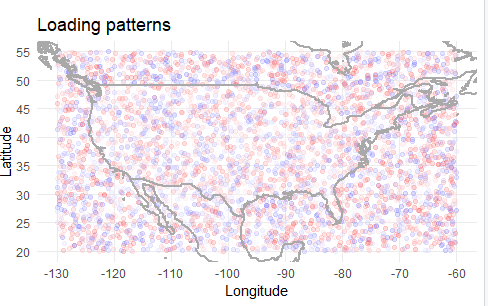
When carrying out Principal Component Analysis (PCA) with spatial data, it might be interesting to plot the PC (or EOFs) on a map to find spatial patterns across a given region.
The piece of code below will plot synthetic colored dots over the maps of the US. Since I generated the synthetic latitude and longitude data with the extreme points of latitude and longitude for the US, there will be dots in the map that fall in the ocean. Although that is not correct, the final product is what I want: a map with whose dots are colored according to a PC. The position for these dots are given by their latitude and longitude and a map of the US will "sit on top of it".
The variable loadings can be thought of as the PCs, the weights given to a certain location (latitude/longitude). Given the range of loadings, we define a sequence of points I called mybreaks.
Using the function colorRampPalette, I can create a function that takes a palette —c("red","white","blue") — and return a function that takes integer arguments and returns a vector of colors interpolating the palette.
The next step is to allocate the loadings into the breaks and I use the cut function for that. Then, using my palette-interpolating function, mycolpal, I will create a vector of hex codes the same length as the number of loadings. This palette runs thru the colors in my palette.
Finally, I create a plot whose x,y are, respectively, longitude and latitude. This points are colored by mycol. On top of this plot, the boundaries of the world map for within those latitudes and longitudes will be plotted thanks to maps::map("world", add = T).
I'd like to know to turn this piece of code into a more Tidyverse-like version of itself. I'm mainly interested in knowing how I'd get this graph using a ggplot/tidy approach. (I'll add that I have very little experience with spatial visualization in general). I'd also be interested in hearing how people come up with another ways to do the same plot. For instance,
- how would you generate a color palette?
- would you assign the elements in
loadingsto an interval usingcutor a different function? - how would you create your version
mycol?
Here's the code.
Thank you for your time and feedback.
# Create fake data for Principal Components (PC), latitude, and longitude.
loadings = runif(5000, -0.02, 0.02)
lat = runif(5000, 20, 55)
lon = runif(5000, -130, -60)

# Create a variable that defines a set of intervals
mybreaks = c(seq(-0.03, -0.001, by = 0.004), seq(0.001, 0.03, by = 0.004))

# Define color pallete
mycolpal = colorRampPalette(c("red","white","blue"))

# Assign each of the elements of an EOF to one of the intervals
mycut = cut(loadings, breaks = mybreaks, label = FALSE)

# Use pallete to assign color to each EOF
mycol = mycolpal(length(mybreaks))[mycut]

# Plot graph
plot(
      x = lon,
      y = lat,
      col = mycol,
      xlab = "Longitude",
      ylab = "Latitude",
      main = "Loading Patterns"
   )
   maps::map("world", add = T)
