How do I plot a bar chart where i can select the x variable and y variable

Hello,

I am currently trying to create a bar chart using the USArrests dataset. I want to plot the aggregate sum of murder, assault and rape for each state as the y variable and then the actual name of the state on the x axis. I am unable to plot the name of the states on the x-axis. Would anyone please be able to help me with the code to get the name of the states listed on the x axis?

Can you provide a reproducible example?

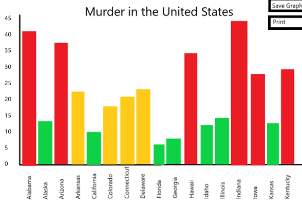
so im trying to get the name of the states shown on the x-axis similar to the mock up ive drawn. I just cant seem to get the x axis right
counts <- table(USArrests$Murder)
barplot(counts, main="Murder rates in the United States",
xlab="State",
ylab="Frequency")

image

Can you provide some data for the reproducible example? See the article.

counts <- USArrests$Murder + USArrests$Assault + USArrests$Rape
names(counts) <- rownames(USArrests)
barplot(counts, 
        main="Aggregated M A R in the United States",
        xlab="State",
        ylab="Frequency",las=2)

Although I would probably go with a ggplot2 based solution rather than a base barplot one.

Hi Nir,

Thank you so much for your response. Im trying to create a rshiny application using the USArrests dataset which models the rate of crime in each particular state. i want it to have a checkbox widget where they can select up to three variables (murder, assault and/or rape) and the graph will reactively reveal the aggregate score depending on the selections.

library(shiny)
library(ggplot2)

# Define UI for application that draws a histogram
ui <- fluidPage(
    
    # Application title
    titlePanel("Murder, Assaults and Rapes in the United States"),
    
    p("Use the variable selector to refine your search!"),
    
    # Sidebar with a slider input for number of bins
    sidebarLayout(
        sidebarPanel(
            checkboxGroupInput("murder_assault_rape",
                               "Which variable to display",
                               choices = c("Murder" = "Murder",
                                           "Assault" = "Assault",
                                           "Rape" = "Rape"),
                               selected = "Murder"
            ),

            mainPanel(
                plotOutput("barplot")
            )
        )
    )
)

Thats what i've written for my code so far but I just dont know how to write the server logic to display the bargraph for the main layout. All the tutorial i've seen on youtube use histograms and when they use bar plot, they use data from an excel spreadsheet rather than data package. Could anyone please help me write the server logic for this?

library(shiny)

# Define UI for application that draws a histogram
ui <- fluidPage(

  # Application title
  titlePanel("Murder, Assaults and Rapes in the United States"),
  p("Use the variable selector to refine your search!"),

  # Sidebar with a slider input for number of bins
  sidebarLayout(
    sidebarPanel(
      checkboxGroupInput("murder_assault_rape",
        "Which variable to display",
        choices = c(
          "Murder" = "Murder",
          "Assault" = "Assault",
          "Rape" = "Rape"
        ),
        selected = "Murder"
      )
    ),
    mainPanel(
      plotOutput("barplot")
    )
  )
)


server <- function(input, output, session) {
output$barplot <- renderPlot({

  marchoice <- req(input$murder_assault_rape)
  sd <- setdiff(names(USArrests),marchoice)
  temp_df <- USArrests
  temp_df[,sd] <- 0
  
  counts <- temp_df$Murder + temp_df$Assault + temp_df$Rape
  names(counts) <- rownames(temp_df)
  barplot(counts, 
          main="Aggregated M A R in the United States",
          xlab="State",
          ylab="Frequency",las=2)
})
}

shinyApp(ui, server)

Thanks Nir,

I've decided for simplicity just to recreate the USArrests dataframe manually. Im starting with 5 states first to make sure the program runs smoothly. I want to use ggplot as i intend on using additional widgets which require the graph to be modified. I cant for some reason get the else if statement to work so that when i press on murder and assault on the website, the graph responds by including the additional variable in the sum.

library(shiny)

# Create data
data <- data.frame(
  state=c("Alabama","Alaska","Arizona","Arkansas","California") ,  
  murder=c(13.2,10,8.1,8.8,9),
  assault=c(236, 263, 294, 190, 276),
  rape=c(21.2, 44.5, 31, 19.5, 40.6)
  
# Define UI for application that draws a histogram
ui <- fluidPage(
  
  # Application title
  titlePanel("Murder, Assaults and Rapes in the United States"),
  p("Use the variable selector to refine your search!"),
  
  # Sidebar with a slider input for number of bins
  sidebarLayout(
    sidebarPanel(
      checkboxGroupInput("murder_assault_rape",
                         "Which variable to display",
                         choices = c(
                           "Murder" = "Murder",
                           "Assault" = "Assault",
                           "Rape" = "Rape"
                         ),
                         selected = "Murder"
      )
    ),
    mainPanel(
      plotOutput("barplot")
    )
  )
)


server <- function(input, output, session) {
  output$barplot <- renderPlot({
    
    if (input$murder_assault_rape == c("Murder"))
    {
    ggplot(data, aes(x=state, y=murder)) + 
      geom_bar(stat="identity", fill="steelblue")+
      geom_text(aes(label=murder), vjust=1.6, color="white", size=3.5)+
      theme_minimal()}
    else if (input$murder_assault_rape == c("Murder", "Assault"))
    {
    ggplot(data, aes(x=state, y=murder + assault)) + 
      geom_bar(stat="identity", fill="steelblue")+
      geom_text(aes(label=murder), vjust=1.6, color="white", size=3.5)+
      theme_minimal()} 
    }
      
  )
}

shinyApp(ui, server)

This is what i've gotten so far. Any help will be appreciated
This topic was automatically closed 54 days after the last reply. New replies are no longer allowed.

If you have a query related to it or one of the replies, start a new topic and refer back with a link.