Here is github repository
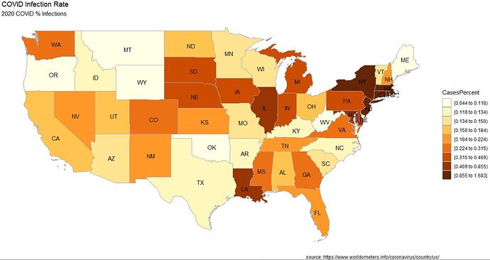
I wish to create single USA map that color-codes percent of COVID infections, and thickens state borders based on COVID deaths.
Here is my code to color-code map based on COVID infections. How do I thicken state border to show relative percent of COVID deaths?
r-map.R
library(ggplot2)
library(choroplethr)
data(continental_us_states)


setwd("C:/covid")

# input the data
library(readr)
covid <- read_csv("covid_infection_rate.csv")


# prepare the data
covid$region <- tolower(covid$State)
covid$value <- covid$CasesPercent


# create the map
state_choropleth(covid,
                 num_colors=9,
                 zoom = continental_us_states) +
  scale_fill_brewer(palette="YlOrBr") +
  labs(title = "COVID Infection Rate",
       subtitle = "2020 COVID % Infections",
       caption = "source: https://www.worldometers.info/coronavirus/country/us/",
       fill = "CasesPercent")
Output
