How do I make the plots in my line graph have the same colour as my annotations

Hello,

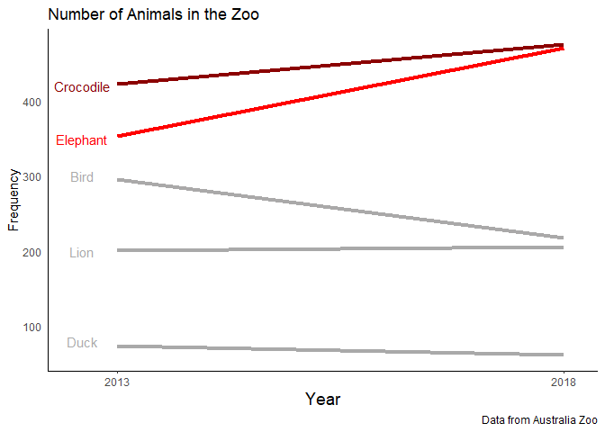
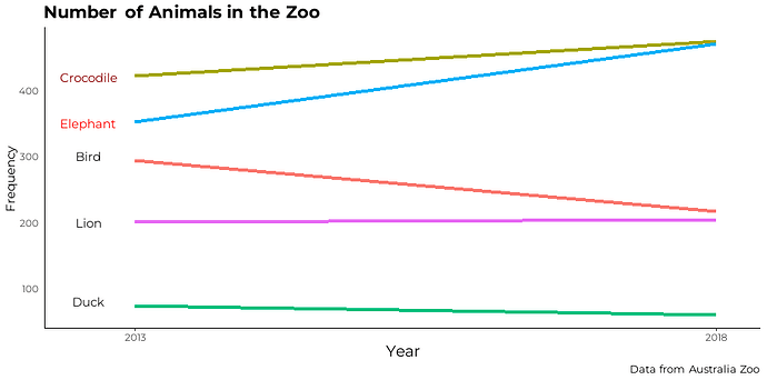
I was wondering how do I make the lines in my line graph to match the same colour as the annotations I have manually entered in the graph. I have attached my current graph along with the desired graph. Any help would be appreciated

Current Graph:

Desired Graph:

data1 <- data_frame(
  Animal = c("Bird", "Elephant", "Lion", "Duck", "Crocodile"),
  year2013 = c(295,353,201,74,423),
  year2018 = c(218,471,205,61,475)
)

### New code starts here

library(tidyr)

data2 <- data1 %>% 
  pivot_longer(cols = 2:3) %>% 
  mutate(
    year = gsub('year', '', name) %>% 
      as.numeric
  ) %>% 
  select(-name)

animalsinthezoo <- data2 %>% 
  ggplot(aes(x = year, y = value, group = Animal)) +
  geom_line(aes(color = Animal),lwd=1.5) + 
  geom_text(aes(label = "",group = ""),
            data = data2 %>% 
              filter(year == 2013),
            position = position_dodge( width = 1, )) + 
  geom_text(aes(label = ""),
            data = data2 %>% 
              filter(year == 2018),
            nudge_x = 0.1) + 
  scale_x_continuous(breaks = c(2013, 2018)) +
  labs(title = 'Number of Animals in the Zoo',
       x = 'Year',
       y = 'Frequency',
       caption = "Data from Australia Zoo")+ 
  theme_classic()+
  theme(text = element_text(family = "montserrat"),
        plot.title = element_markdown(size=16, face = "bold",),
        axis.ticks.y = element_blank(),
        axis.title.x = element_text(size=14),
        plot.caption = element_markdown(size=10),
        legend.position ='none')

animalsinthezoo + annotate("text", x = 2012.6, y = 420, label = "Crocodile", family = "montserrat", col="darkred")+
  annotate("text", x = 2012.6, y = 350, label = "Elephant", family = "montserrat", col="red")+
  annotate("text", x = 2012.6, y = 300, label = "Bird", family = "montserrat", color="#1a1919")+
  annotate("text", x = 2012.6, y = 200, label = "Lion", family = "montserrat", color="#1a1919")+
  annotate("text", x = 2012.6, y = 80, label = "Duck", family = "montserrat", color="#1a1919")
animalsinthezoo
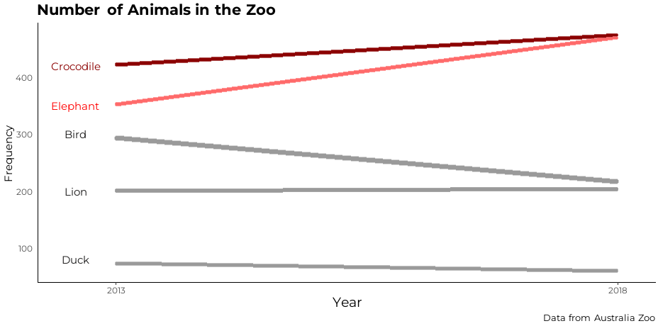
I used scale_color_manual to set the colors of the lines. I had to comment out some of your code as I do not have the necessary libraries. I also adjusted some of your hex values to give a lighter grey.

library(tidyverse)
#> Warning: package 'tibble' was built under R version 4.1.2
data1 <- data_frame(
  Animal = c("Bird", "Elephant", "Lion", "Duck", "Crocodile"),
  year2013 = c(295,353,201,74,423),
  year2018 = c(218,471,205,61,475)
)
#> Warning: `data_frame()` was deprecated in tibble 1.1.0.
#> Please use `tibble()` instead.
#> This warning is displayed once every 8 hours.
#> Call `lifecycle::last_lifecycle_warnings()` to see where this warning was generated.

### New code starts here

data2 <- data1 %>% 
  pivot_longer(cols = 2:3) %>% 
  mutate(
    year = gsub('year', '', name) %>% 
      as.numeric
  ) %>% 
  select(-name)

COLORS <- c("Crocodile"="darkred", "Elephant"="red","Bird"="#aAa9a9", 
            "Lion"="#a9a9a9","Duck"="#a9a9a9")

animalsinthezoo <- data2 %>% 
  ggplot(aes(x = year, y = value, group = Animal)) +
  geom_line(aes(color = Animal),lwd=1.5) + 
  geom_text(aes(label = "",group = ""),
            data = data2 %>% 
              filter(year == 2013),
            position = position_dodge( width = 1, )) + 
  geom_text(aes(label = ""),
            data = data2 %>% 
              filter(year == 2018),
            nudge_x = 0.1) + 
  scale_x_continuous(breaks = c(2013, 2018)) +
  scale_color_manual(values = COLORS) +
  labs(title = 'Number of Animals in the Zoo',
       x = 'Year',
       y = 'Frequency',
       caption = "Data from Australia Zoo")+ 
  theme_classic()+
  theme(text = element_text(family = "montserrat"),
        #plot.title = element_markdown(size=16, face = "bold",),
        axis.ticks.y = element_blank(),
        axis.title.x = element_text(size=14),
        #plot.caption = element_markdown(size=10),
        legend.position ='none')

animalsinthezoo + annotate("text", x = 2012.6, y = 420, label = "Crocodile", family = "montserrat", col="darkred")+
  annotate("text", x = 2012.6, y = 350, label = "Elephant", family = "montserrat", col="red")+
  annotate("text", x = 2012.6, y = 300, label = "Bird", family = "montserrat", color="#a9a9a9")+
  annotate("text", x = 2012.6, y = 200, label = "Lion", family = "montserrat", color="#a9a9a9")+
  annotate("text", x = 2012.6, y = 80, label = "Duck", family = "montserrat", color="#a9a9a9")

1 Like

This topic was automatically closed 21 days after the last reply. New replies are no longer allowed.

If you have a query related to it or one of the replies, start a new topic and refer back with a link.