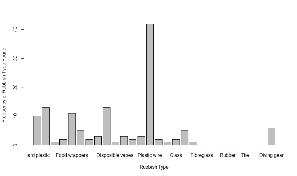
barplot(Sardine)
main="Frequency Of Rubbish Types found on the Sardine Run",
xlab="Rubbish Type"
ylab="Frequency of rubbish type found"
xlim=c(0,50)
ylim=c(0,28)
Border="red"
col="red"
density=10
horiz=TRUE
names.arg=c("Hard Plastic", "Soft Plastic", "Cigarette Pack", "Cigarette Butt", "Food Wrapper", "Bottles"," Plastic foodware eg plates cups and cutlery", "Bottle Caps", "Single Use Plastic Bag", "Disposible Vapes", "Metal", "Textiles", "Styrafoam", "Plastic Wire", "Paint Roller", "Zipper", "Glass", "Fishing line", "Fishing line with hook", "Fibreglass", "Sandpaper", "Facemask", "Rubber", "Balloon", "Tile", "Feminine Hygeine Products", "Beauty Products", "Diving Gear")
)
FJCC
August 14, 2023, 1:36pm
2
You can try rotating the text on the x axis and shrinking the size of the tick labels using the par() function.
DF <- data.frame(X = c("A","B","C"), Y = c(5,4,8))
barplot(Y ~ X, data = DF)
par(las = 3, cex.axis = 0.7)
barplot(Y ~ X, data = DF)
Created on 2023-08-14 with reprex v2.0.2
hi there! thanks for the insight. how do I access the las function? do I need to download a specific package?
FJCC
August 14, 2023, 1:55pm
4
The par() function is part of the graphics package included in base R. You can run ?par to see its Help file. The par() function has many parameters, so the Help file is long.
1 Like
system
September 25, 2023, 1:55pm
5
This topic was automatically closed 42 days after the last reply. New replies are no longer allowed.