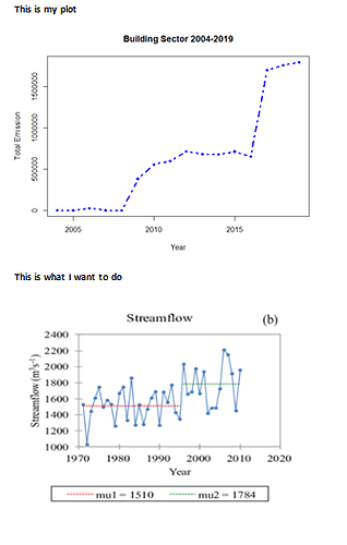
This is my plot
This is my code so far for the plot#From 2004 to 2019, Canada, Buildings--#
matplot(x, y, type="b", lty=4, pch = 18, col="blue",xlab="Year",
pettittTest <- trend::pettitt.test(x = Buildings[['TotalEmi']])
print(Buildings[['Year']][pettittTest$estimate])
Thanks in advance
We need a reproducible example (reprex)
A minimal reproducible example consists of the following items:
A minimal dataset, necessary to reproduce the issue
The minimal runnable code necessary to reproduce the issue, which can be run
on the given dataset, and including the necessary information on the used packages.
Let's quickly go over each one of these with examples:
Any particular reason for using matplot?
When I try this
x = (2004:2019)

y = integer(19)

y = as.double(y)

y=y[04:19]

matplot(x, y, type="b", lty=4, pch = 18, col="blue",xlab="Year",

        ylab="Total Emission",main = "Building Sector 2004-2019", lwd = '3')
all I get is a flat line with y == 0
system
January 12, 2022, 6:13pm
3
This topic was automatically closed 21 days after the last reply. New replies are no longer allowed.
