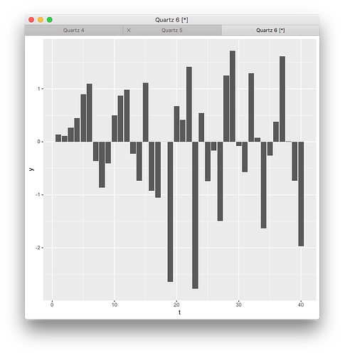
I'm using the gridSVG package to export garnished plots: that is, plots that have additional SVG attributes relating to their original data. So a barplot might have individual bars that, in the SVG, look like:
<rect
  xmlns="http://www.w3.org/2000/svg"
  id="geom_rect.rect.214.1.11"
  x="308.05" y="236.07" width="9.58" height="67.65" transform="" stroke="none" fill="rgb(89,89,89)"
  stroke-width="1.07" stroke-dasharray="none" stroke-linecap="butt" stroke-opacity="0" fill-opacity="1"
  data_t="11" data_y="0.871303487786997"/>
The last two, data_t and data_y, are garnished in using code like this reprex:
library(tidyverse)
library(grid)
library(gridExtra)
library(gridSVG)

# generate test data and barplot
testdata = data_frame(t = 1:40, y = rnorm(40))
bp = ggplot(testdata) + geom_col(aes(x = t, y = y))

# garnish plot with the original data, then export
bpg = bp %>% ggplotGrob() %>% grid.force()
dev.new(width = 8, height = 4.5, units = 'in')
grid.draw(bpg)
grid.garnish('geom_rect',
             data_t = testdata$t,
             data_y = testdata$y,
             group = FALSE, grep = TRUE, redraw = TRUE)
grid.export('test_garnished_naive.svg', strict = FALSE)
The particularly powerful part of grid.garnish is that you can give it vectors, so that instead of garnishing the parent grob with a single value, it garnishes each child grob (say, each bar with its original value for a given aesthetic).
However, I naively assumed that those children would be ordered in the SVG output the same way they are in the dataset I gave to ggplot2 (testdata). That isn't the case: in both this reprex and my own work, bars with negative y values precede bars with positive ones, so the data frame columns no longer match up with the child grobs.
Does anyone know if there's a way for me to tell how grid orders the geom elements? I'm thinking the draw_panel function for GeomRect in geom-rect.r is where I want to look, but I'm not sure how to get breakpoints into internal ggplot2 code to have a look.
