Hello,
A = c(0.7986, 0.5456, 0.3730, 0.8544, 0.6092, 0.3244, 0.3134, 0.8736, 0.4532)
B = c( 0.9184, 0.6754, 0.9434, 0.3818, 0.6732, 0.8198, 0.5276, 0.8102, 0.4010, 0.9252, 0.3116)
Could anyone give me advice on how I can combine my variables into a bar graph?
Thanks
Hello,
The best way to plot in R is using {ggplot2}, check out its website here:
A system for declaratively creating graphics, based on "The
Grammar of Graphics". You provide the data, tell ggplot2 how to map
variables to aesthetics, what graphical primitives to use, and it
takes care of the details.
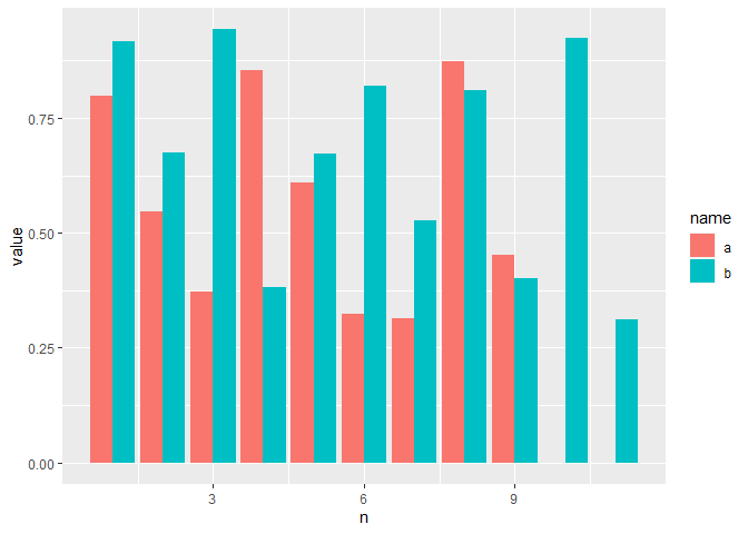
For your specific data, what do you want the bar chart to show? I've taken a stab at it below assuming you want A and B as separate bars.
library(ggplot2)
library(dplyr)
#>
#> Attaching package: 'dplyr'
#> The following objects are masked from 'package:stats':
#>
#>     filter, lag
#> The following objects are masked from 'package:base':
#>
#>     intersect, setdiff, setequal, union
library(tidyr)

A = c(0.7986, 0.5456, 0.3730, 0.8544, 0.6092, 0.3244, 0.3134, 0.8736, 0.4532)
B = c( 0.9184, 0.6754, 0.9434, 0.3818, 0.6732, 0.8198, 0.5276, 0.8102, 0.4010, 0.9252, 0.3116)

dat <- tibble(a = c(A, NA, NA), b = B) %>%
  mutate(n = row_number()) %>%
  pivot_longer(-n)

ggplot(dat, aes(x = n, y = value, fill = name)) +
  geom_col(position = "dodge")
#> Warning: Removed 2 rows containing missing values (geom_col).
Created on 2022-05-30 by the reprex package (v2.0.1)
I wanted to show how the values of A and B differ from each other in terms of removing non-informational values. What if i have more NA value? Length A = 100 and length B = 45?
system
June 20, 2022, 1:19pm
4
This topic was automatically closed 21 days after the last reply. New replies are no longer allowed.
![]()
