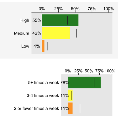
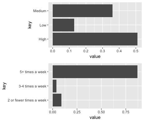
How do I set the size of the panel in a ggplot so they are consistent regardless of axis labels? I've tried adjust with width/height but doesn't scale properly. Is this possible? Below is what I've got now.

How do I set the size of the panel in a ggplot so they are consistent regardless of axis labels? I've tried adjust with width/height but doesn't scale properly. Is this possible? Below is what I've got now.

Could you please give us some information on how you produced this graphs? Without seeing your code, it is hard to help you.
Pretty basic example. If i set the width and height to the same size then the panel sections are different sizes due to different axis labels.
library(tidyverse)

key <- c("High", "Medium", "Low")
value <- c(.51, .36, .13)
df1 <- data.frame (key, value)

df1 %>%
  ggplot () +
  aes (x = key, y = value) +
  geom_bar (stat = "identity") +
  coord_flip()

key <- c("5+ times a week", "3-4 times a week", "2 or fewer times a week")
value <- c(.87, .04, .09)
df2 <- data.frame (key, value)

df2 %>%
  ggplot () +
  aes (x = key, y = value) +
  geom_bar (stat = "identity") +
  coord_flip()
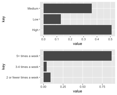
You can use ggarrange from the egg package to get align the plots:
library(tidyverse)
library(egg)

key <- c("High", "Medium", "Low")
value <- c(.51, .36, .13)
df1 <- data.frame (key, value)

p1=df1 %>%
  ggplot () +
  aes (x = key, y = value) +
  geom_bar (stat = "identity") +
  coord_flip()

key <- c("5+ times a week", "3-4 times a week", "2 or fewer times a week")
value <- c(.87, .04, .09)
df2 <- data.frame (key, value)

p2=df2 %>%
  ggplot () +
  aes (x = key, y = value) +
  geom_bar (stat = "identity") +
  coord_flip()

ggarrange(p1, p2, ncol=1)

plot_grid from the cowplot package is another option.
library(cowplot)

plot_grid(p1, p2, ncol=1, align="v")

The patchwork package is a newer option. I don't have much experience with it, but it looks more flexible than the other options.
#devtools::install_github("thomasp85/patchwork")
library(patchwork)

p1 + p2 + plot_layout(ncol = 1)

Thanks, those are great. The difficulty I have is that, for formatting and style reasons, they are in separate sections of a report that appear right under each other. That's why I was hoping to make some adjustment in theme (i.e. theme (panel.background = element_rect(width = 5))
I'll see what I can do about the formatting on the page and get your suggestion working.
If you save your plots with ggsave before including them in your report, you can set their dimensions:
 ggsave(filename, plot = last_plot(), device = NULL, path = NULL,
       scale = 1, width = NA, height = NA, units = c("in", "cm", "mm"),
       dpi = 300, limitsize = TRUE, ...)
If you don't want to save the graphs, you can set the dimensions with dev.new. e.g.:
dev.new(width = 8, height = 4, unit = "in")
To align plots with intervening text, you can use align_plots from the cowplot package. It returns a list where each element is one of the plots, but with all the panels aligned. Here's an rmarkdown example:
---
output: pdf_document
urlcolor: blue
---

```{r setup, include=FALSE}
knitr::opts_chunk$set(echo = FALSE, fig.height=1.5, fig.width=4)
library(tidyverse)
library(cowplot)
theme_set(theme_bw())
```

```{r}
key <- c("High", "Medium", "Low")
value <- c(.51, .36, .13)
df1 <- data.frame (key, value)

p1=df1 %>%
  ggplot () +
  aes (x = key, y = value) +
  geom_bar (stat = "identity") +
  coord_flip()

key <- c("5+ times a week", "3-4 times a week", "2 or fewer times a week")
value <- c(.87, .04, .09)
df2 <- data.frame (key, value)

p2=df2 %>%
  ggplot () +
  aes (x = key, y = value) +
  geom_bar (stat = "identity") +
  coord_flip()
```

Note that the plots below have panels that are aligned vertically on the page, even though there is intervening text between each plot. The code to align the plots is adapted from [this Stack Overflow answer](http://stackoverflow.com/a/45616684/496488).

```{r}
# Generate a list of the aligned plot objects
pl <- align_plots(p1, p2, align="v")
```

```{r}
ggdraw(pl[[1]])
```

`align_plots` returns a list of plots that we can draw seperately, but whose panels will still be vertically aligned on the page.

```{r}
ggdraw(pl[[2]])
```
Here's the output document: