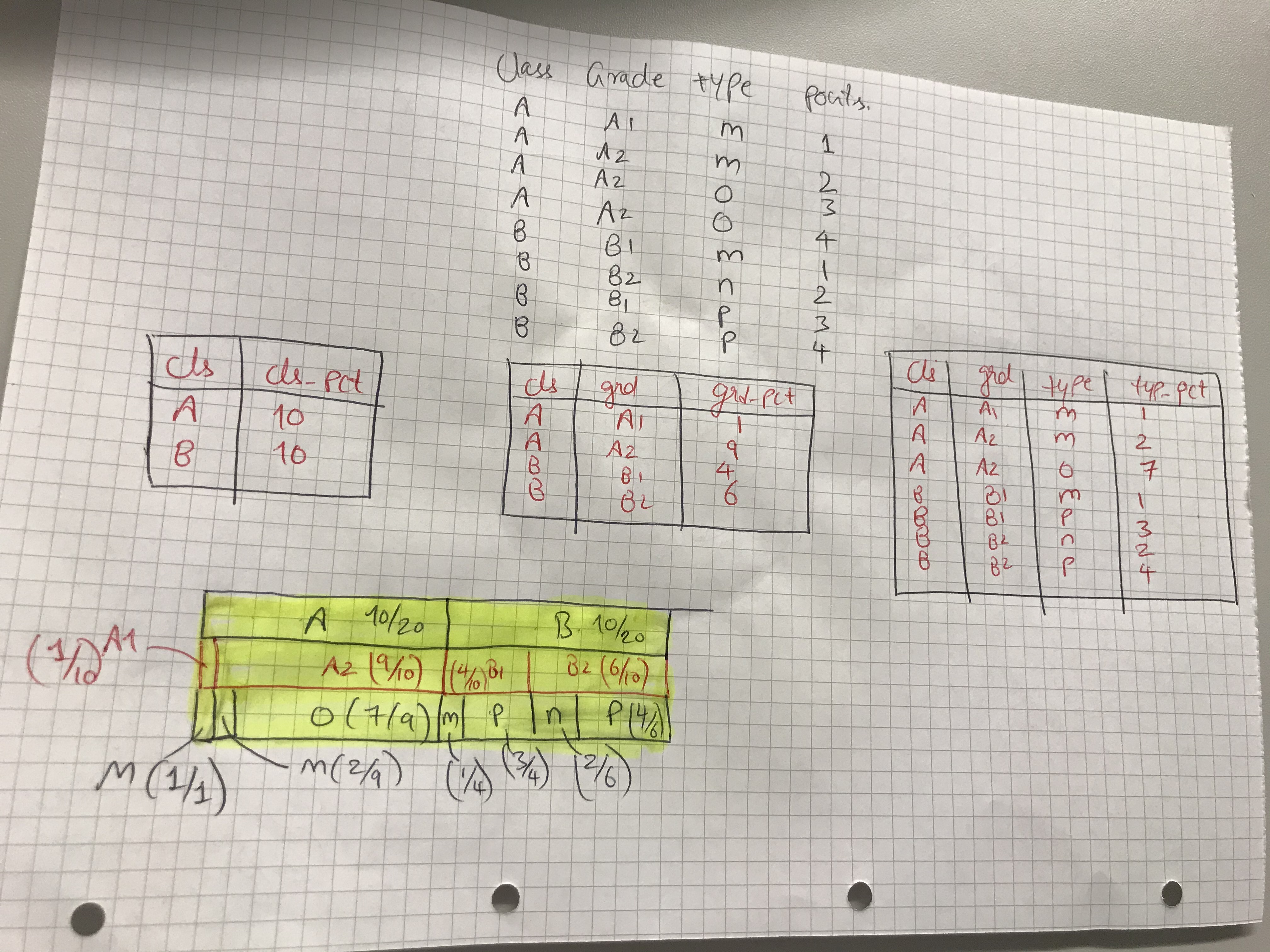
   cls   grd   typ    pnts   pct
   <fct> <chr> <chr> <int> <dbl>
 1 A     A1    m         1 1
 2 A     A2    m         2 0.222
 3 A     A2    o         7 0.778
 4 B     B1    m         1 0.25
 5 B     B1    p         3 0.75
 6 B     B2    n         2 0.333
 7 B     B2    p         4 0.667
 8 A     A1    All       1 0.1
 9 A     A2    All       9 0.9
10 B     B1    All       4 0.4
11 B     B2    All       6 0.6
12 A     All   All      10 0.5
13 B     All   All      10 0.5
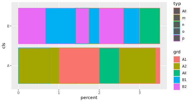
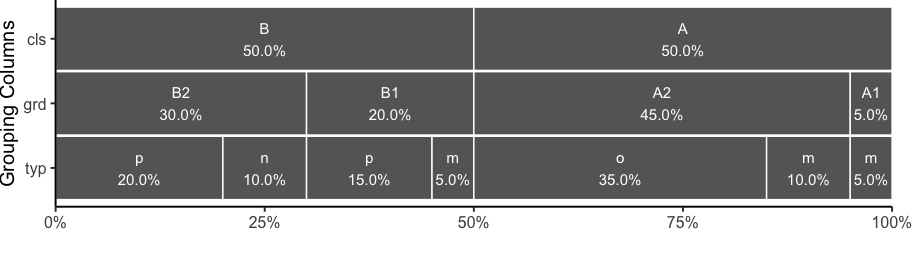
Can we use ggplot2 or sunburst or something to somehow show the proportion of 3 categories in 1 graph (e.g. bar-like chart) ? differentiating with colors or fill ? also, excluding "All" categories if possible.
please dont suggest facets as my real data has many variable
data <- df %>%
  group_by(cls,grd,typ) %>%
  summarise(pnts = sum(pnts)) %>%
  mutate(pct = pnts/sum(pnts)) %>%
  bind_rows(df %>%
              group_by(cls, grd) %>%
              summarise(pnts = sum(pnts)) %>%
              mutate(pct = pnts/sum(pnts),
                     typ = "All")) %>%
  bind_rows(df %>%
              group_by(cls) %>%
              summarise(pnts = sum(pnts)) %>%
              mutate(pct = pnts/sum(pnts),
                     grd = "All",
                     typ = "All"))
#### Attempt to visualize all the ratios in 1 chart

data %>%
  pivot_longer(cols = -c(cls:pnts),
               names_to = "per_cat",
               values_to = "percent") %>%
  ggplot(aes(cls,percent, col = typ, fill = grd)) +
  geom_bar(stat = "identity") +
  coord_flip() +
  theme_bw()