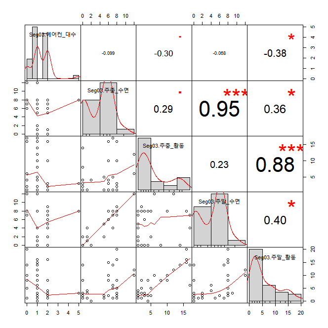
I have used R codes below to get the result of correlation.
install.packages("PerformanceAnalytics")
library(PerformanceAnalytics)

original_data <- read.csv("에솔_correlation_analysis.csv", header = TRUE, sep = ",", na.strings = "NA")
str(original_data)
library(dplyr)
original_data <- tbl_df(original_data)

Seg03 <- filter(data_analysis, 가구seg=="type03")
Seg03_airconditioner <- data.frame(Seg03$에어컨_대수,Seg03$주중_수면,Seg03$주중_활동,Seg03$주말_수면,Seg03$주말_활동)
chart.Correlation(Seg03_airconditioner, histogram = TRUE, method = "pearson")
I got the chart like the attached image and I wonder how can I read the result of red dots which are in the cell (1,3) and (2,3). Few other cells show me how significant that coefficient value is with red star(s) but those two cells mentioned earlier, they show me only a red dot in each cells.

