Thanks for including code. It's more useful in the form of a reproducible example, called a reprex. In this case, to answer it it necessary 1) to track down the grid.arrange function (found in the gridExtra package and 2) to guess what data explore_data represents.
The data does not have to be your actual data, just data (preferably from mtcars or another standard built-in data set) that produces the same issue.
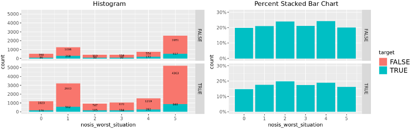
Great. Small adjustment. Here is what a reprex (an addin option--use the search box) should look like
library(dplyr) # necessary libraries
#>
#> Attaching package: 'dplyr'
#> The following objects are masked from 'package:stats':
#>
#> filter, lag
#> The following objects are masked from 'package:base':
#>
#> intersect, setdiff, setequal, union
library(ggplot2)
library(gridExtra)
#>
#> Attaching package: 'gridExtra'
#> The following object is masked from 'package:dplyr':
#>
#> combine
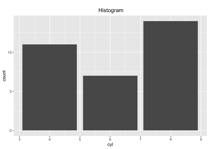
explore_data <- mtcars # mtcars is always available without calling it
p1 <- explore_data %>%
ggplot(aes(cyl, fill=vs)) +
ggtitle("\n Histogram") +
theme(plot.title = element_text(hjust = 0.5),
legend.position="none") +
geom_bar(stat='count', position = 'stack') # +
# facet_grid(is_for_train~.) # omitted because is_for_train not defined
p1 # show the result of defining the plot
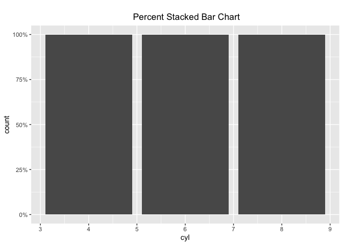
p2 <- explore_data %>%
ggplot(aes(cyl, fill=vs)) +
ggtitle("\n Percent Stacked Bar Chart") +
theme(plot.title = element_text(hjust = 0.5)) +
geom_bar(stat='count', position = 'fill') # + omitted
# facet_grid(is_for_train~.) # omitted because is_for_train not defined

p2 # show he result
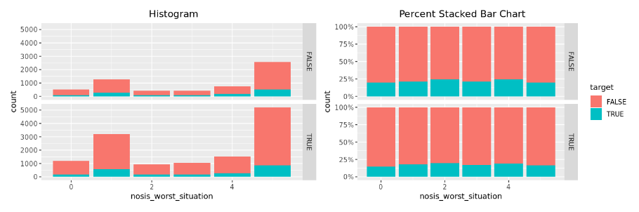
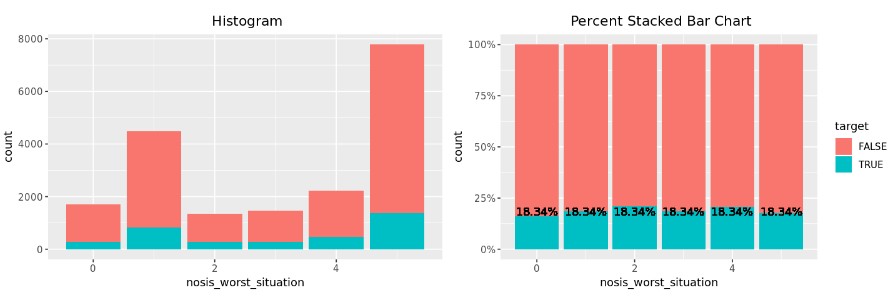
I´m sory, I expressed wrong. What I´m trying to do is to show the percentage into the bars in the Barplot (p2)
This are the library I´m using:
library(ggplot2)
library(magrittr)
library(dplyr)
library(tidyr)
library(lubridate)
library(Amelia)
library(tabplot)
library(gridExtra)
While you can do the percentage calculations within ggplot, because geom_text() takes character arguments, such as 25.2%, it's easier to do the calculation outside and use the object names, such as bar1.
Work the examples in help(geom_text) to get the placement you want. The final example will be particularly helpful.
I still can't solve the problem.
The problem is that I want to visualize the percentage of trues in lots of variables, and if I create an argument by result of each variable I'm going to have to generate a lot of arguments, that is why I was traing to do this calculate on the ggplot function.