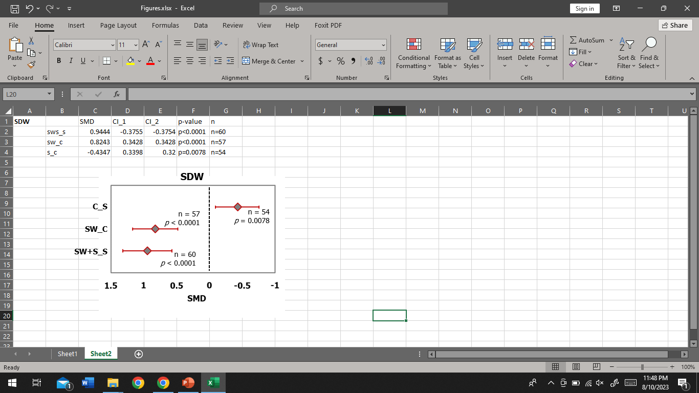
| SMD | CI_1 | CI_2 | p-value | n | |
|---|---|---|---|---|---|
| sws_s | 0.9444 | -0.3755 | -0.3754 | p<0.0001 | n=60 |
| sw_c | 0.8243 | 0.3428 | 0.3428 | p<0.0001 | n=57 |
| s_c | -0.4347 | 0.3398 | 0.32 | p=0.0078 | n=54 |
The plot_model function from the sjPlot package is able to create these figures.
You can use ggplot2 and do some fancy stuff there. In order to get some actual code you should use dput to provide actual usable data instead of a table which one would have to manually transfer into a valid R structure.
Try this:
library(tidyverse)

df <- tibble(
  name = c("sws_s", "sw_c", "s_c"),
  smd = c(0.9444, 0.8243,-0.4347),
  ci_1 = c(0.3755, 0.3428, 0.3398),
  ci_2 = c(0.3754, 0.3428, 0.32),
  p_value = c("p<0.0001", "p<0.0001", "p=0.0078"),
  n = c("n=60", "n=57", "n=54")
) |>
  mutate(name = as_factor(name))

df |> ggplot(aes(x = smd, y = name)) +
  theme_bw() +
  theme(panel.grid = element_blank()) +
  geom_vline(xintercept = 0, linetype = "dotted") +
  geom_point() +
  geom_errorbarh(aes(xmin = smd - ci_1, xmax = smd + ci_2), height = 0.1) +
  geom_text(aes(label = p_value), vjust = -1) +
  geom_text(aes(label = n), vjust = -3) +
  labs(x = "SMD", y = NULL, title = "SDW")
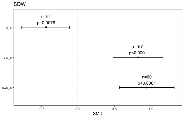
You can reverse the x-axis by adding scale_x_reverse(), though I'm not sure why anyone would like to do this.
1 Like
This topic was automatically closed 7 days after the last reply. New replies are no longer allowed.
If you have a query related to it or one of the replies, start a new topic and refer back with a link.